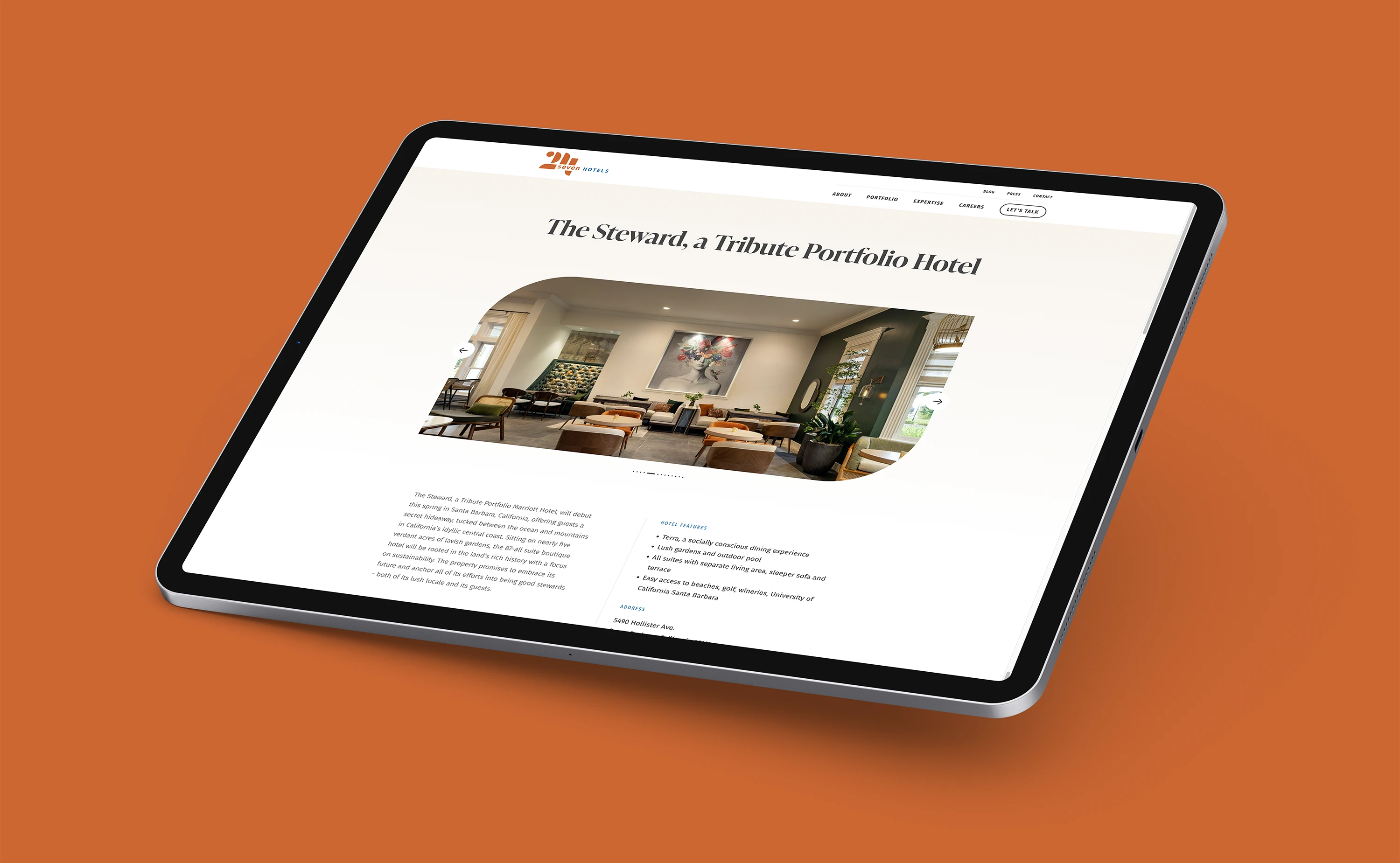
24seven Hotels manages lifestyle and select-service properties across the western and south-central U.S., but their visual identity hadn’t kept pace with the sophistication of their operations. The team needed an identity that could work in two very different rooms: an owner pitch where institutional credibility matters, and a corporate storytelling moment where brand personality needs to land. The new system had to carry both registers without compromising either.
Hospitality, Finely Tuned
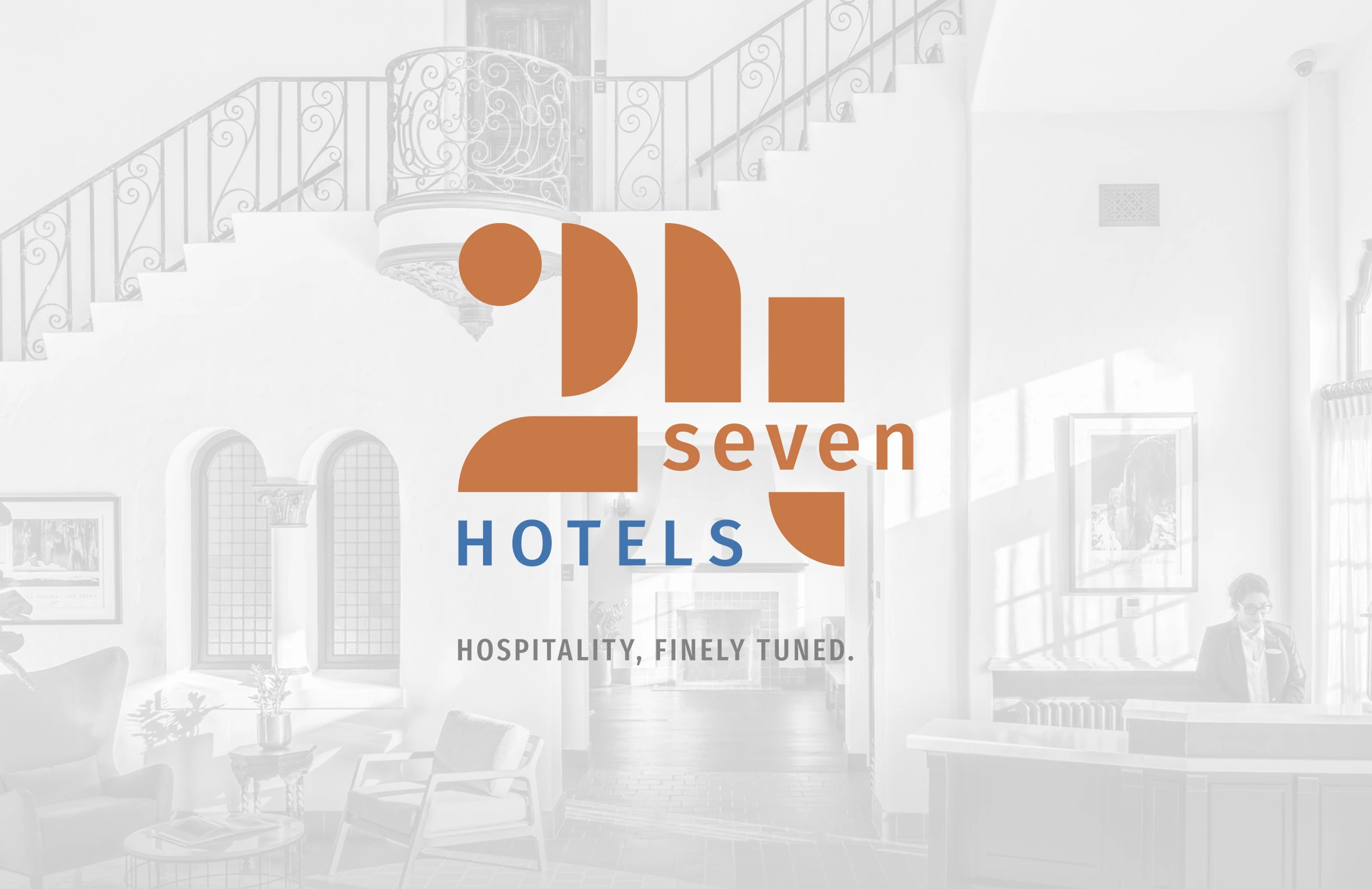
The brand idea Hospitality, finely tuned. anchored the new identity. It signals craft, precision, and care without overpromising. Every visual decision flowed from this positioning, including the Bauhaus-influenced geometric mark and the restrained palette.
A System Built For Handoff
The identity was built knowing it would extend into web, marketing, and operational rollout through partner agencies. Clear guidelines, a comprehensive asset library, and explicit usage rules made the handoff to Wallop seamless. The brand stays consistent regardless of which partner is executing.
People At The Center
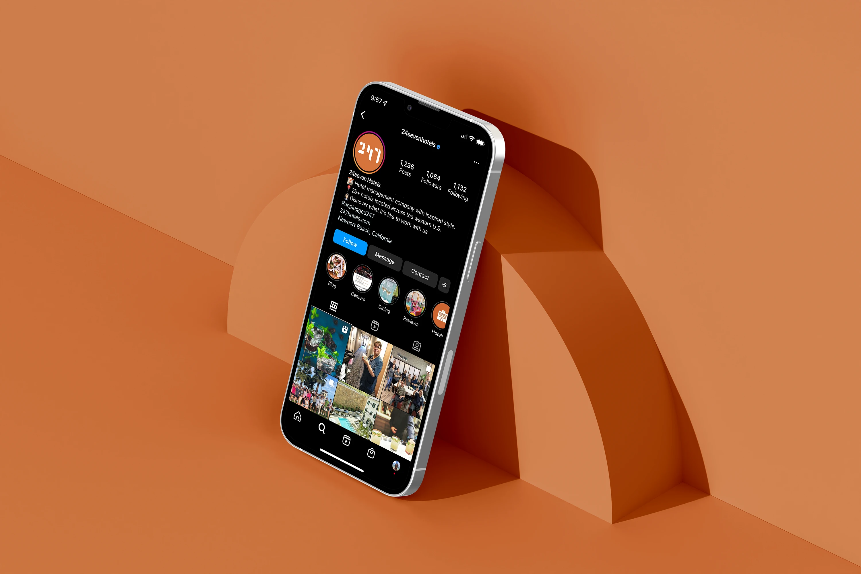
24seven describes itself as a people-first operator, and the brand had to reflect that. Photography direction, color palette, and brand voice all skew warm and human rather than corporate, while the geometric mark provides the structural anchor that signals operational seriousness.