American Beauty is photographer Philip Jarmain's decade-long archive documenting the rapid loss of Detroit's pre-Depression architecture. The project needed an identity and exhibition catalogue that would let the photographs hold the foreground while carrying the visual weight of a museum publication. Jarmain's work captures buildings the architecture world considered impossible to lose, and the design system had to feel as deliberate and considered as the subject matter.
A Custom Logotype
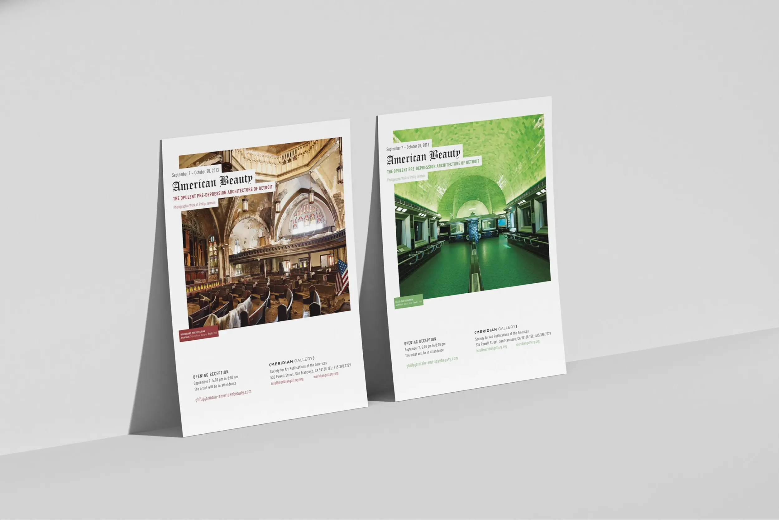
We built a custom logotype inspired by historic Detroit signage, drawing from the same era of typographic confidence that built the buildings Jarmain photographs. The logotype anchors every application from the exhibition catalogue to the gallery posters.
An Editorial Grid That Listens
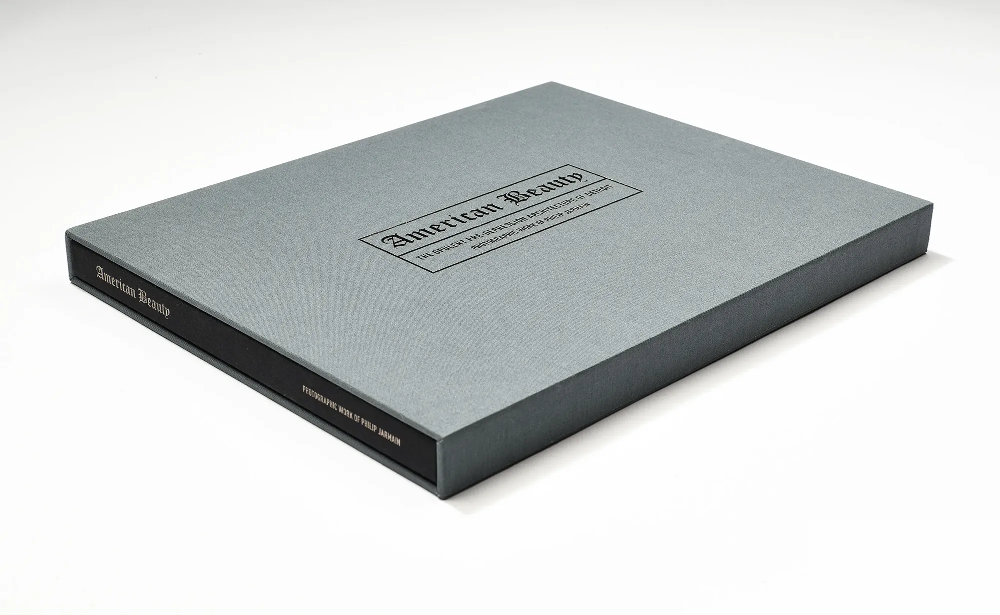
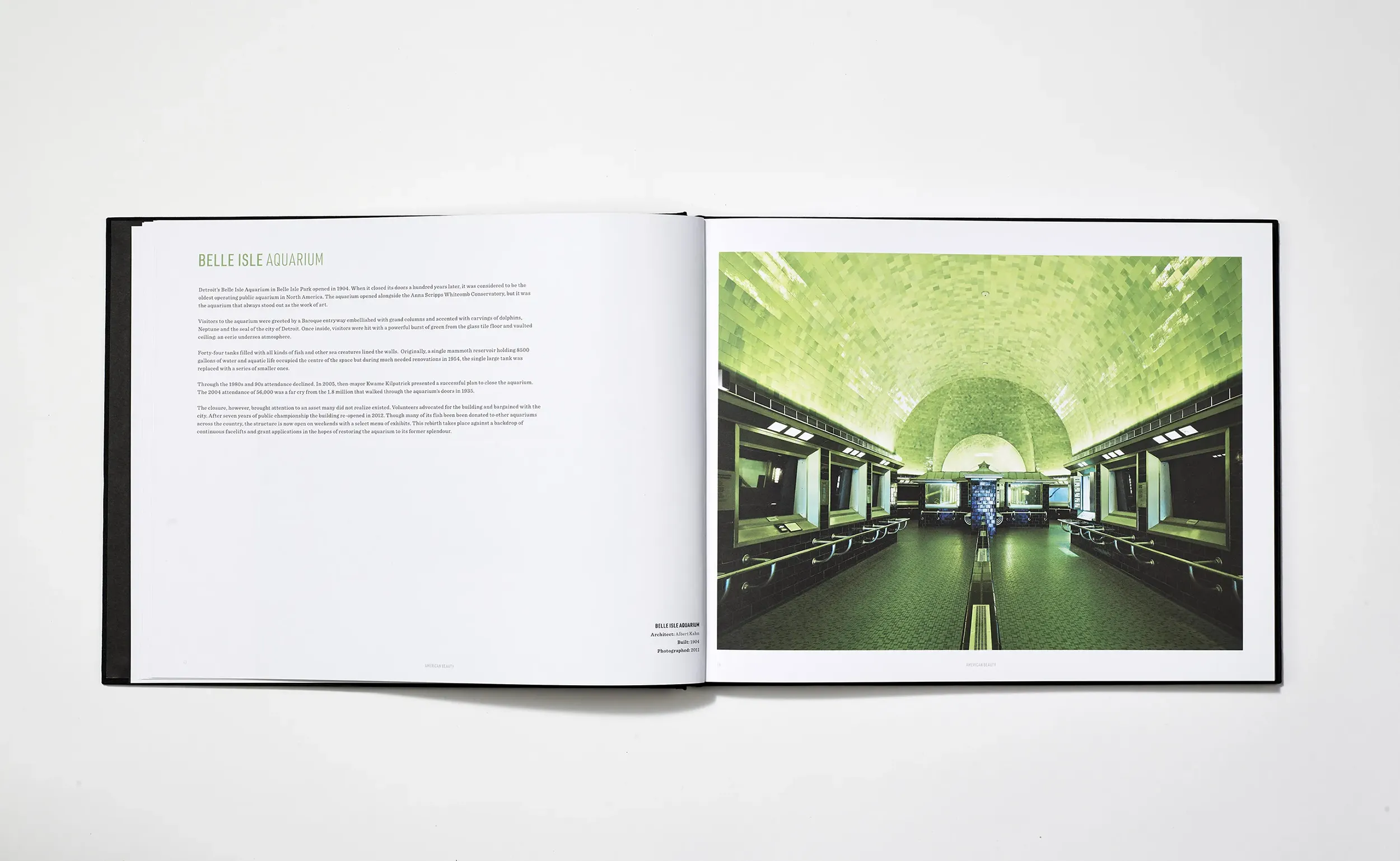
The slipcased hardcover uses a generous editorial grid that gives each photograph the room it needs. White space is treated as a deliberate compositional choice, not a default. The book reads as a museum publication rather than a coffee-table art book.
Produced With Hemlock
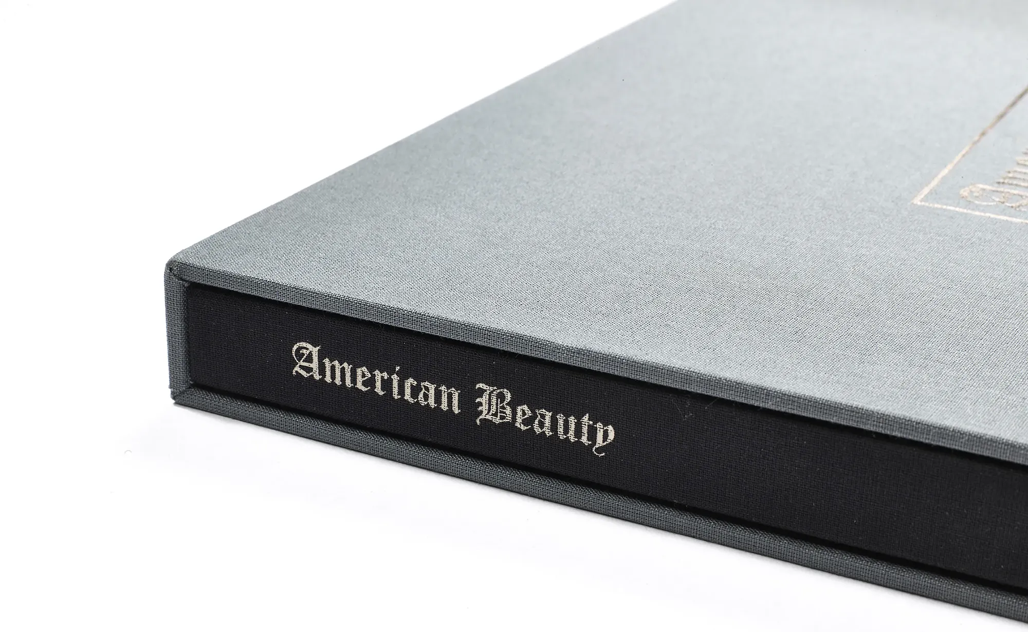
Working with Hemlock Printers in Vancouver, we treated the production as part of the design. Foil-stamped covers, black cloth binding, and considered paper stock turn the book into an object worth keeping. The catalogue went on to win awards.