American Beauty
Exhibition identity and an award-winning art book
WHAT WE DID:
Visual Identity • Editorial Design • Art Direction • Production Management • Web
SECTOR:
Arts & Culture / Photography
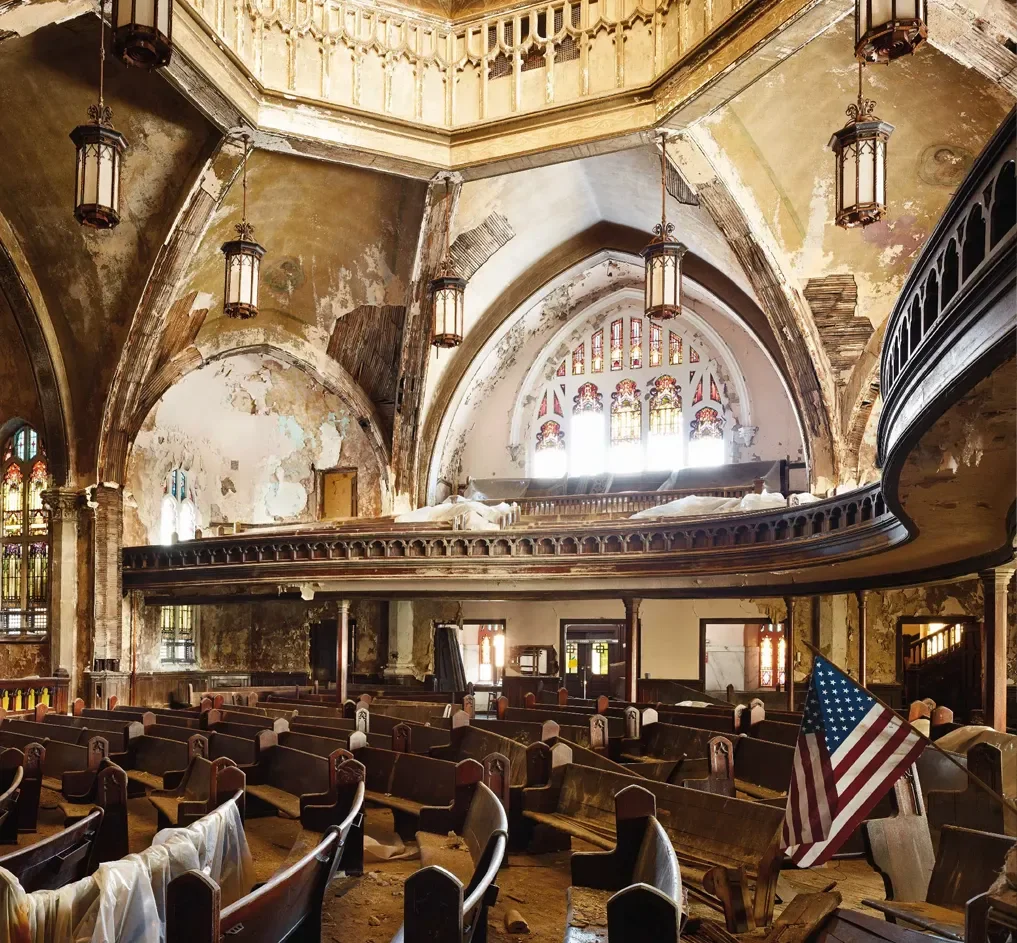
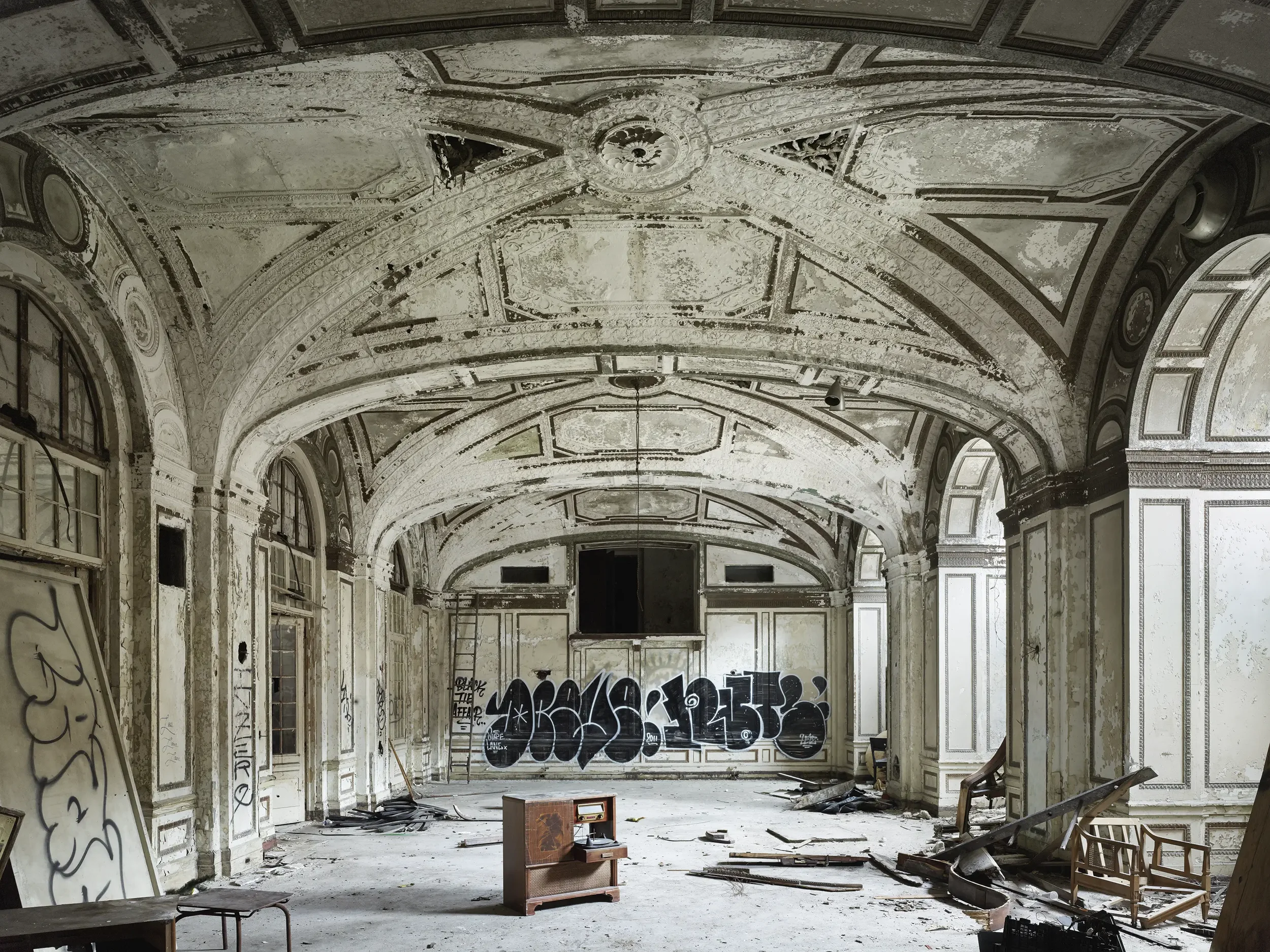
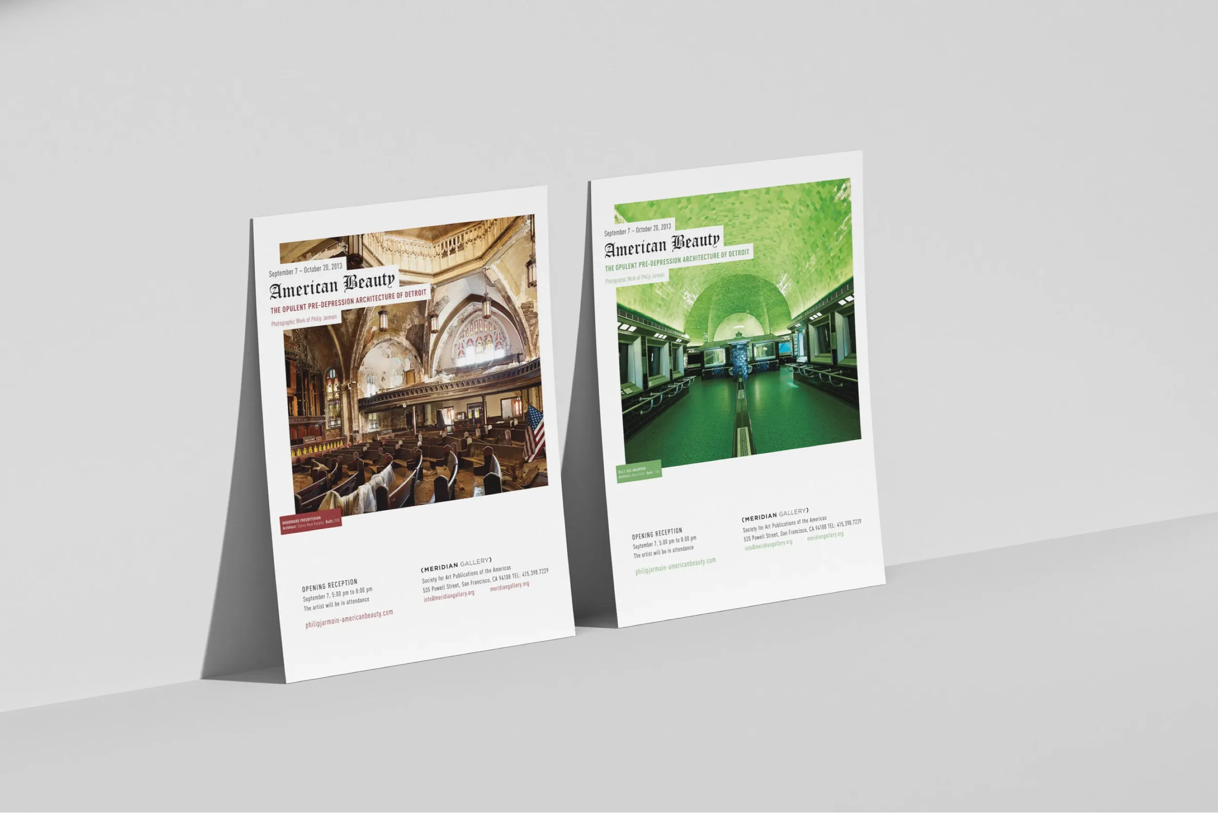
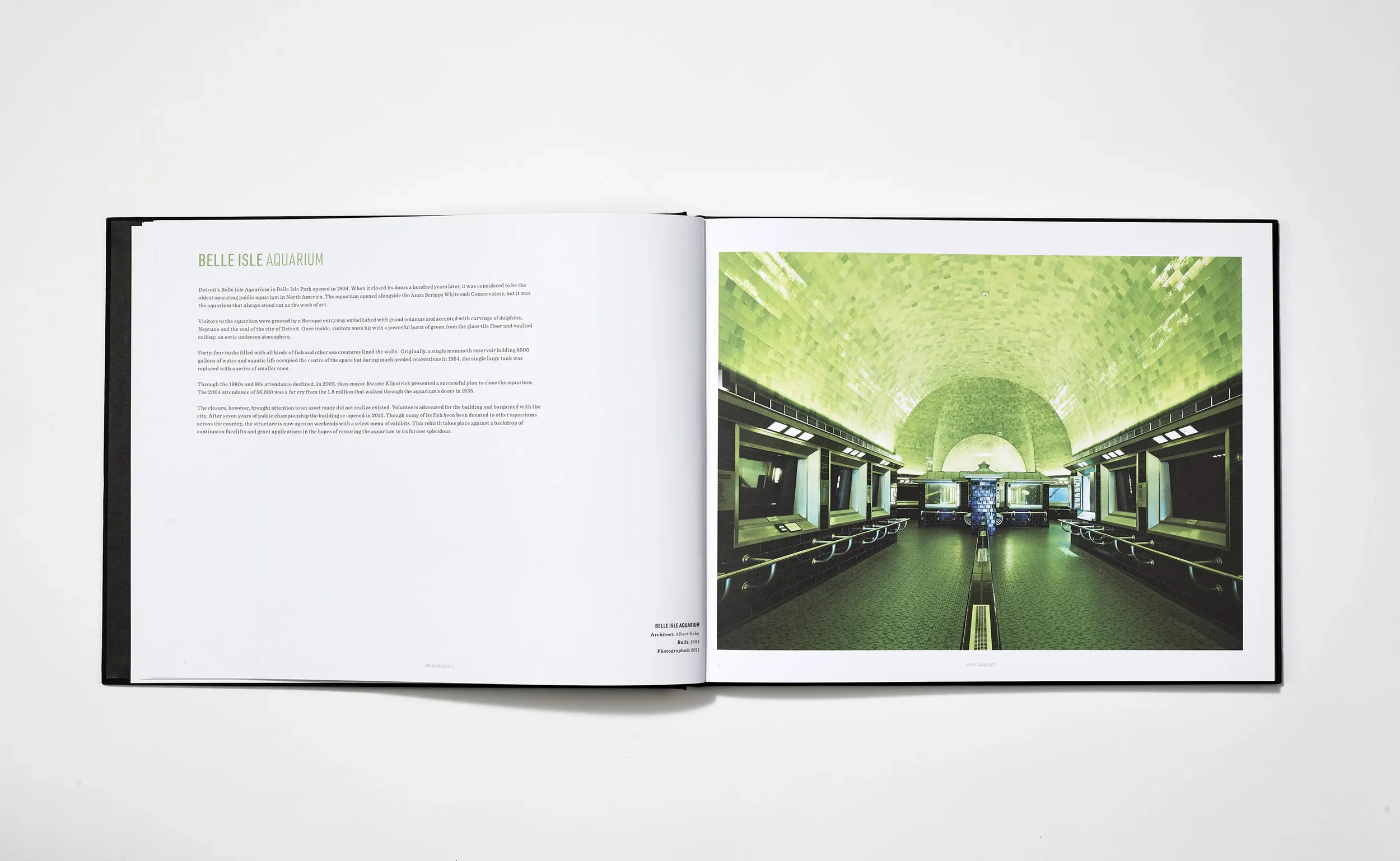
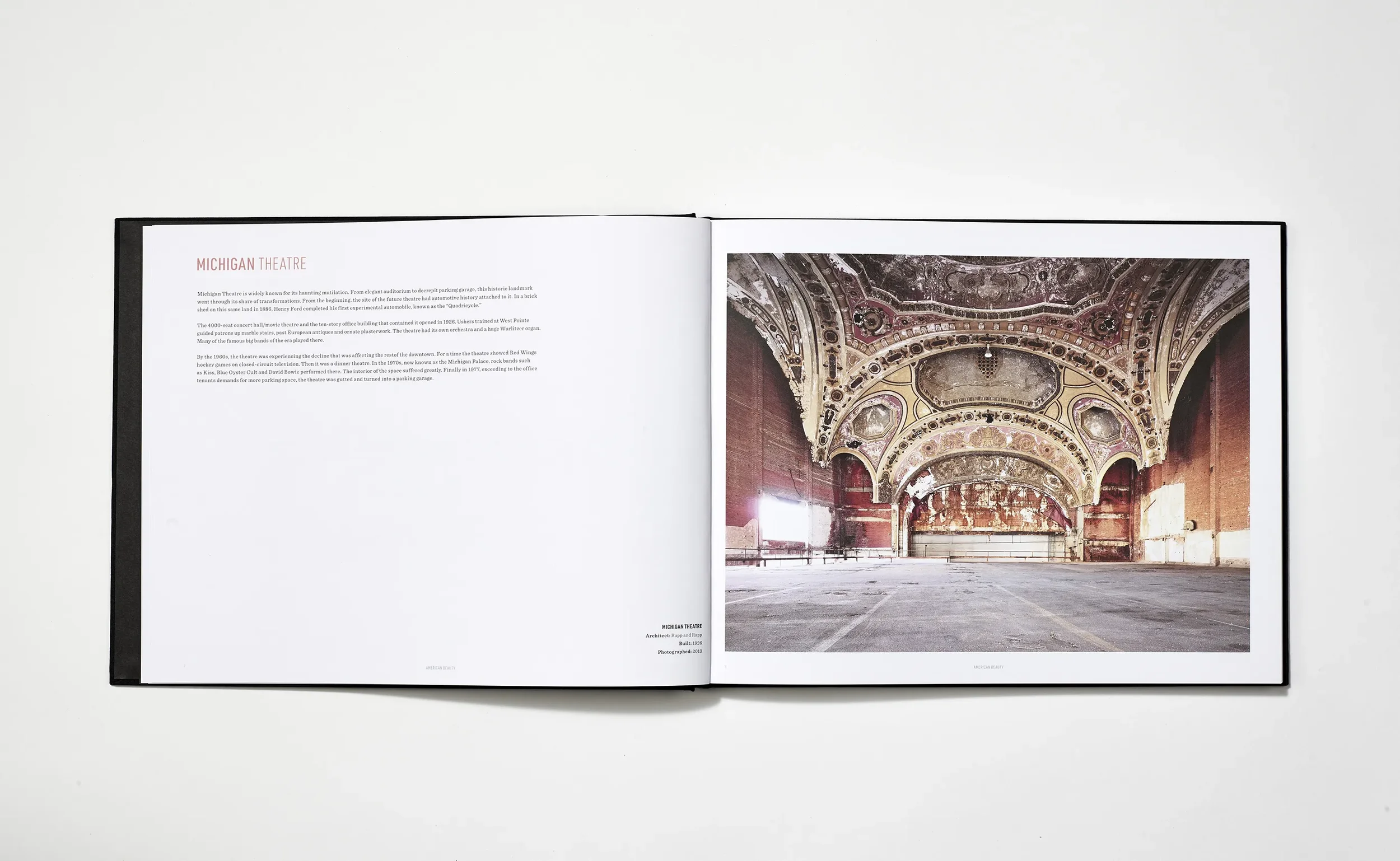
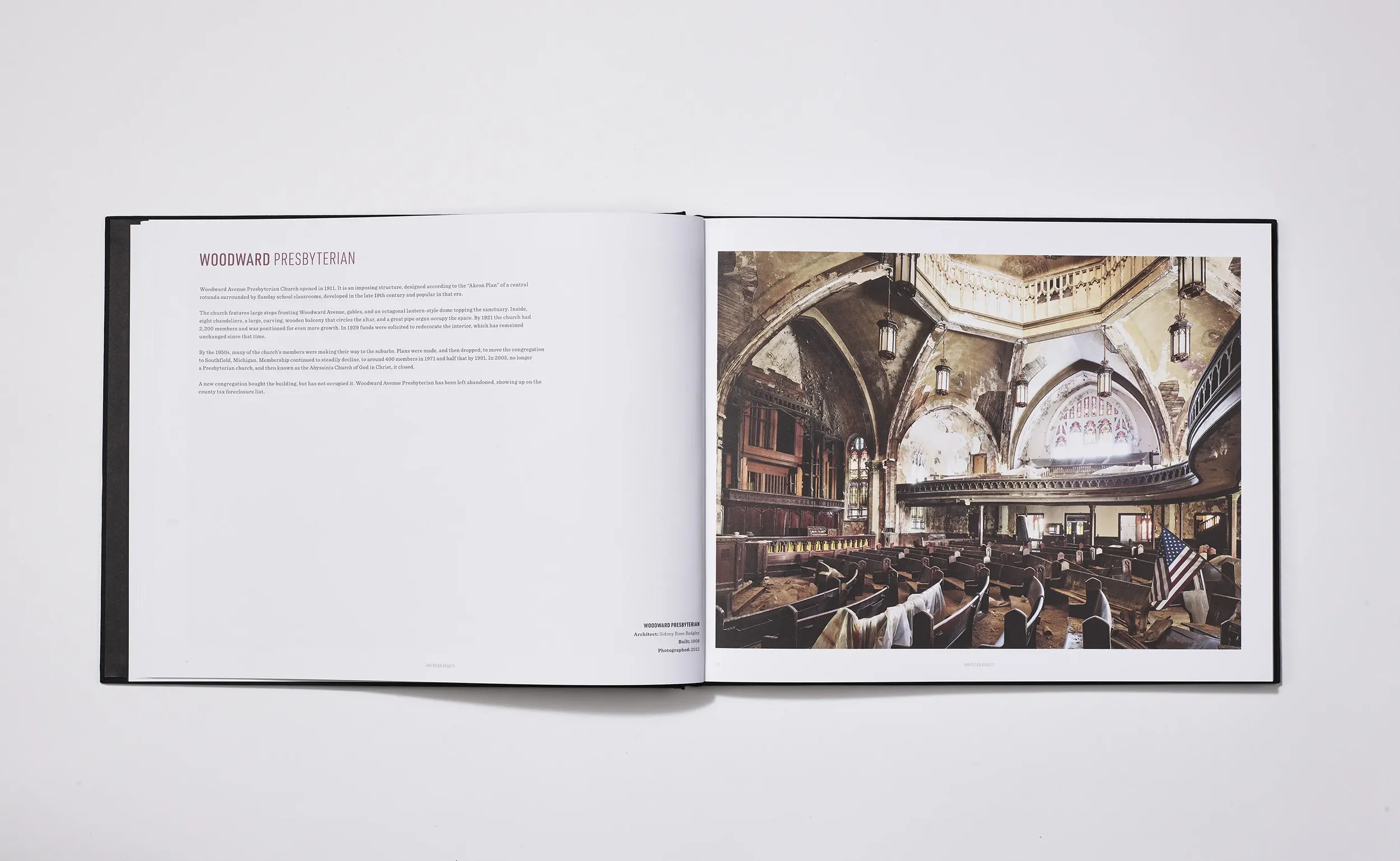
We partnered on the identity, exhibition catalogue, and collateral for photographer Philip Jarmain’s American Beauty—a series of large-scale architectural photographs documenting the rapid loss of Detroit’s early 20th-century buildings.
The Problem
Create a catalogue and identity that honor the scale and craft of the work without overpowering it.
Translate a century-old Detroit design vernacular into modern typography and layout.
Manage premium book production so prints reproduce faithfully and the object feels archival.
Our Approach
Lead with restraint. Let the images breathe. Build the brand from Detroit’s own visual language.
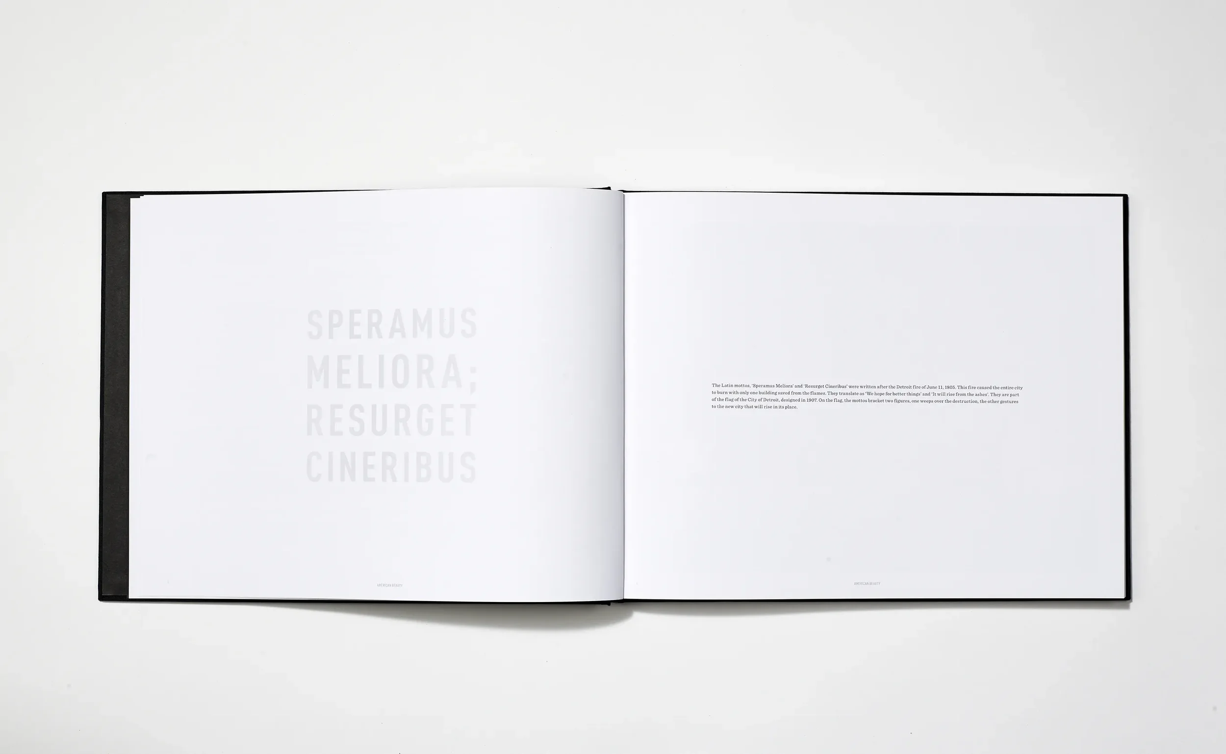
Editorial system: generous white space, clean grid, and minimal ornament so structure lines and details in the photographs stay front and center.
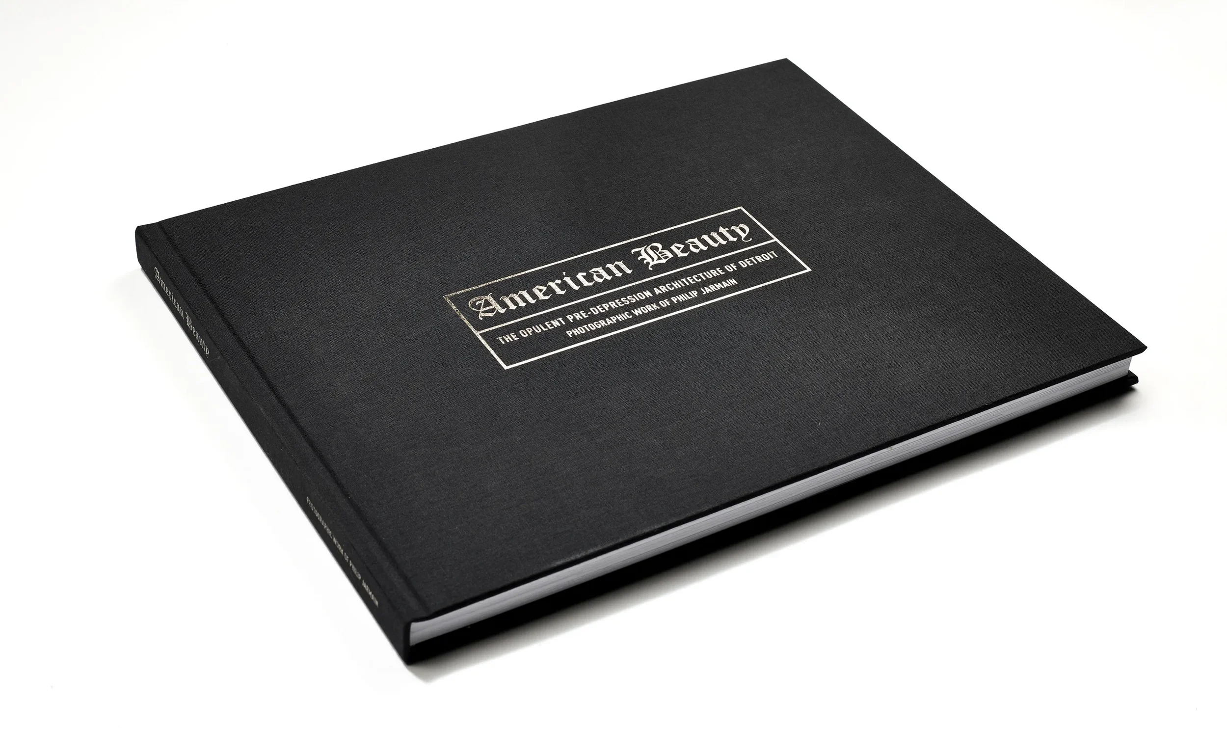
Identity cues: a custom logotype that nods to historic Detroit signage and the Tigers’ early mark, paired with a robust, modern typeface to reflect the region’s industrial character.
Production craft: close collaboration with Hemlock Printers to tune materials and specs for a large, tactile, durable book.

What We Made
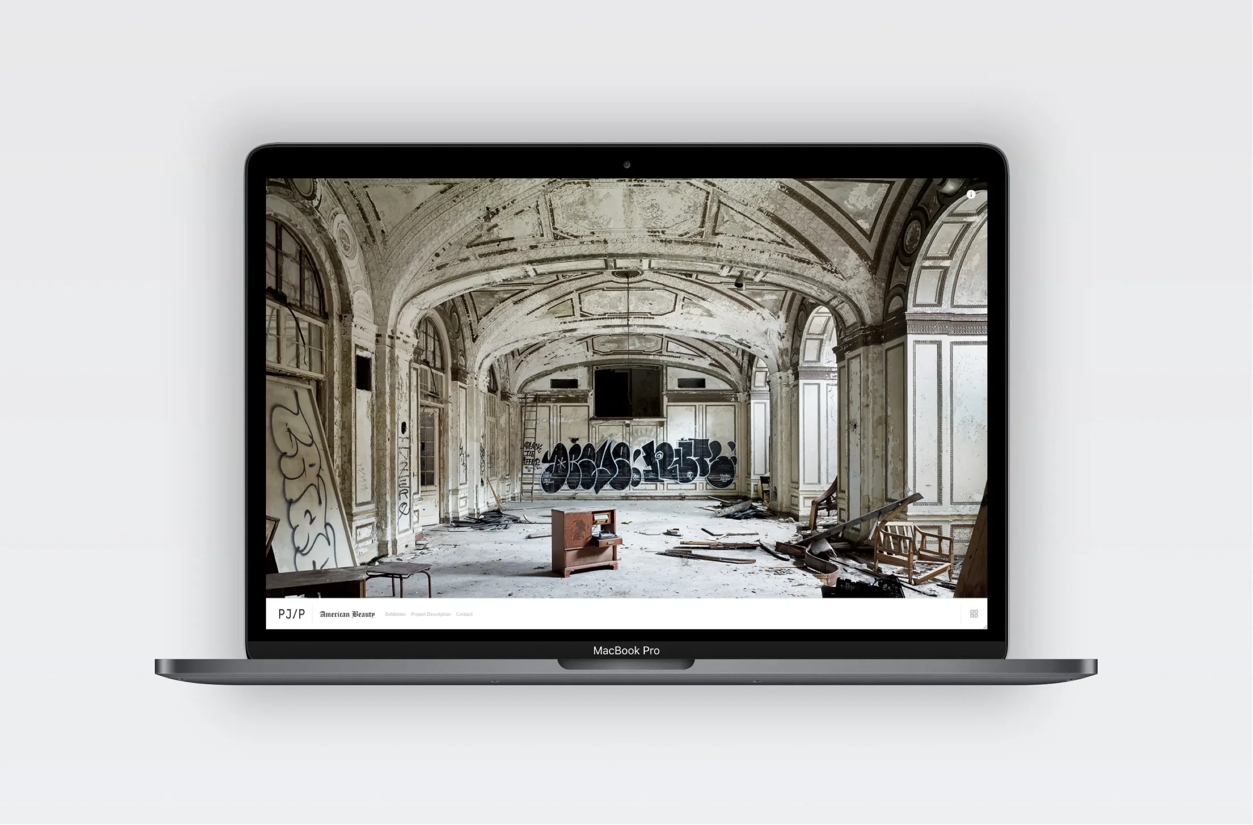
Exhibition catalogue and launch collateral (posters and website) that carried the series identity into the gallery and onto the street.
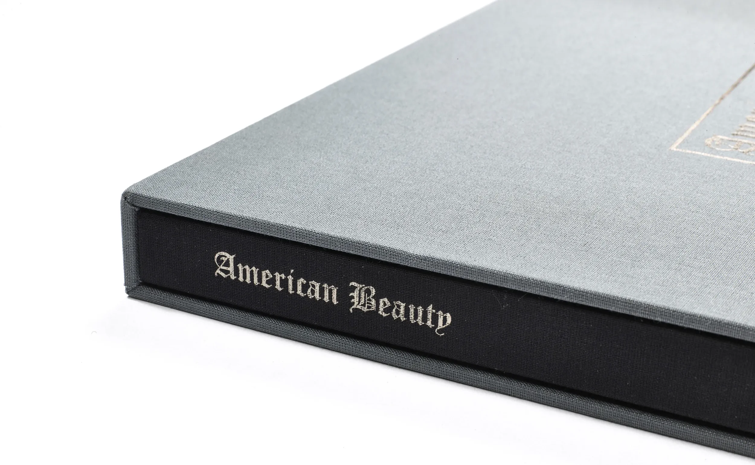
Limited-edition hardcover book: 13.5" × 10.5", 132 pages, 60 photographs with historical text notes. Case-bound in black cloth with an optional wrapped slipcover, each with a foil-stamped mark.
Identity system: logotype inspired by early Detroit letterforms; plaque-style lockup structure; type and layout rules for consistency across print and web.

Outcomes
The exhibition launch drew strong critical response, and the publication received awards.
The book’s materials and finish created a “sublime tactile experience,” matching the subject matter’s gravity.
A cohesive identity and editorial system that scales from posters to long-form print and web.
Project Facts
Client: Philip Jarmain
Role: Visual Identity, Art Direction, Web Development, Editorial Design, Production Management
Production: Hemlock Printers (book)
Related Work We Have Done
24seven Hotels →
Visual identity for a people-first hotel operator.
Summer Bhangra Jam →
A festival identity sponsors wanted to use.
Monsoon Festival of Performing Arts →
A living identity that refreshes every season.