24seven Hotels
Visual identity for a people-first hotel operator
WHAT WE DID:
Visual Identity • Brand Guidelines • Art Direction • Asset Library
SECTOR:
Hospitality
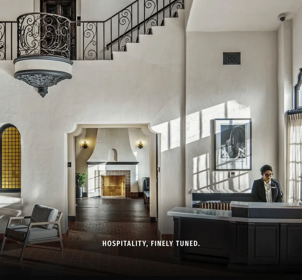
24seven Hotels is a Southern California–based hotel management company with a portfolio of lifestyle and select-service properties across the western and south-central U.S., built around a people-first culture and the brand idea “Hospitality, finely tuned.”
The Problem
Create a modern identity that reflects a music-inflected, people-led culture without drifting into generic “hotel blue.”
Build a flexible visual system that works for corporate storytelling and owner/developer pitches, then scales to property comms.
Deliver a clean handoff so a partner agency can extend the work into web and marketing.
Our Approach
Lead with personality, then systematize it.
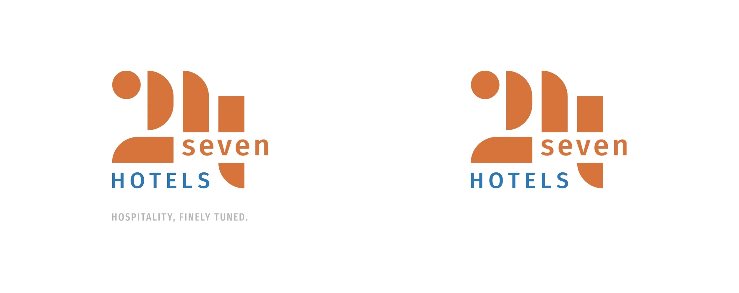
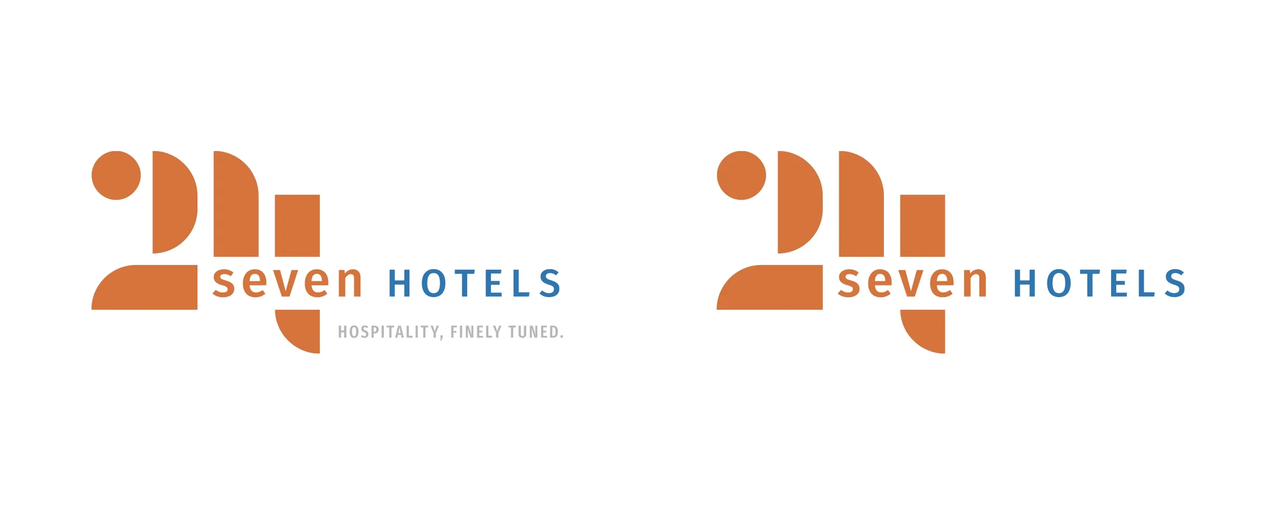
Brand cues. Identify signature elements (type rhythm, motion hints, graphic motifs) that nod to the “finely tuned” idea while staying professional for owners and brands.
Simple, ownable palette. A restrained corporate core plus supportive accents that feel contemporary across presentations, one-pagers, and decks.
Guidelines built for handoff. Clear usage rules, downloadable assets, and examples for corporate materials and property-level applications.
What We Made
Visual identity kit (logo lockups, color, typography, grid, iconography).
Brand guidelines with do/don’t examples and layout recipes for credentials decks and one-pagers.
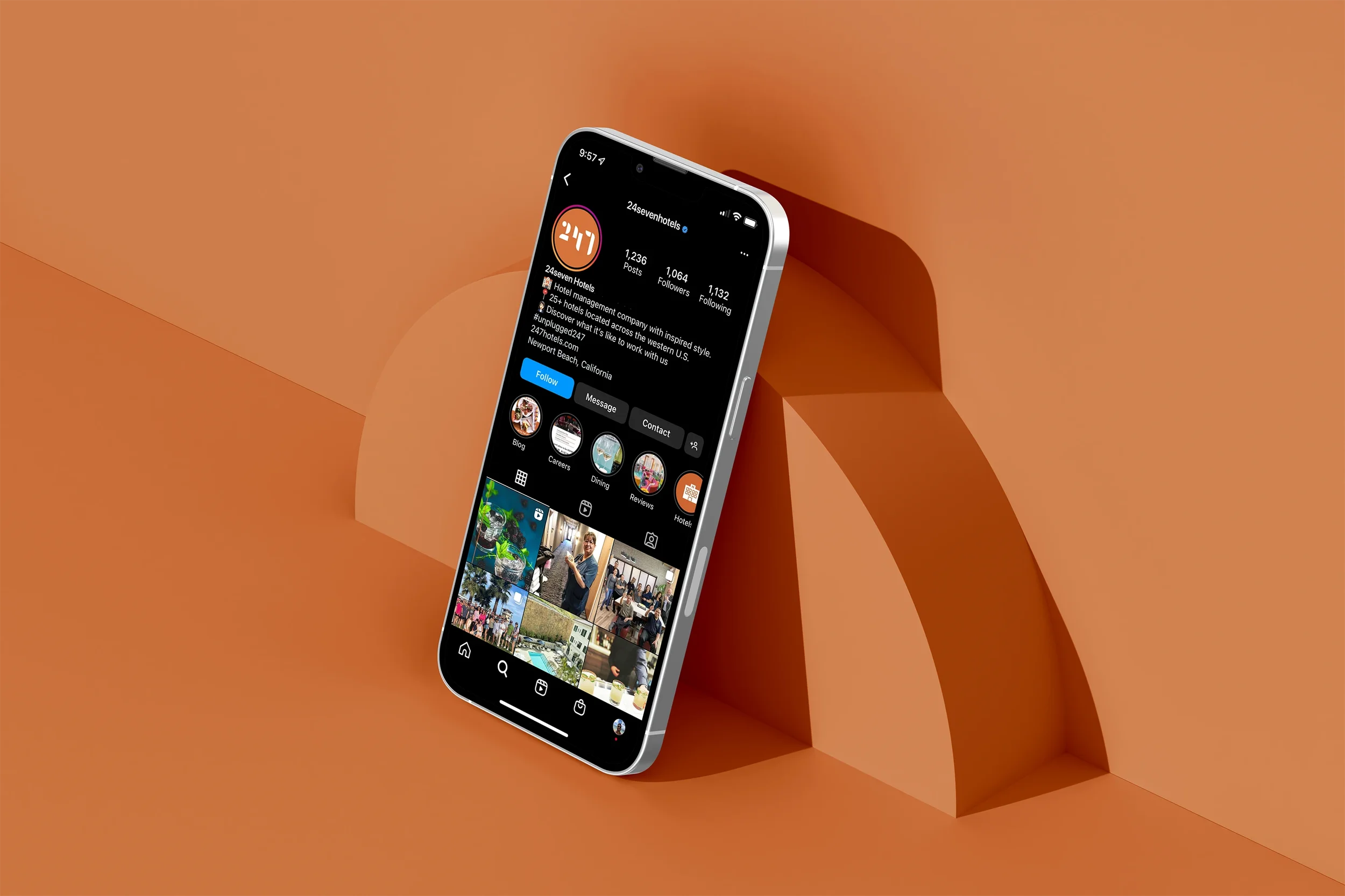
Starter asset library for social and presentation use.
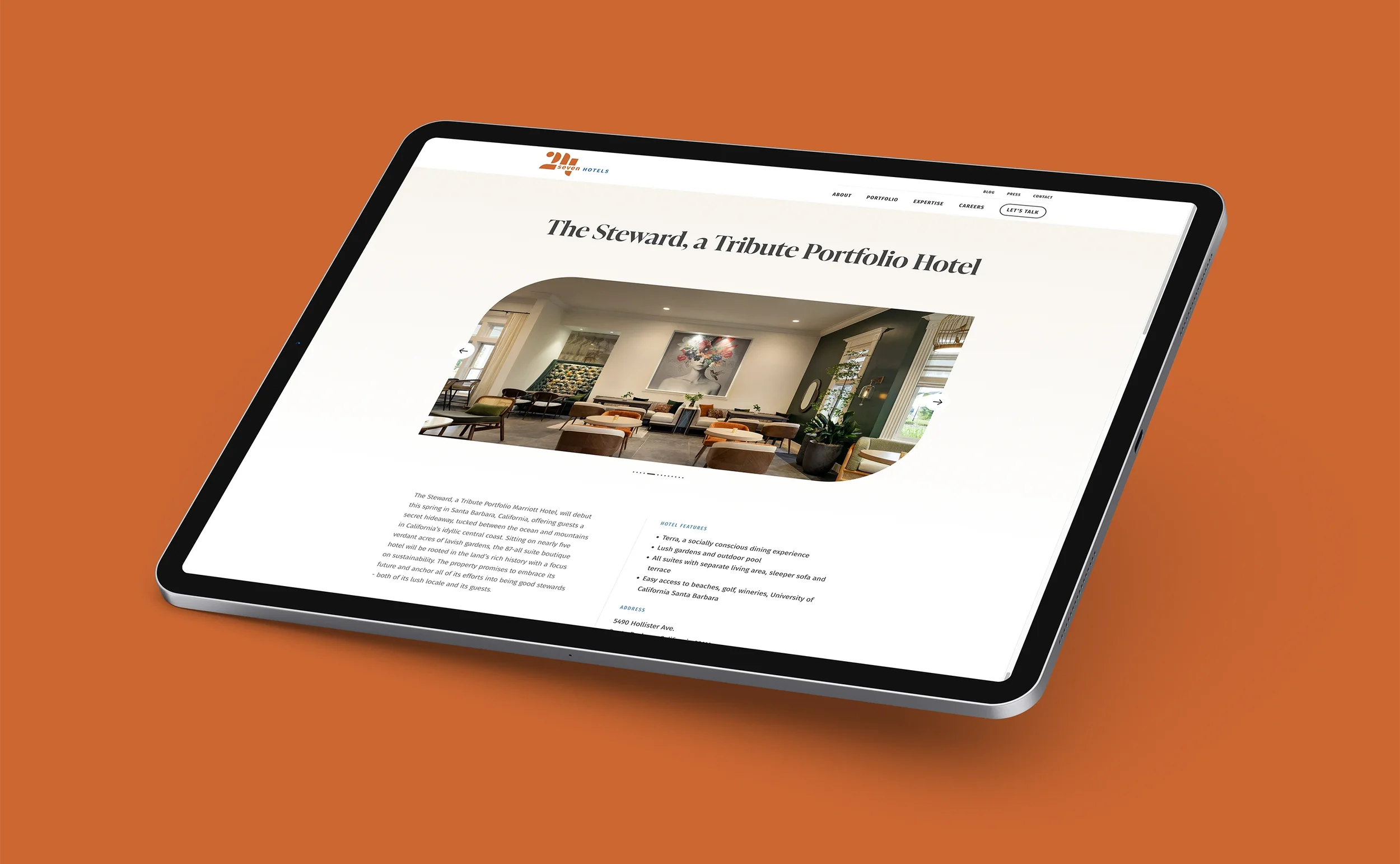
Handoff package enabling a seamless roll-out to web and video.
(Our visual identity directly informed the new website and promo materials executed with Wallop.)
Outcomes
A clearer, more distinctive identity that expresses 24seven’s people-first, performance mindset.
A system that scales from corporate to property storytelling without reinventing core elements each time.
A clean foundation for the website and ongoing marketing; Wallop extended the system into a new site experience.
Project Facts
Client: 24seven Hotels
Role: Visual identity, guidelines, and art direction
Partners: Wallop (website and marketing roll-out)
Platforms: Brand system applied to corporate communications; extended to web by partner
Related Work We Have Done
T.M. Crest Homes →
Brand platform and website built for repeatable launches.