T.M. Crest Homes
Brand platform and website built for repeatable launches
WHAT WE DID:
Brand Strategy • Tagline • Identity System • Design Guidelines • UX/UI Design • Website Design • Component Library • CMS Architecture • Analytics
SECTOR:
Real Estate
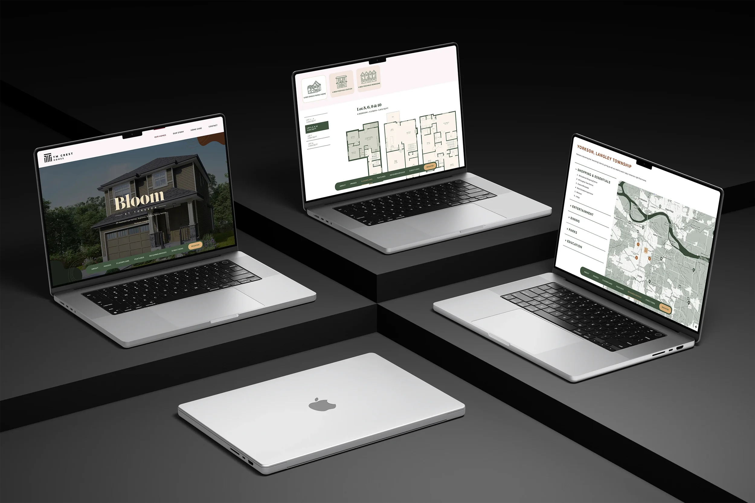
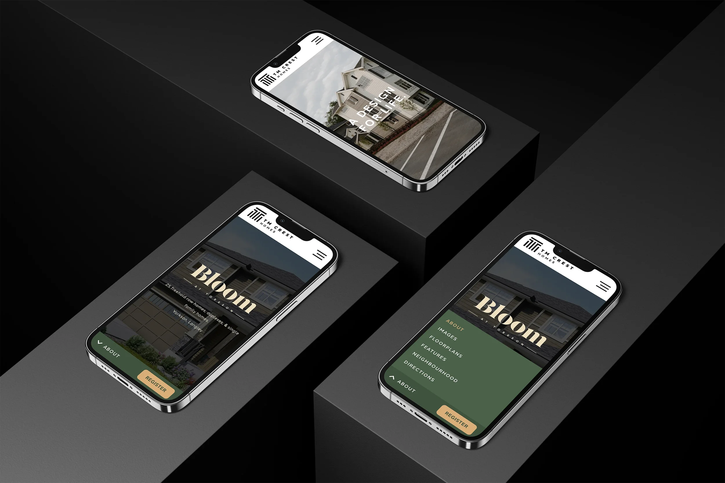
We repositioned T.M. Crest with a flexible identity and a single website that powers every community. The new tagline, “A Design For Life.”, anchors the brand. The site combines a corporate hub with community pages that each have their own sticky navigation, color theme, and type styling. The result is faster launches without building a new microsite each time.
The Problem
Launches were treated as one-offs. Timelines stretched and costs rose.
Brand expression shifted from project to project. Buyers had an uneven experience.
Separate microsites split traffic and diluted SEO.
Marketing and sales teams needed a simpler way to spin up new communities.
Our Approach
Build the foundation once, then let it flex.
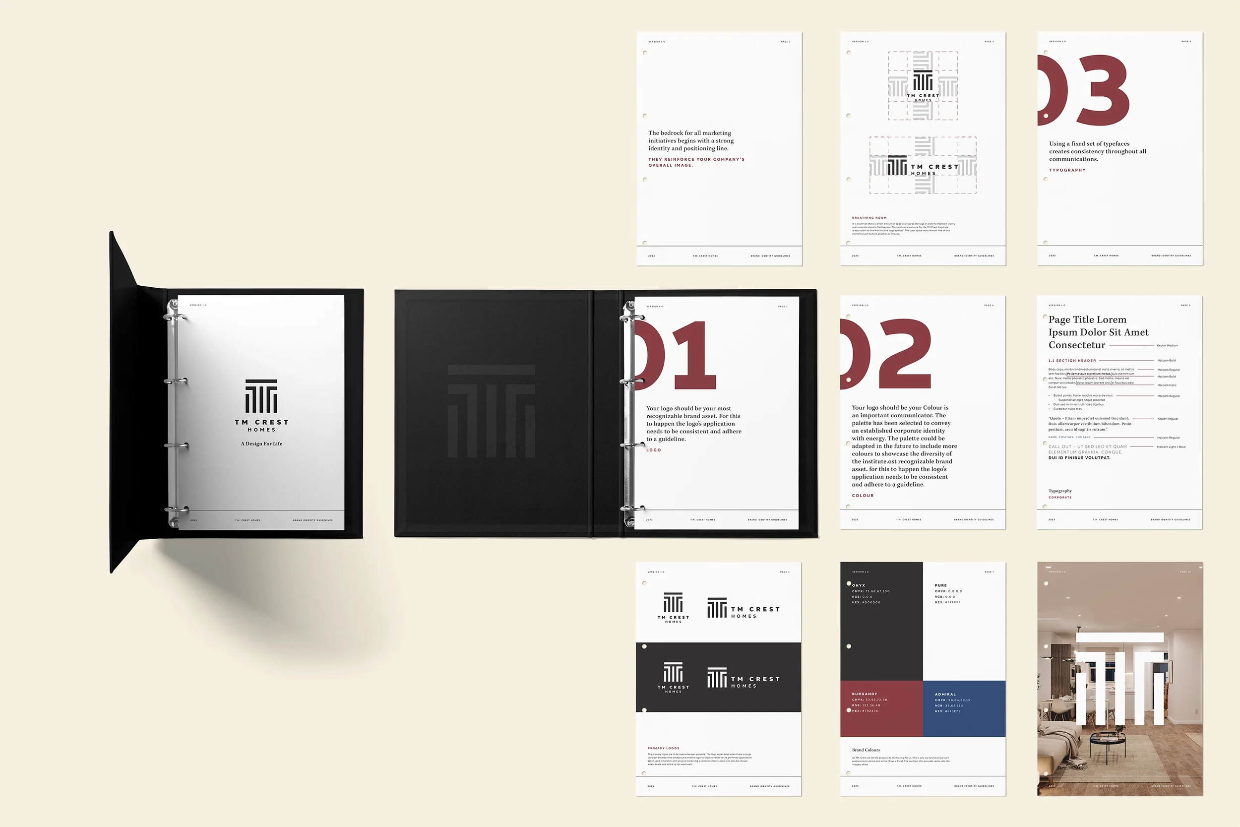
Brand system. Core typography, layout rhythm, and a neutral palette for the master brand. Community “accents” apply color and mood without breaking consistency.
Tagline and voice. “A Design For Life.” guides copy from ads to web. Plain language. Buyer benefits first.
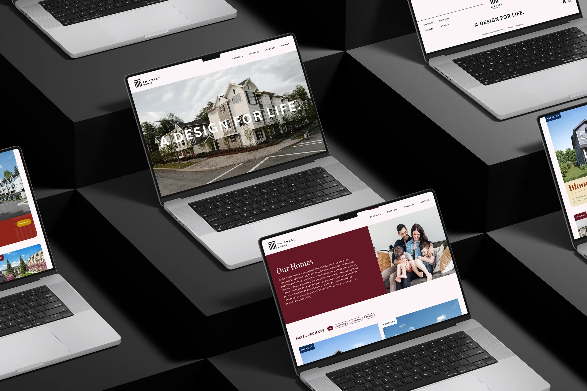
One site, many communities. A corporate hub for the company story. Community pages that feel independent, with their own sticky sub-nav for Overview, Homes, Plans, Gallery, Neighbourhood, and Register.
Reusable components. Cards, galleries, plan specs, FAQs, CTAs, and map blocks that can be themed per community.
Ops ready. Structured CMS fields, SEO basics, analytics, and CRM-friendly forms wired in.
What We Made
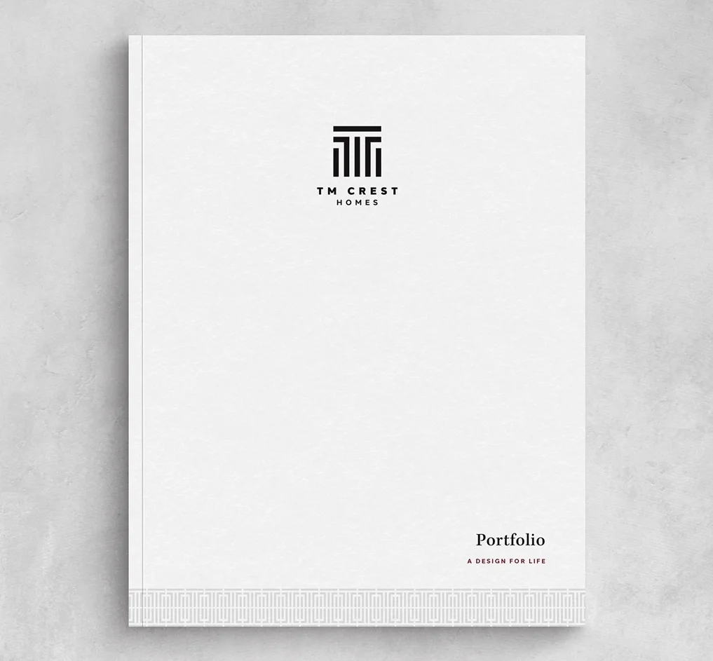
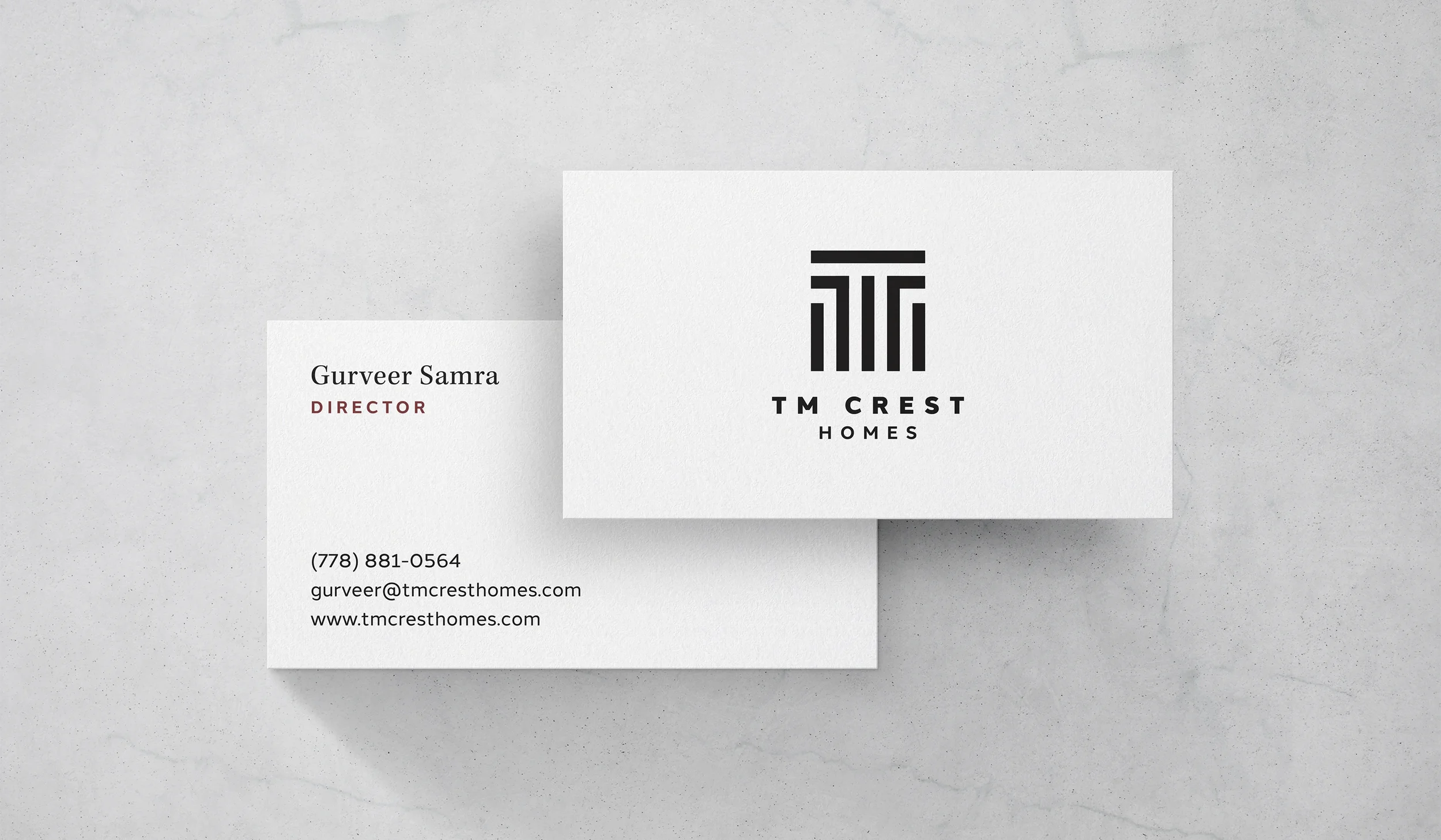
Identity system with color and type rules that scale across print, signage, and web.
Tagline and messaging kit that keeps headlines and microcopy on point.
Corporate pages for About, Quality, Process, Careers, and Contact.
Community page template with independent sticky navigation and per-community theming.
Component library for plans, finishes, galleries, timelines, and registration.
CMS architecture that lets the team add a new community in hours, not weeks.
Measurement setup for registrations, file downloads, and key click paths.
Outcomes
No more one-off microsites. Every launch lives on one platform.
Faster time to market. New communities stand up quickly with consistent quality.
Cleaner buyer journey. Clear sections. Fewer clicks to register or request floorplans.
Stronger SEO. Authority builds on a single domain while each project keeps its own voice.
Project Facts
Client: T.M. Crest Homes
Role: Brand platform, identity system, tagline, UX and website design, component library, CMS architecture
Platforms: Corporate + community website
Related Work We Have Done
Bloom at Yorkson →
Family-forward identity and a registration-first launch.

Westwood at Tynehead Park →
Park-side brand and microsite that make registering easy.
Marq Rowhomes →
Name, identity, and a registration-first WordPress microsite.