Gratitude Seafood
Coastal brand and packaging for an Indigenous-owned enterprise
WHAT WE DID:
Brand Strategy • Visual Identity • Packaging System • Copywriting • Illustration • Art Direction • Sales Collateral • Web Design
SECTOR:
CPG (Food & Beverage)
Gratitude Seafood is part of the Nuu-chah-nulth Seafoods family. Nuu-chah-nulth Seafood LP is a First Nation owned seafood enterprise on Vancouver Island’s West Coast. The product line is positioned as a premium, “Authentic Aboriginal” offer grounded in Nuu-chah-nulth stewardship and community values.
The Problem
Create a premium shelf presence that is true to Nuu-chah-nulth ownership and story, not generic “west coast” packaging.
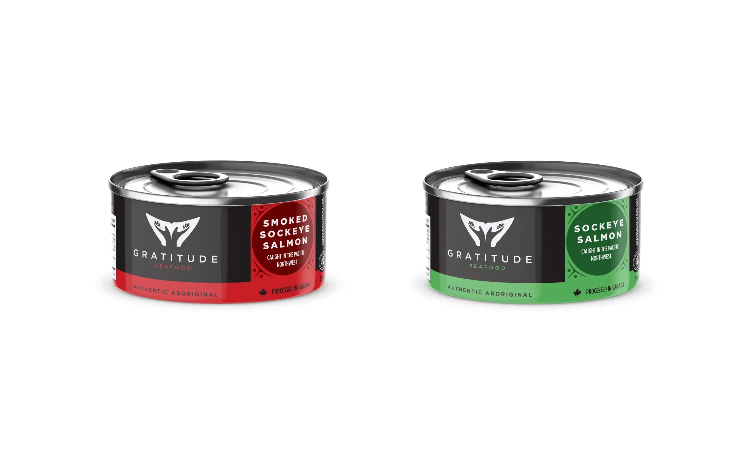
Make species, cut, and cooking method obvious at a glance.
Build a system that can grow across SKUs and retail requirements while keeping the Indigenous-owned story front and center.
Give sales a tight narrative and ready tools for buyer meetings.
Cultural Grounding
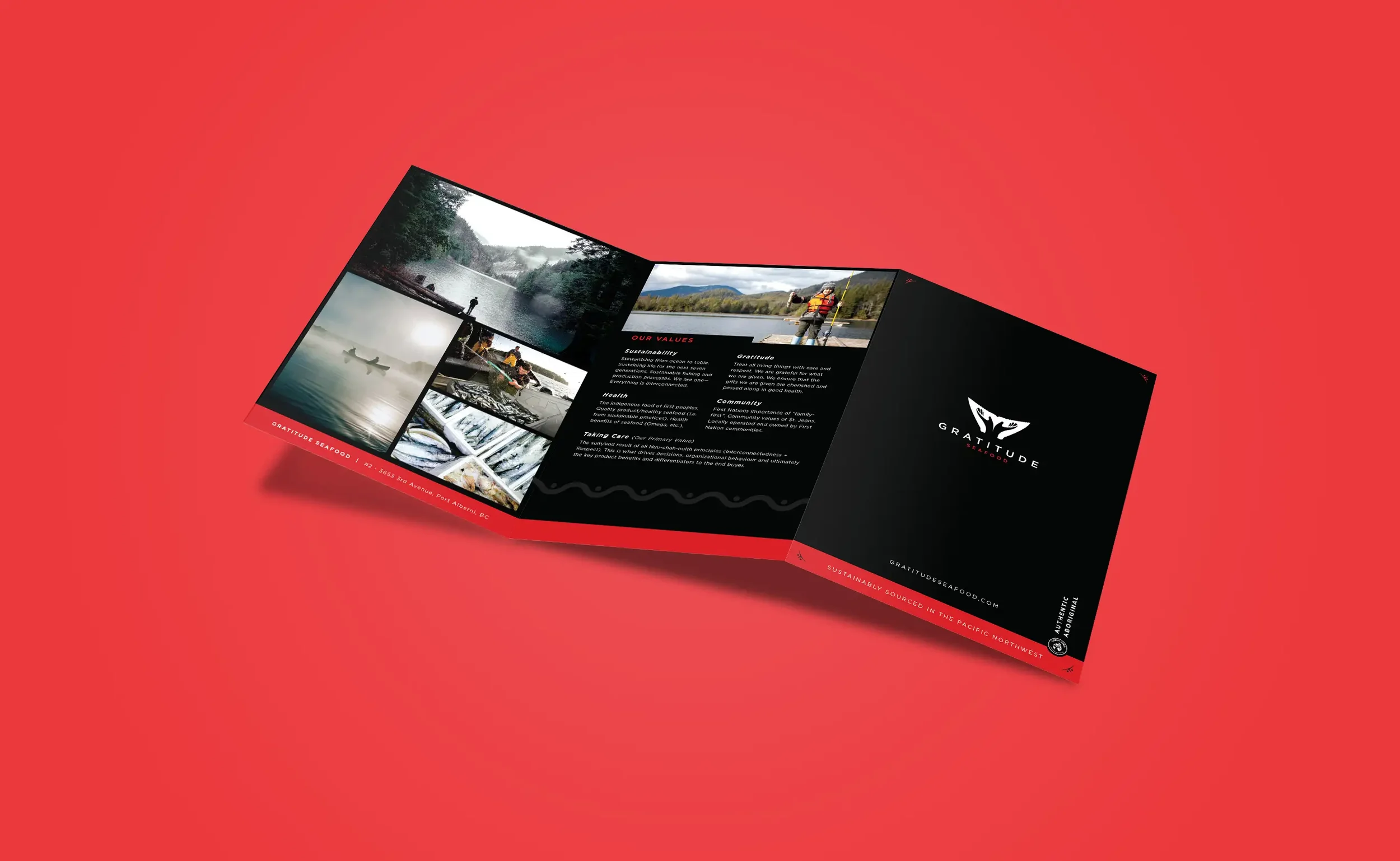
We anchored the brand in Nuu-chah-nulth ownership and values, reflected in the enterprise’s plan to develop an authentic Aboriginal branded seafood line. Language, color, and iconography avoid pan-Indigenous clichés and focus on respect, care, and traceable sourcing.
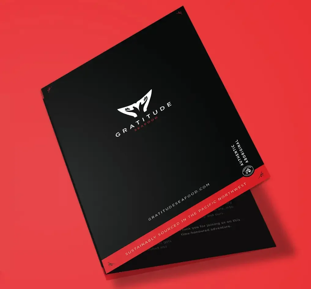
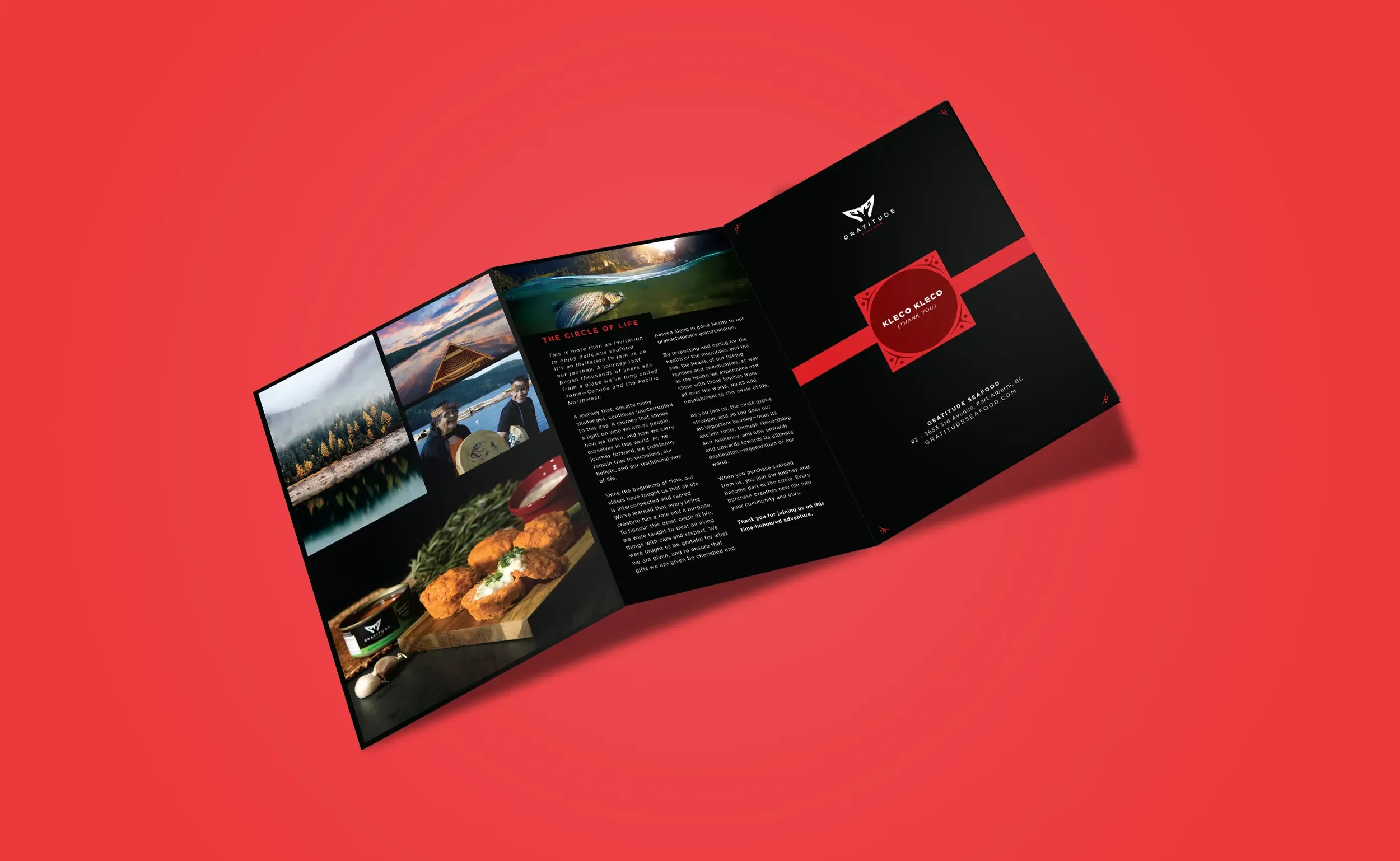
Logo Story
Our mark is inspired by the welcoming monument in Port Alberni, where the brand is based. The open, out-turned hands speak to gratitude and community. The whale tail nods to the ocean we depend on and ties the identity to seafood in a simple, memorable way.
Our Approach
Lead with clarity. Let the story and the product share the front panel.
Positioning and voice. A premium Indigenous-owned brand that speaks in plain language about freshness, origin, and care.
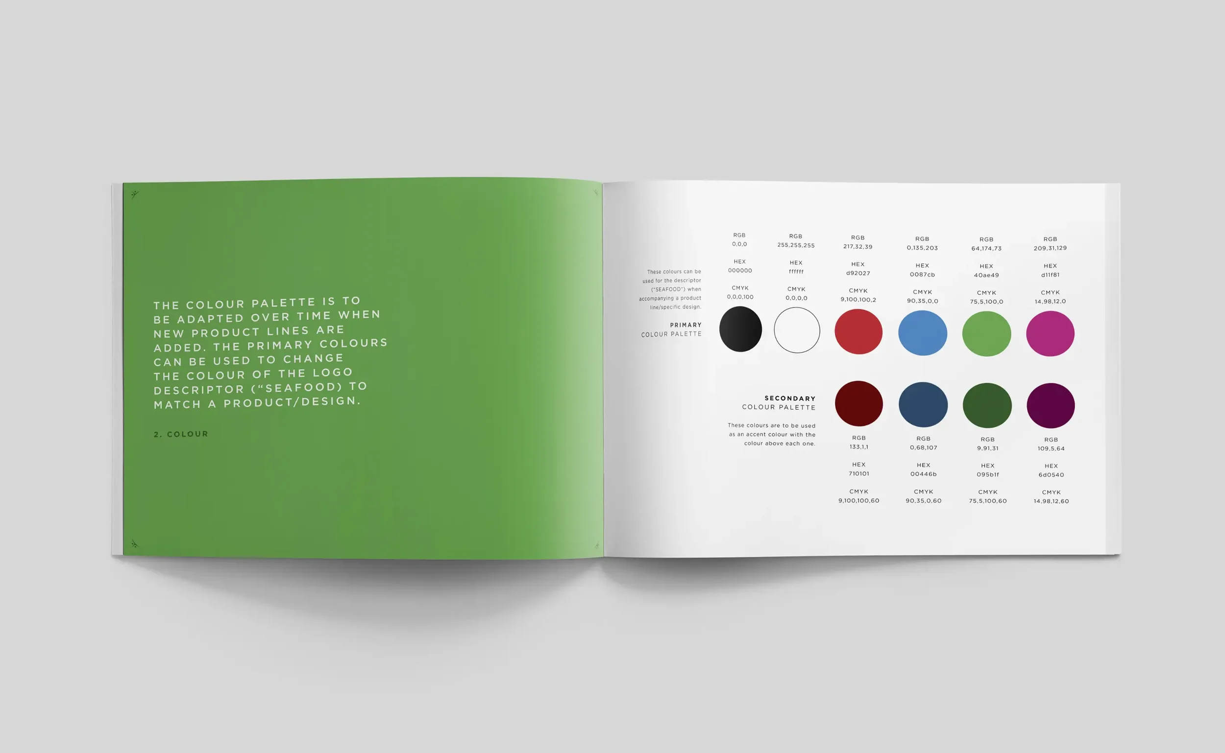
Identity and system. Maritime wordmark, Indigenous art themed colour palette, and a type scale that keeps product names large and legible.
Pattern and icons. Wave and net-inspired patterns with a small icon set for species, cut, and prep cues.
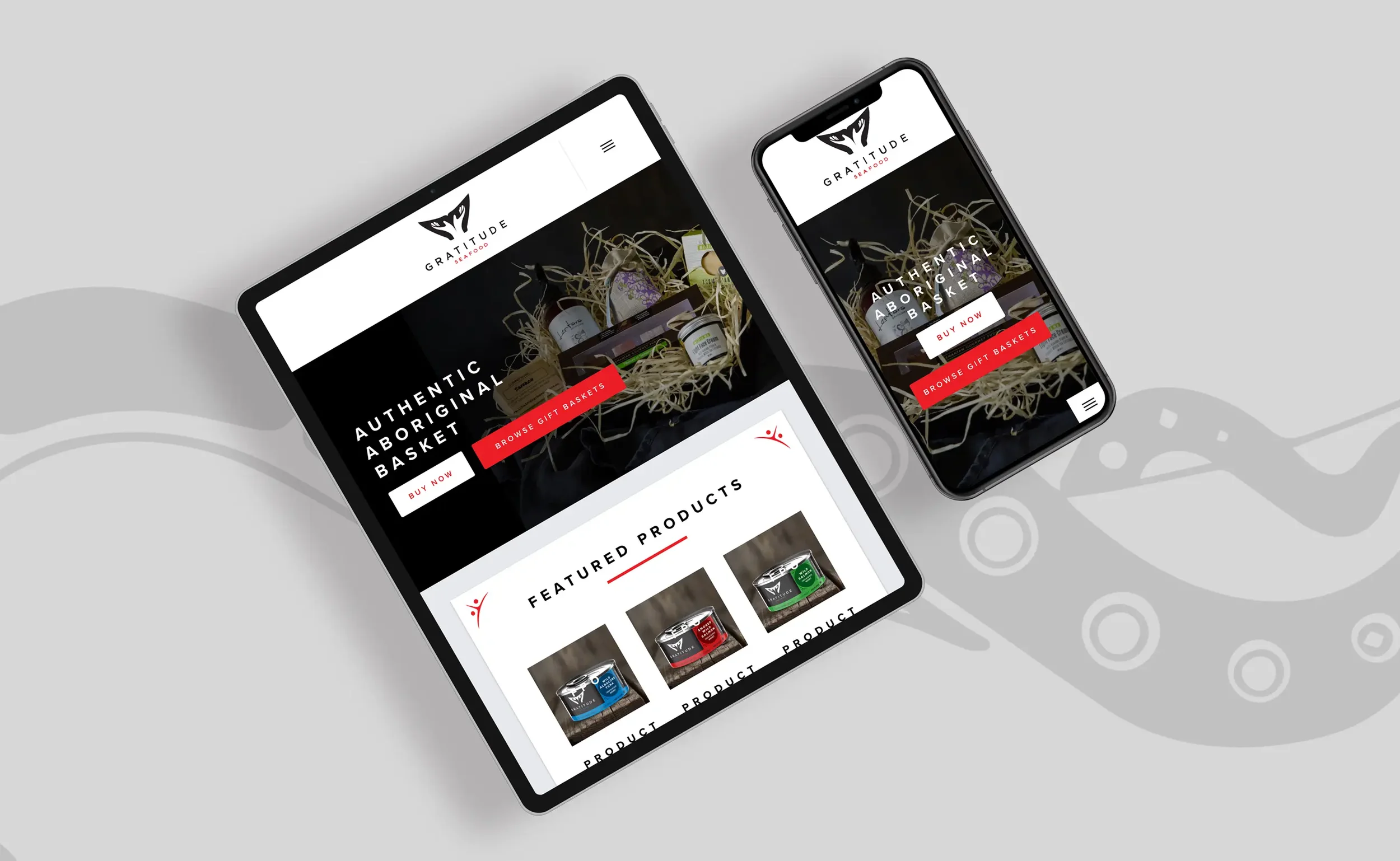
Shelf-first hierarchy. Big species name, bold cut, supporting badges for source and method, plus a QR for traceability and recipes.
Photography direction. Natural light with simple props. Crops leave clean space for labels and origin statements.
What We Made
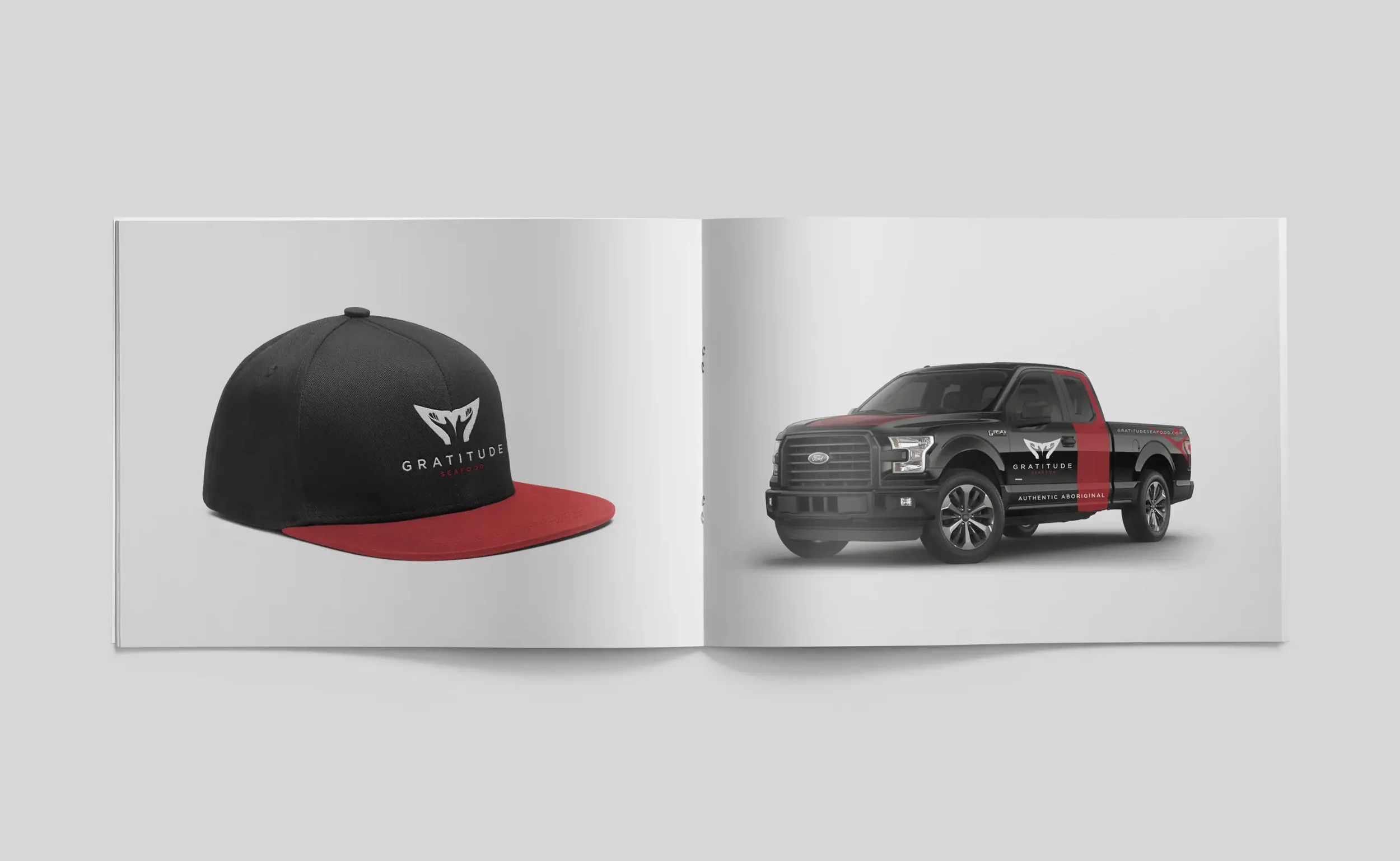
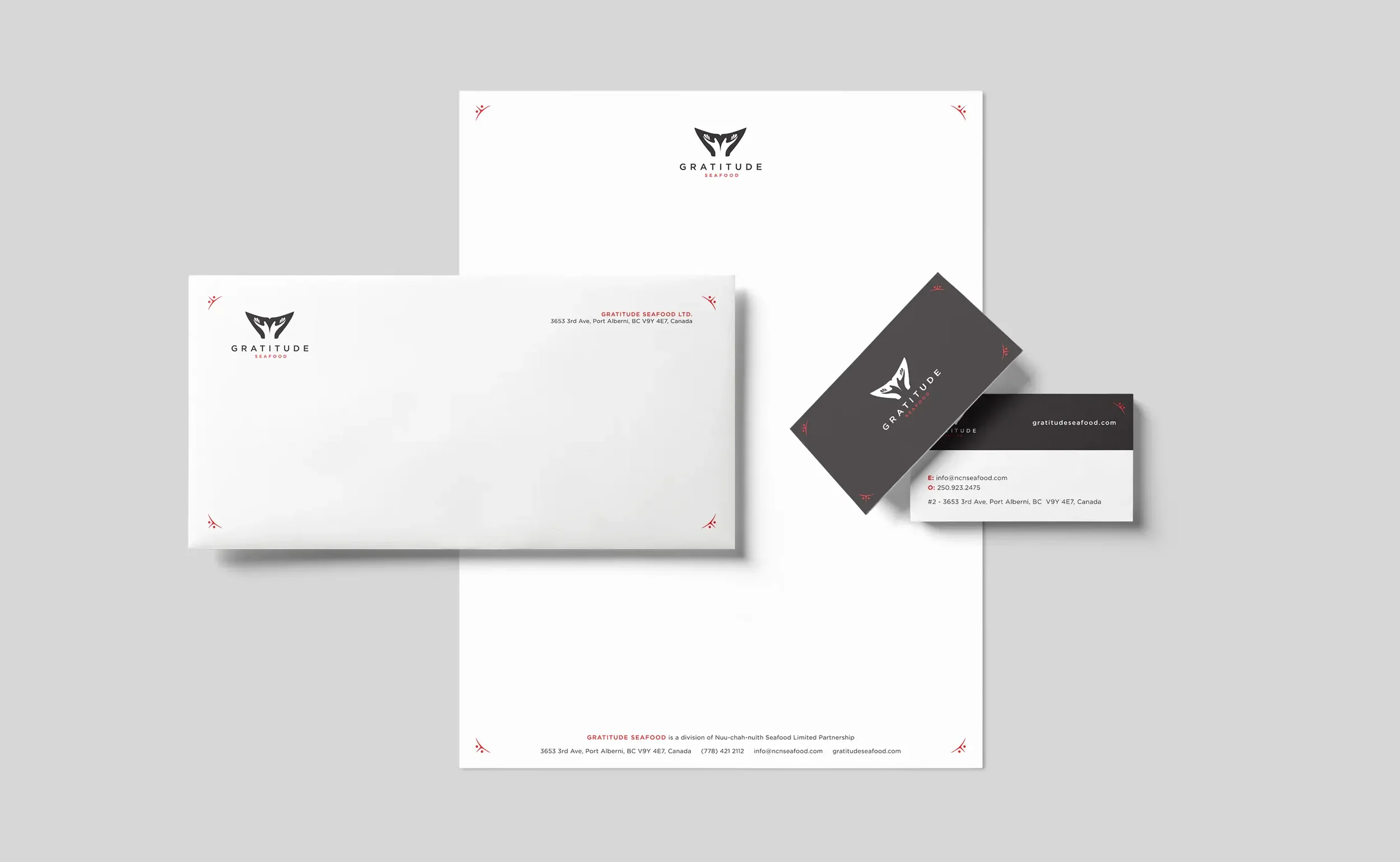
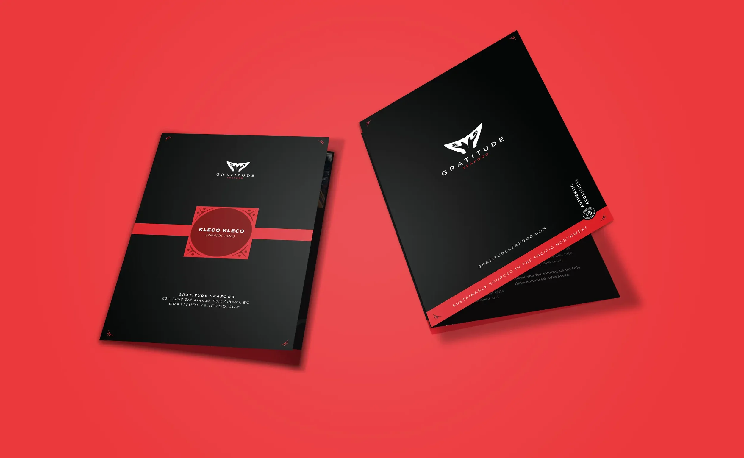
Logo & marks: Primary lockup with open-hand symbol and whale-tail motif; one-color and knock-out versions documented for print and digital.
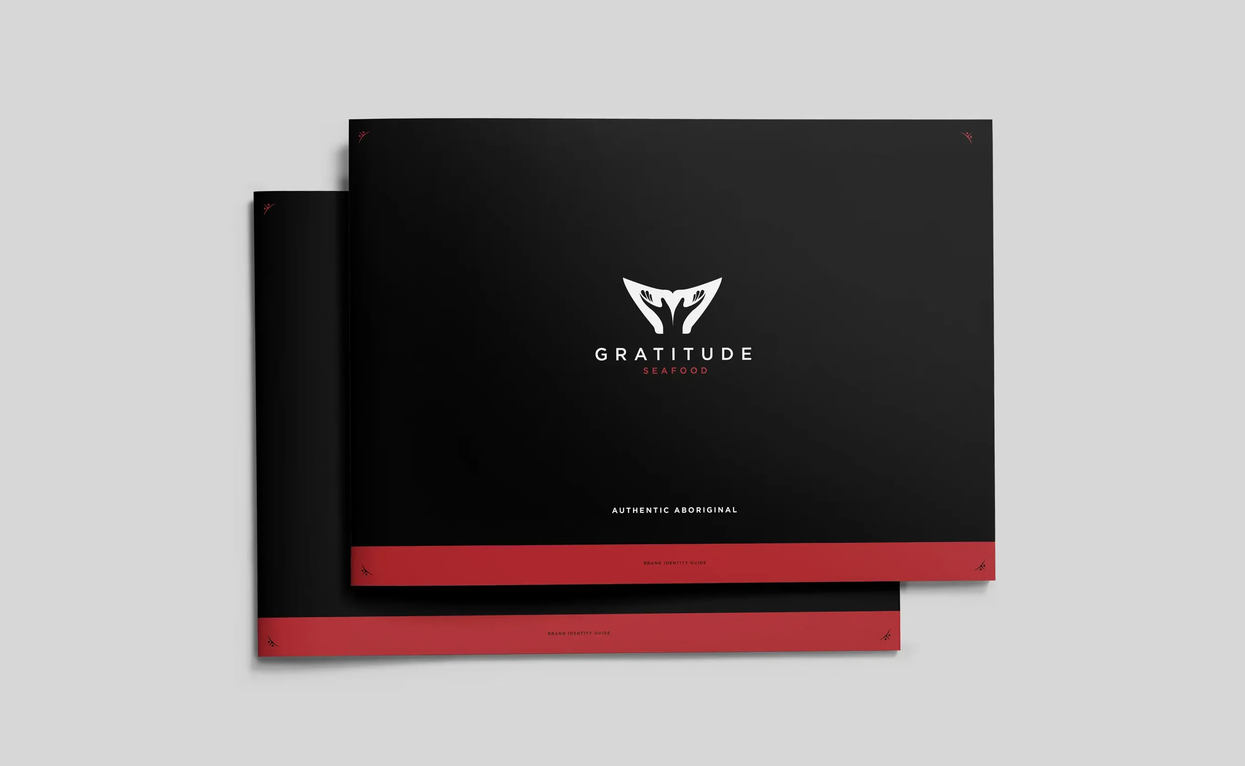
Identity kit with logo lockups, palette, typography, and usage rules.
Packaging system for pouches, trays, and cartons with printer-ready dielines and compliance zones.
Origin and ownership panel that explains Nuu-chah-nulth Seafood LP and the Indigenous-owned status in a short paragraph.
Icon and pattern library that travels to shippers, sleeves, and POS.
Sales collateral for retail buyers: one-pagers, spec sheets, and a compact brand deck.
Web landing with the brand story, lineup, and where-to-buy.
Outcomes
Stronger shelf read and a distinct block that improves recognition.
A clear Indigenous-owned story presented consistently on pack and online, aligned with the enterprise’s “authentic Aboriginal” product direction.
Faster buyer conversations with ready assets and a simple proof narrative.
A scalable line with documented print specs that control costs and quality.
Project Facts
Client: Nuu-chah-nulth Seafood LP/Gratitude Seafood
Role: Brand strategy, identity, packaging, copy, illustration, photography direction, web landing, sales tools
Platforms: CPG (Food & Beverage Rollout)
Related Work We Have Done
American Beauty →
Exhibition identity and an award-winning art book.

Oxford & Kin →
A clinically rooted eyewear brand built from the ground up.