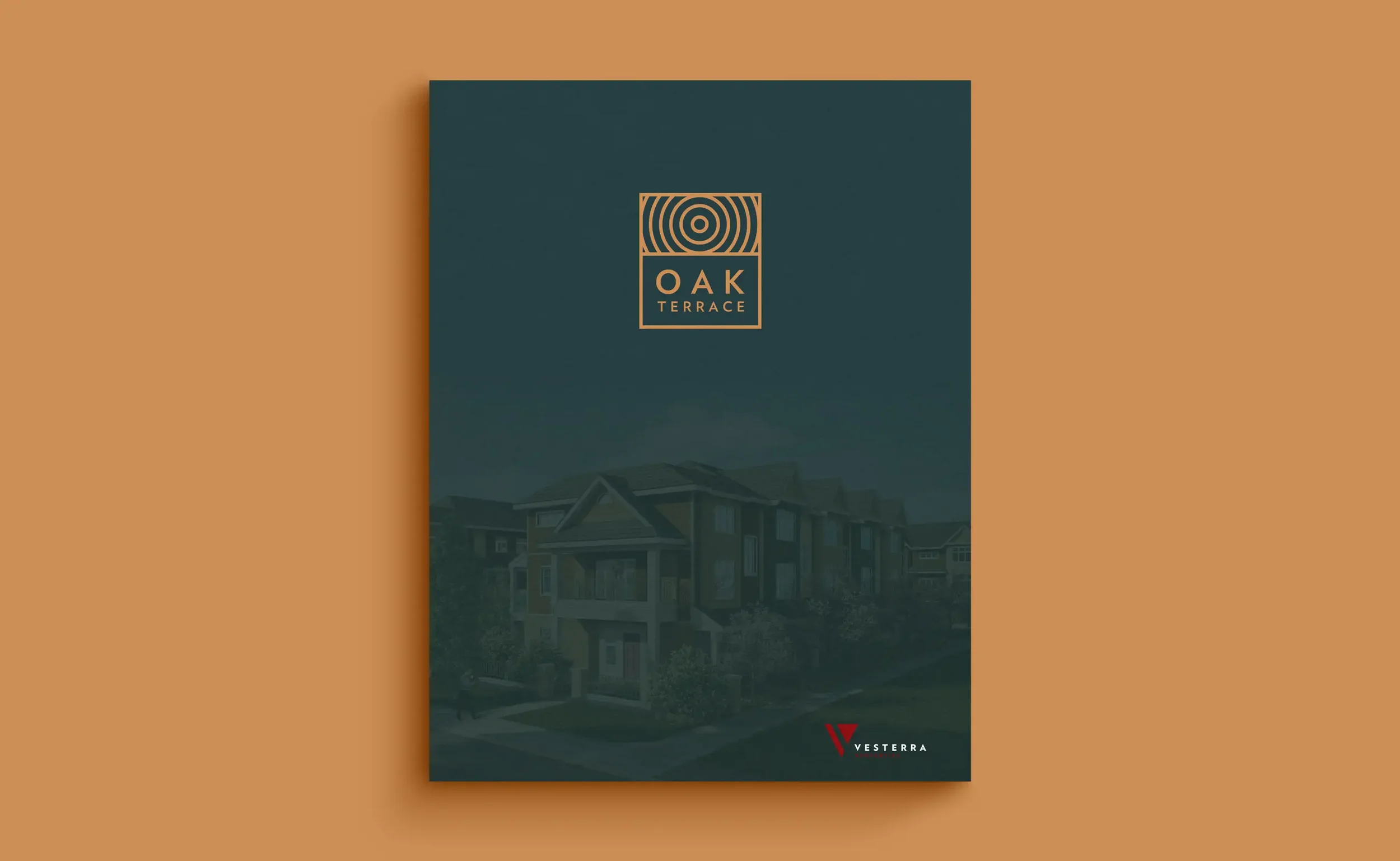
Oak Terrace
Calm identity and a registration-first launch
WHAT WE DID:
Brand Strategy • Visual Identity • Messaging • UX/UI Design • WordPress Development • Rendering Art Direction • Sales Collateral • Signage
SECTOR:
Real Estate
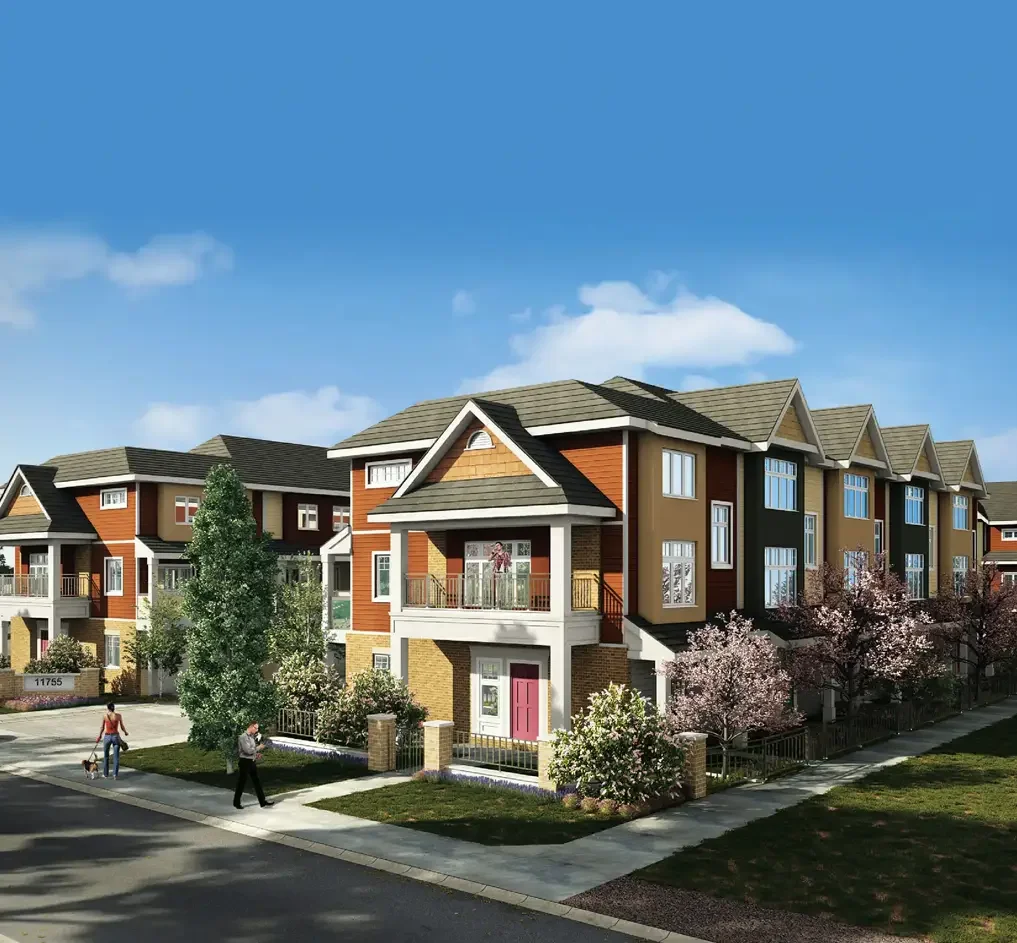
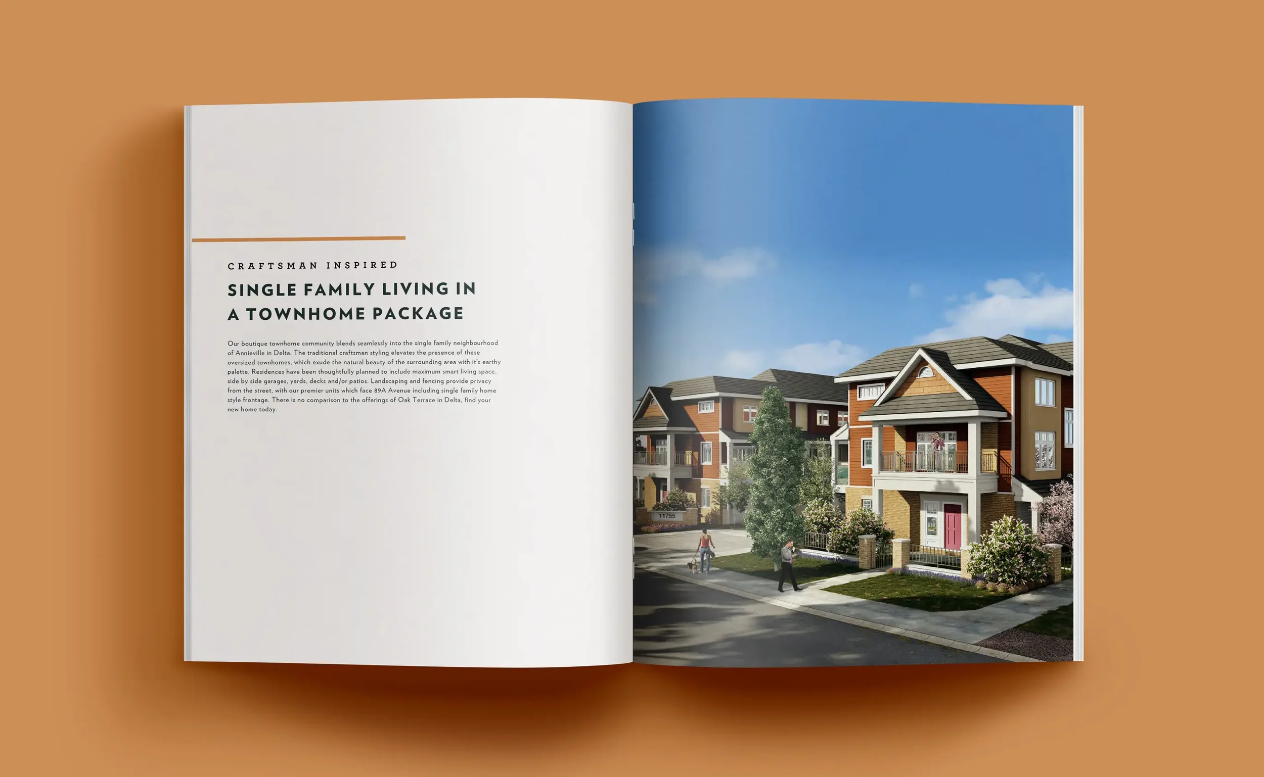
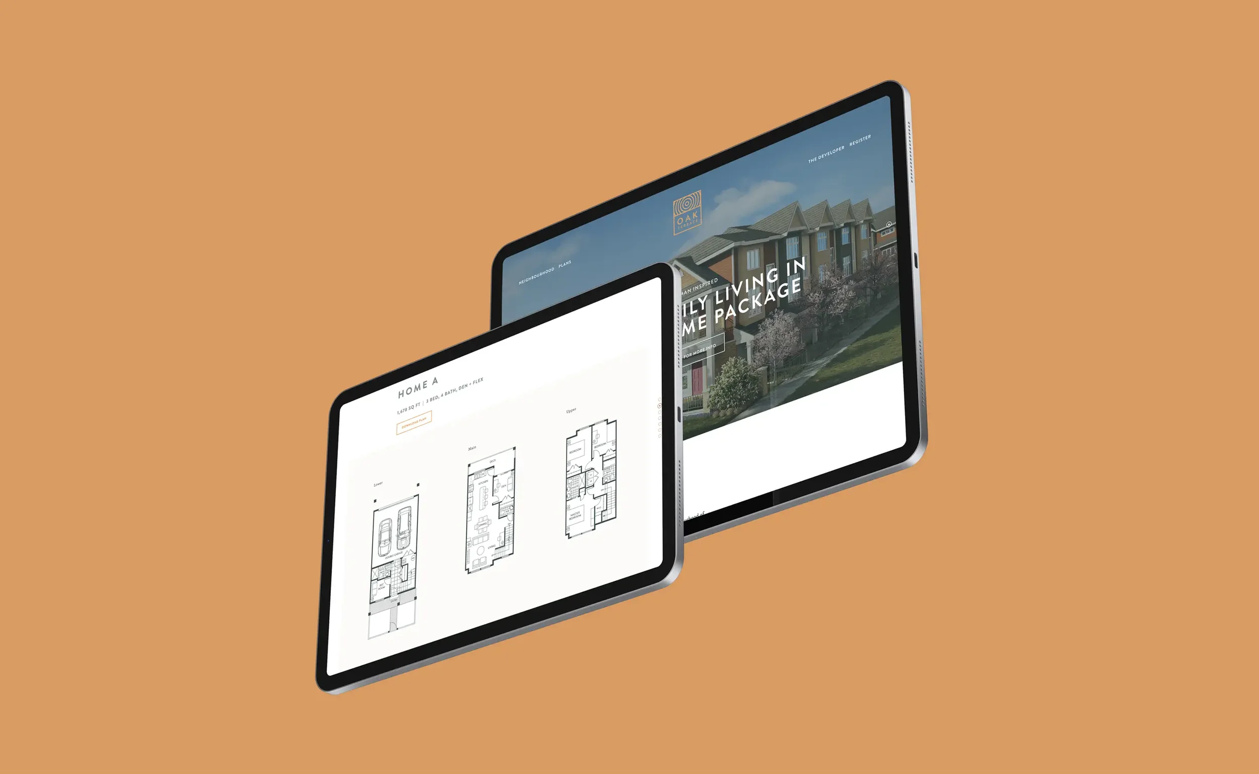
A modern community brand and a focused launch site that make it easy for buyers to understand the homes, see the location, and register interest.
The Problem
Create a distinct community identity that feels natural, modern, and trustworthy.
Keep the website tight and purposeful with a straight path to plans and registration.
Align renderings, signage, and ads so everything tells the same story.
Our Approach
Brand first, then a clean path to action.
Positioning and voice. Plain, benefit-led messaging about space, light, and everyday convenience.
Identity system. A calm wordmark, grounded color, and readable type that carry from web to signage.
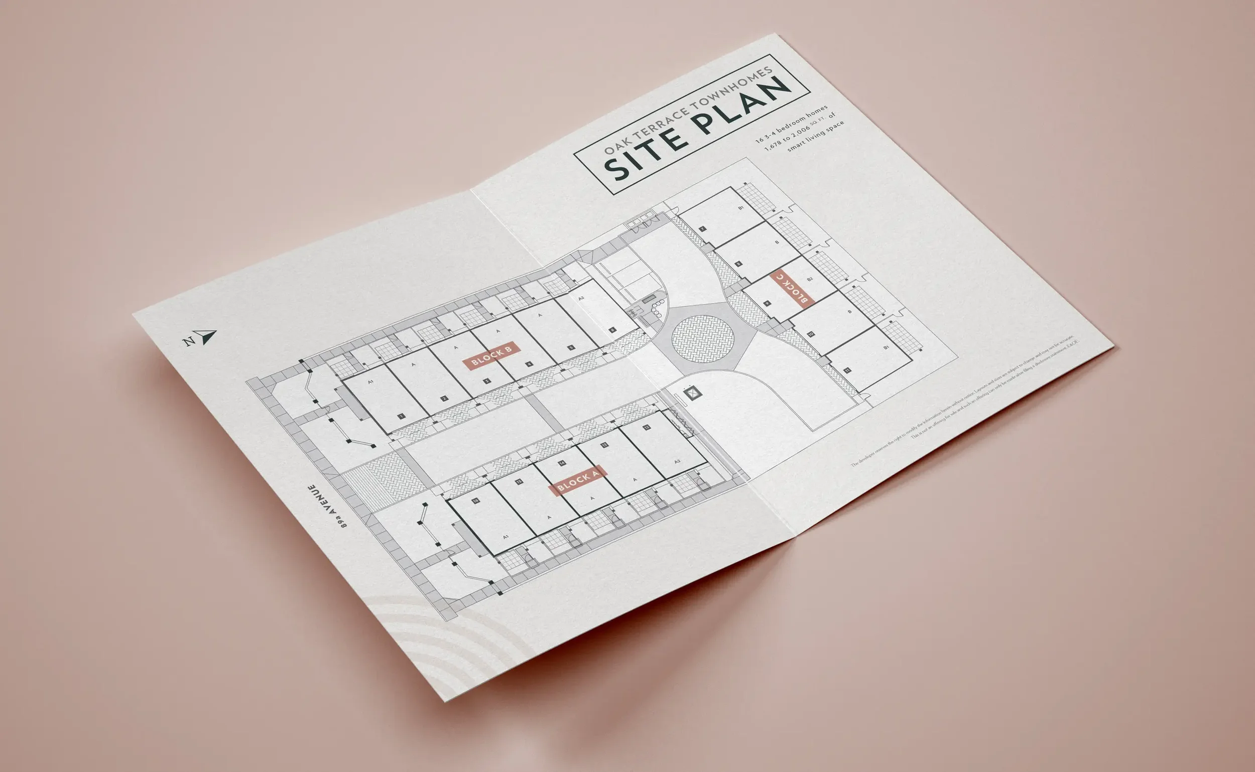
Registration-first UX. Compact sitemap with quick routes to Plans, Features, Gallery, Neighbourhood, and Register.
Rendering direction. Shot list with hero and secondary angles, time-of-day and grading notes, and crops for web, print, and social.
What We Made
Identity kit with logo lockups, palette, type scale, and usage rules.
Messaging kit for headlines, benefits, plan summaries, and FAQs.
Launch website with plan/spec modules, gallery, map, and short forms for Register and “Get floorplans.”
Sales collateral templates for plan sheets, feature callouts, and posters.
Render brief covering camera height and lens, golden-hour grade, people for scale, and brand placements.
Outcomes
A recognizable community brand that builds trust from first impression to sales centre.
A faster buyer journey from ad to plans to registration.
Tighter consistency across web, ads, and signage, which improves recall and reduces production rework.
Project Facts
Client: Vesterra Properties
Role: Brand strategy, identity, messaging, UX/UI, website, sales collateral, rendering direction
Platforms: Real estate branding + community microsite
Related Work We Have Done
Bloom at Yorkson →
Family-forward identity and a registration-first launch.

Westwood at Tynehead Park →
Park-side brand and microsite that make registering easy.
Marq Rowhomes →
Name, identity, and a registration-first WordPress microsite.