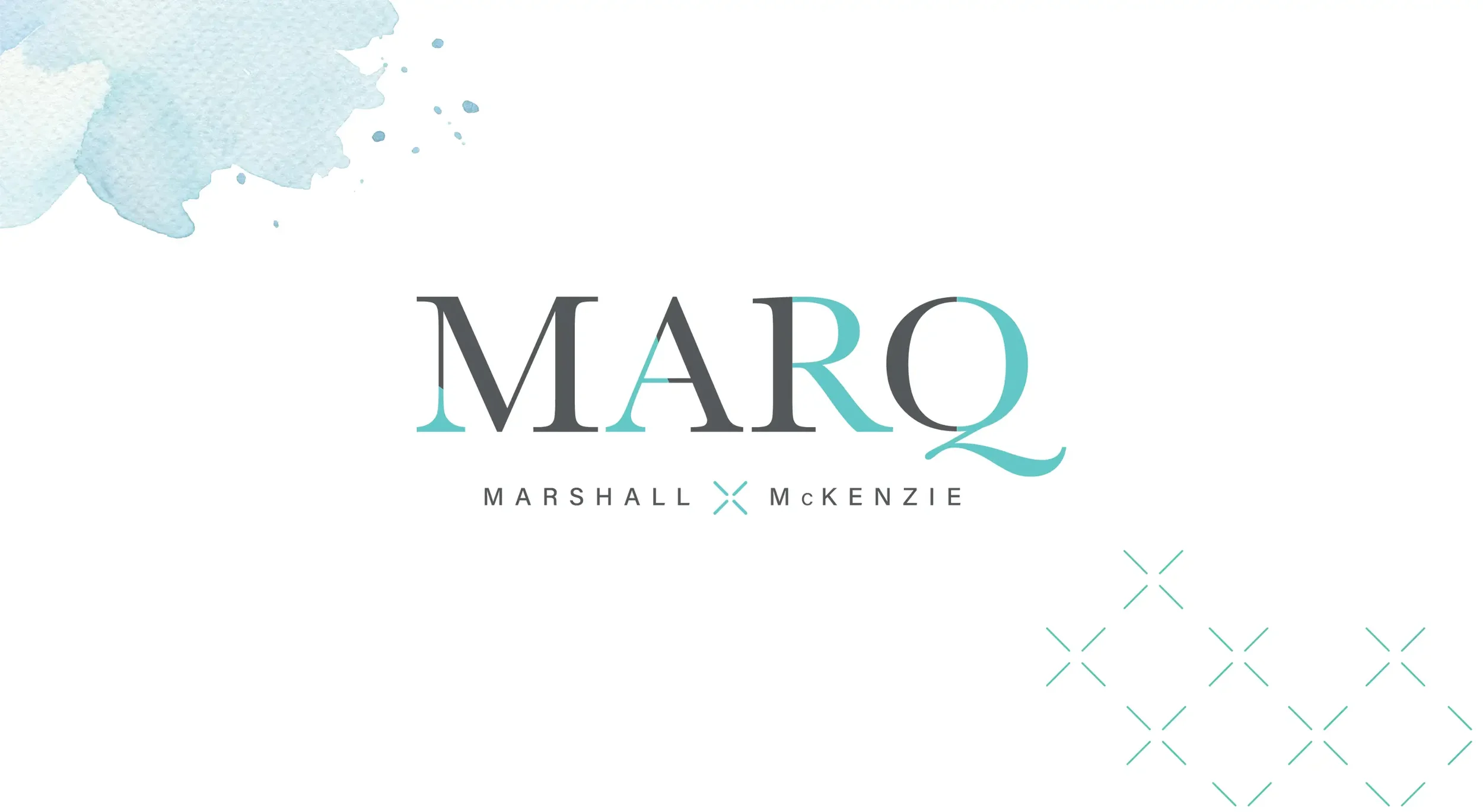
Marq Rowhomes
Name, identity, and a registration-first WordPress microsite
WHAT WE DID:
Brand Strategy • Naming • Identity • Messaging • UX/UI Design • WordPress Development • Rendering Art Direction • Sales Collateral • Signage
SECTOR:
Real Estate
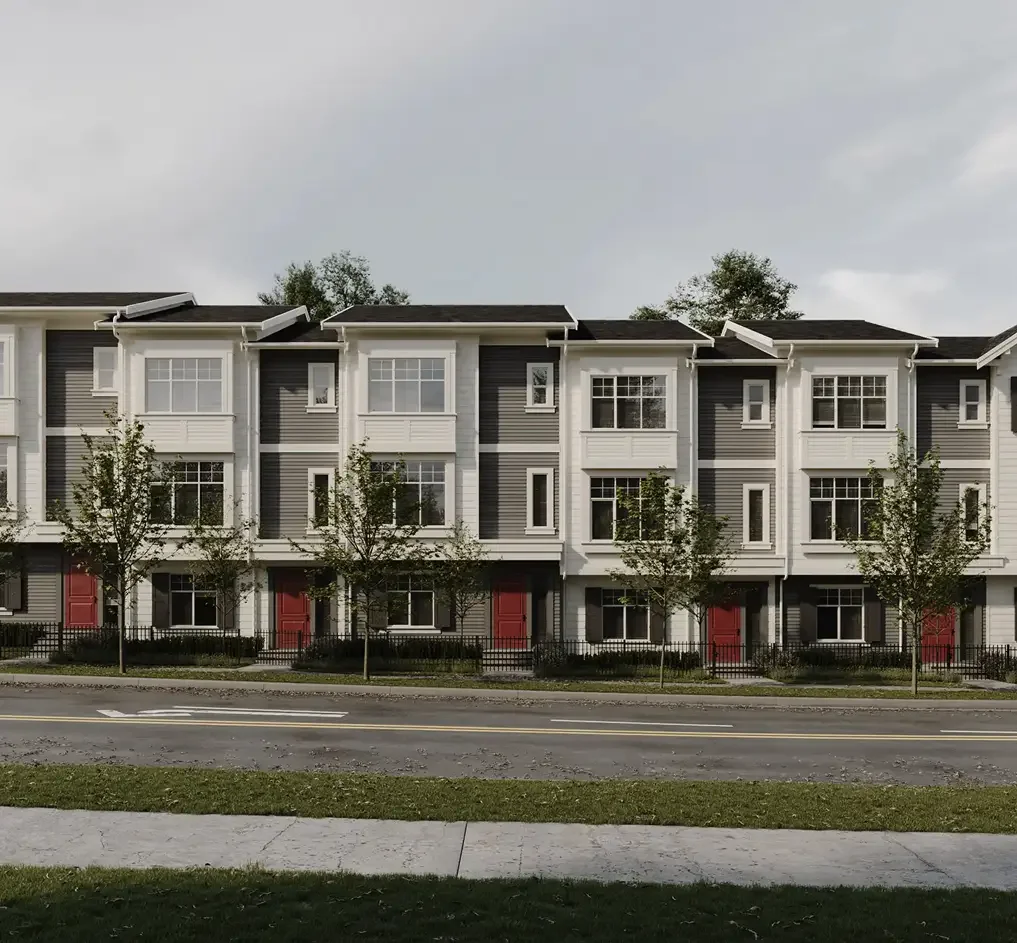
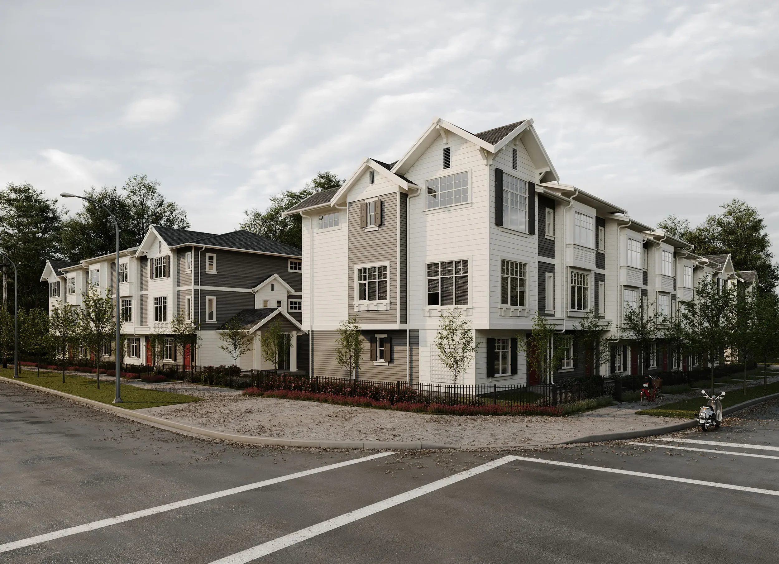
Marq Rowhomes is a T.M. Crest community in central Abbotsford. The brief: create a memorable name and look, then launch with a fast, focused custom WordPress microsite that turns interest into registrations.
The Problem
Give the community a distinct name and identity in a crowded market.
Ship a lean, high-clarity microsite with a straight path to register and get floorplans.
Keep sales tools simple and consistent across ads, signage, and web.
Our Approach
Brand first, then a clean build that moves buyers forward.
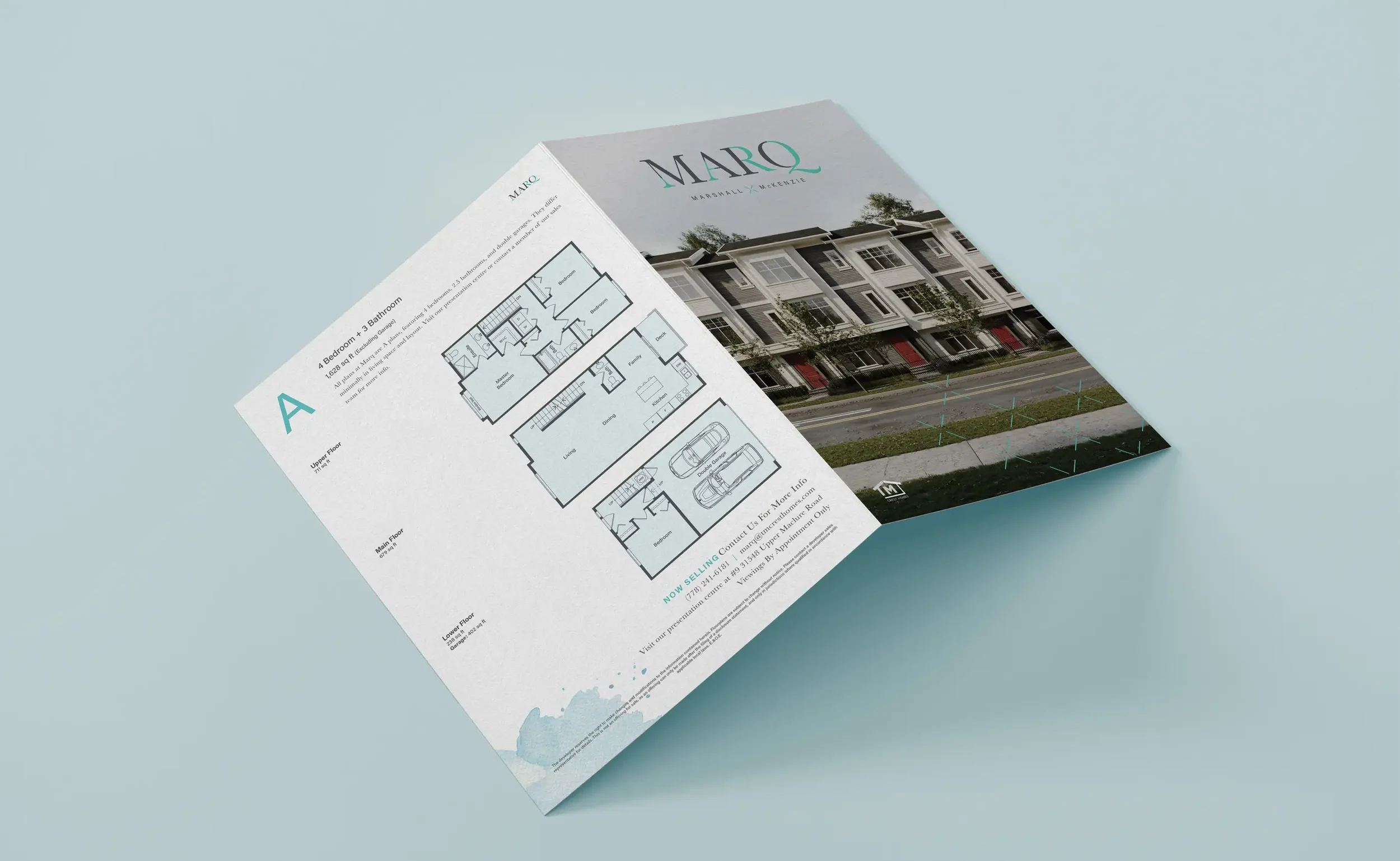
Naming and story. “Marq” signals confident, modern living. Messaging stays direct and benefits-led.
Identity system. Wordmark, color, and typography that read well on signs, plan sheets, and screens.
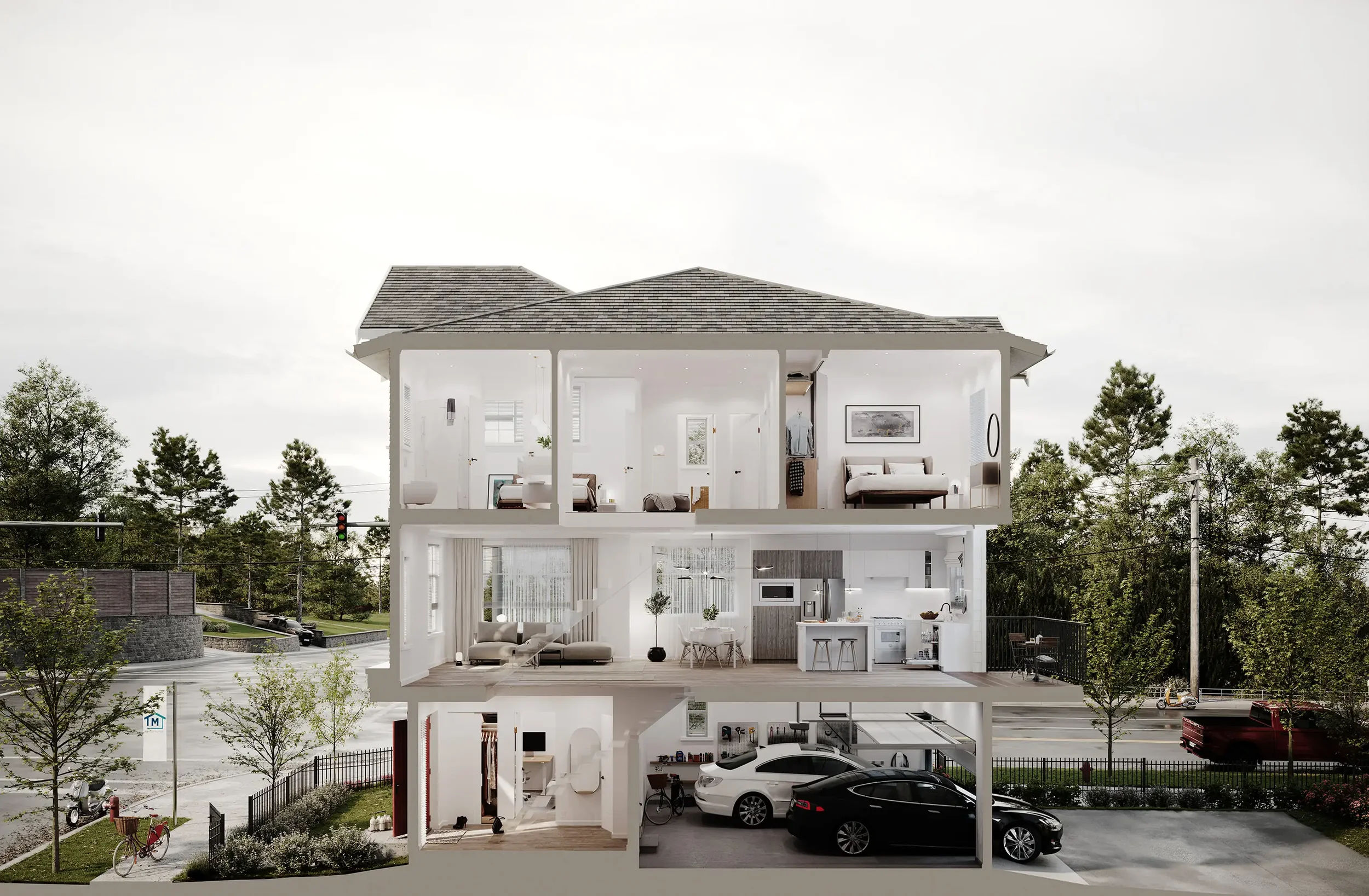
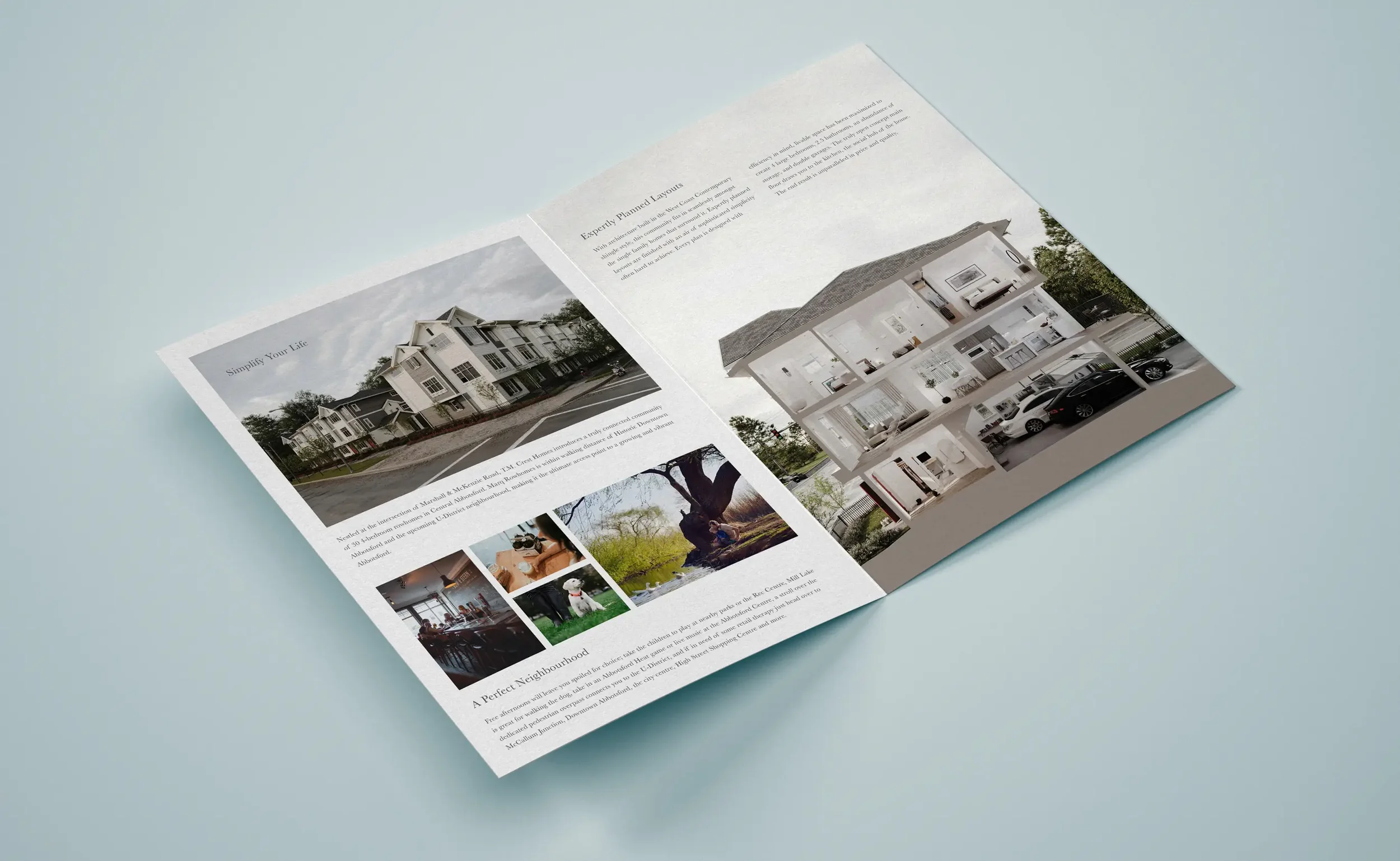
Rendering art direction. We defined a shot plan with hero angles, secondary views, and interior moments. Prioritized street-level perspectives with human scale, clear wayfinding, and strong curb appeal. Set time-of-day, lighting, and weather for warmth and realism. Spec’d lens lengths, height, and focal points so ads, signage, and the site all share the same look.
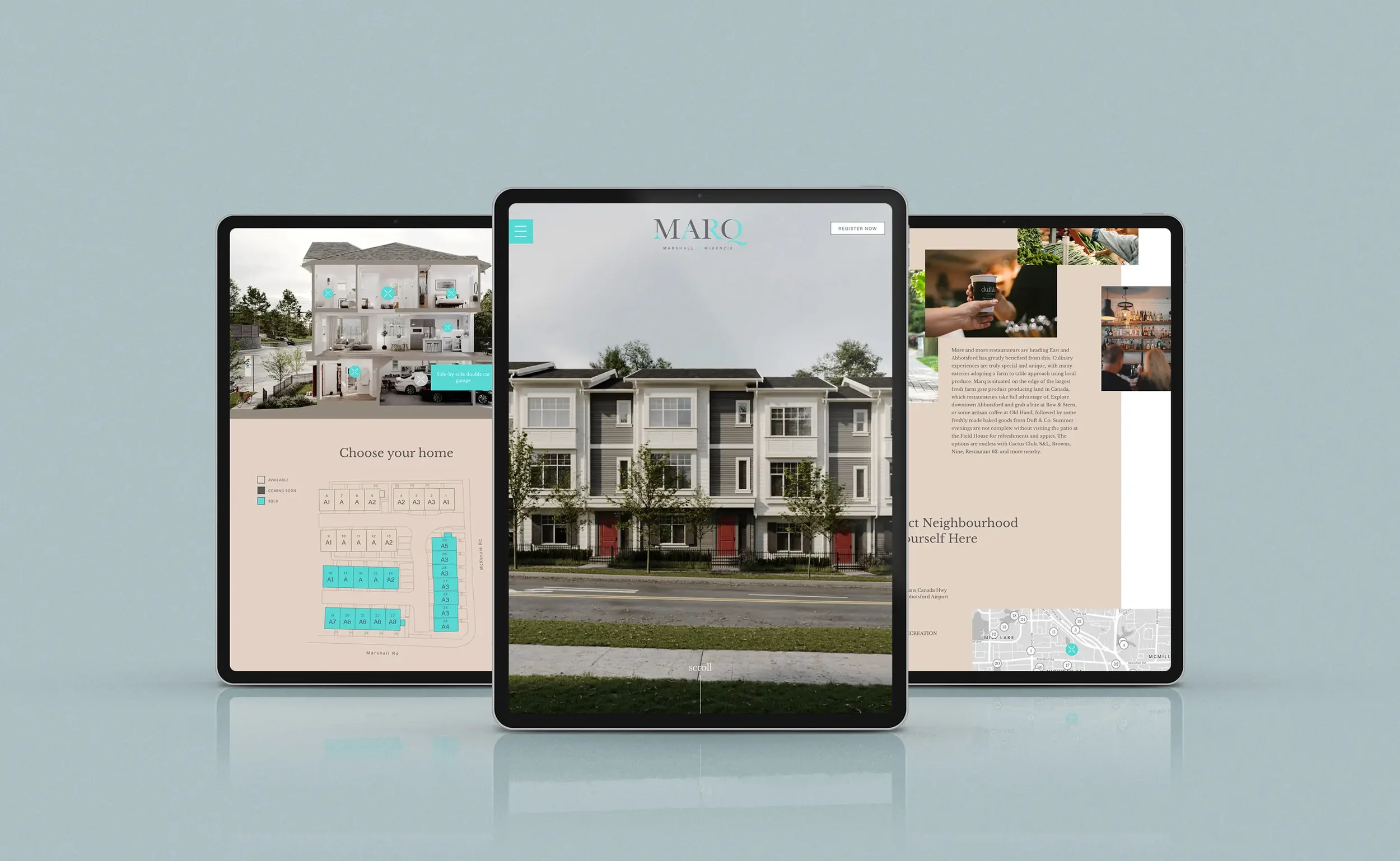
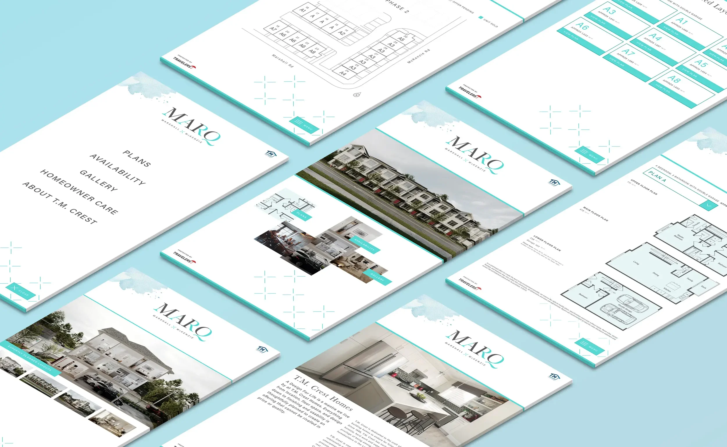
Registration-first UX. Compact sitemap; sticky sub-nav to Overview, Homes, Plans, Gallery, Neighbourhood, Register; prominent CTAs.
Custom WordPress. Lightweight theme, reusable blocks, SEO basics, analytics, and a short form tied to the sales workflow.
What We Made
Name, logo, and palette with usage rules for print and web.
Messaging kit for headlines, benefits, and plan summaries.
Render brief and shot list. Camera angles, lens and height specs, golden-hour lighting references, landscape and furnishing notes, and brand placements.
Delivery kits. Crops for web hero, 4:5 feed, 16:9 video, and print; color tuning to match the palette; light retouching guidelines for people, sky, and greenery.
Custom WordPress microsite with sticky sub-nav, plan/spec modules, gallery, map, and Register / Get floorplans CTAs.
Sales collateral including plan sheets, feature callouts, and signage templates.
Outcomes
Focused launch hub that routes visitors from ad to plans to registration in fewer steps.
Mobile-first performance and clearer copy improved on-site engagement.
Consistent presentation across ads, site, and sales centre, boosting trust and recall.
Project Facts
Client: T.M. Crest Homes
Role: Naming, Brand Strategy, Visual Identity, Art Direction, Web Design
Platforms: Real estate branding + community microsite
Related Work We Have Done
Bloom at Yorkson →
Family-forward identity and a registration-first launch.

Westwood at Tynehead Park →
Park-side brand and microsite that make registering easy.

Oak Terrace →
Calm identity and a registration-first launch.