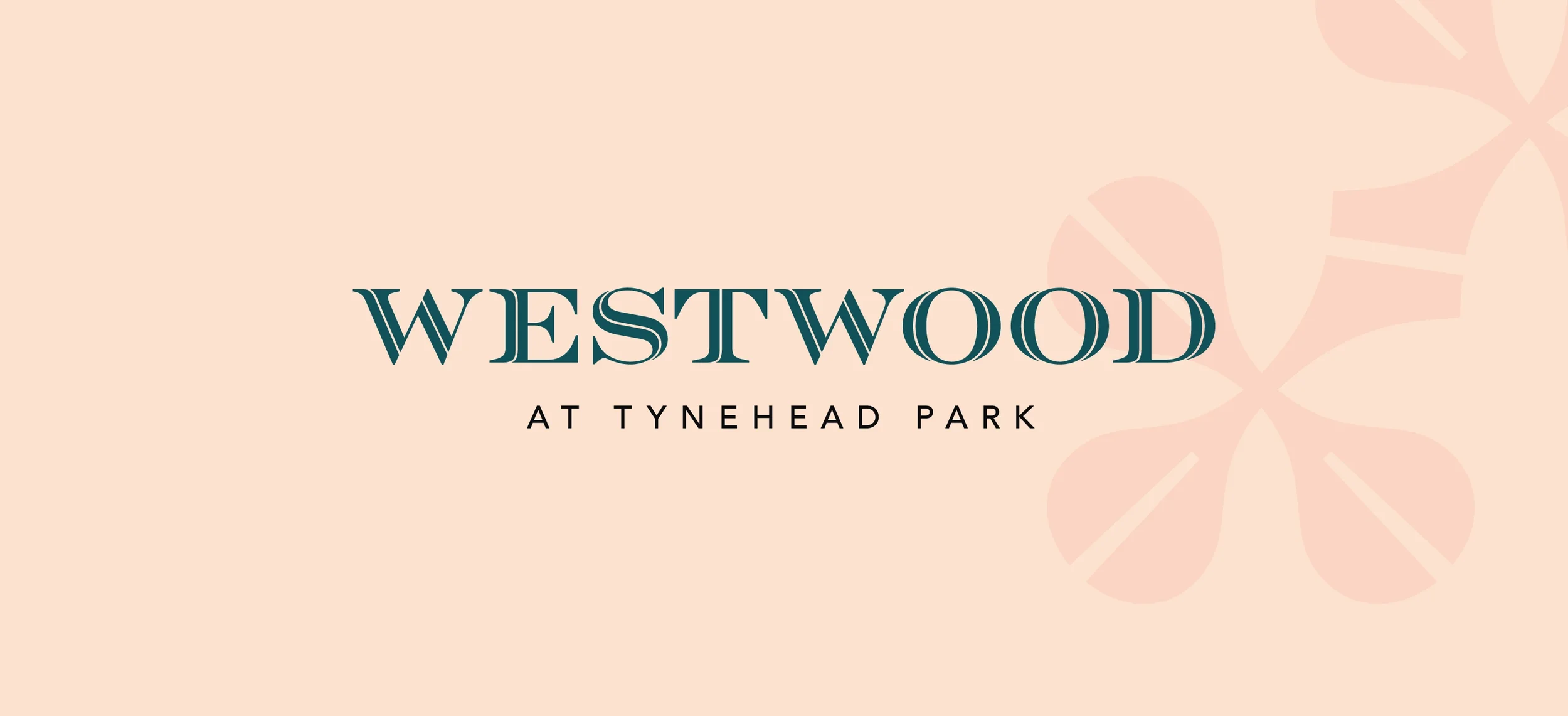
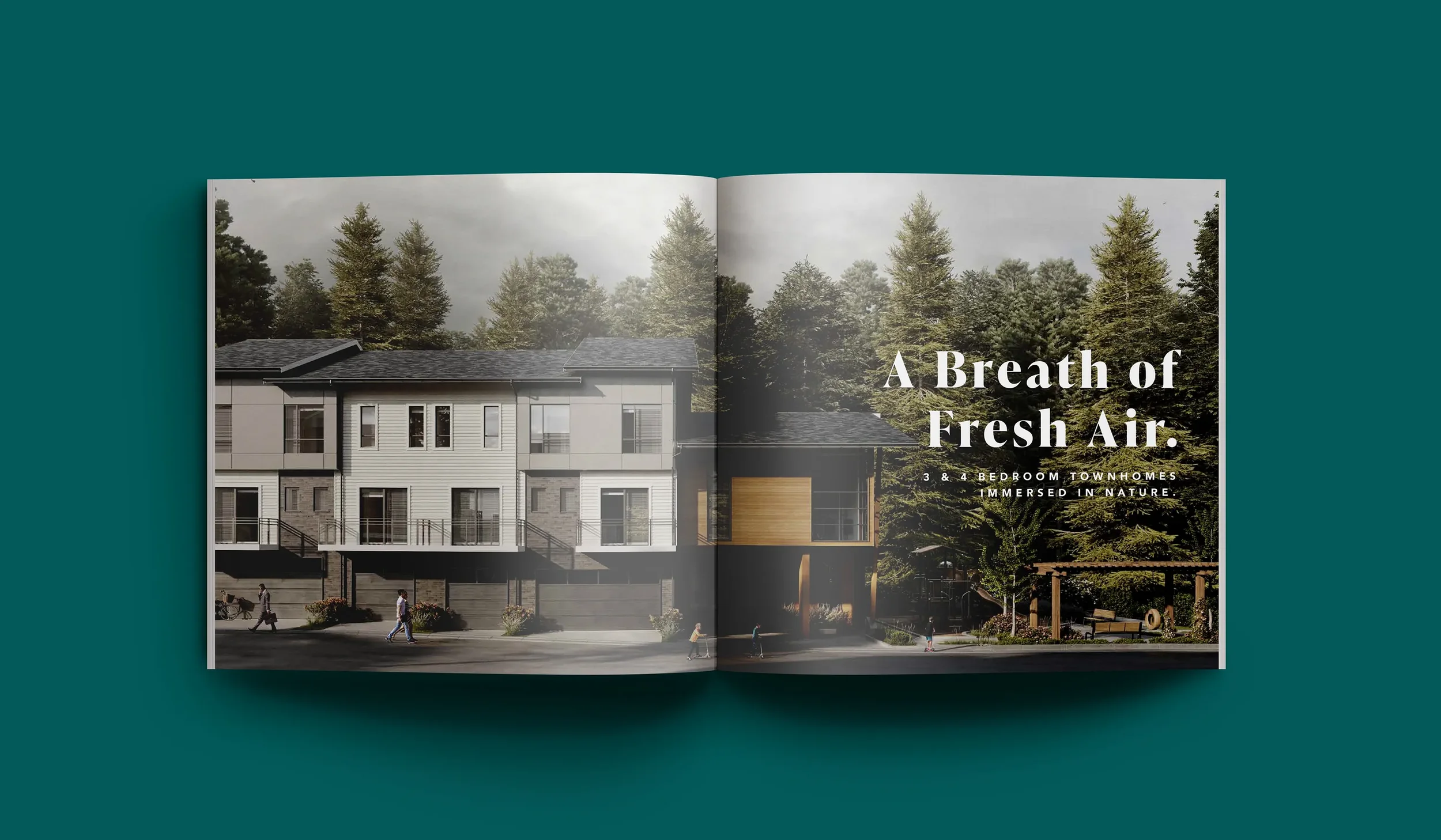
Westwood at Tynehead Park
Park-side brand and microsite that make registering easy
WHAT WE DID:
Brand Strategy • Visual Identity • Messaging • UX/UI Design • WordPress Development • Rendering Art Direction • Sales Collateral • Signage
SECTOR:
Real Estate
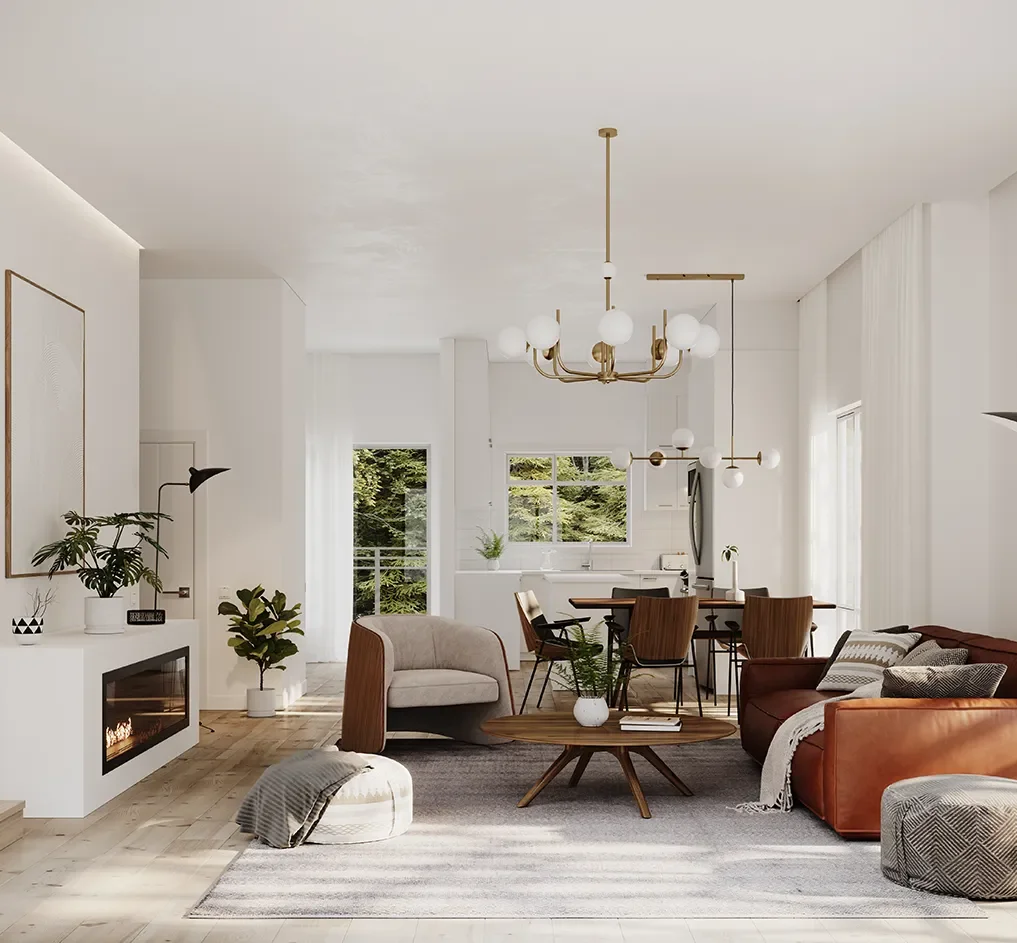
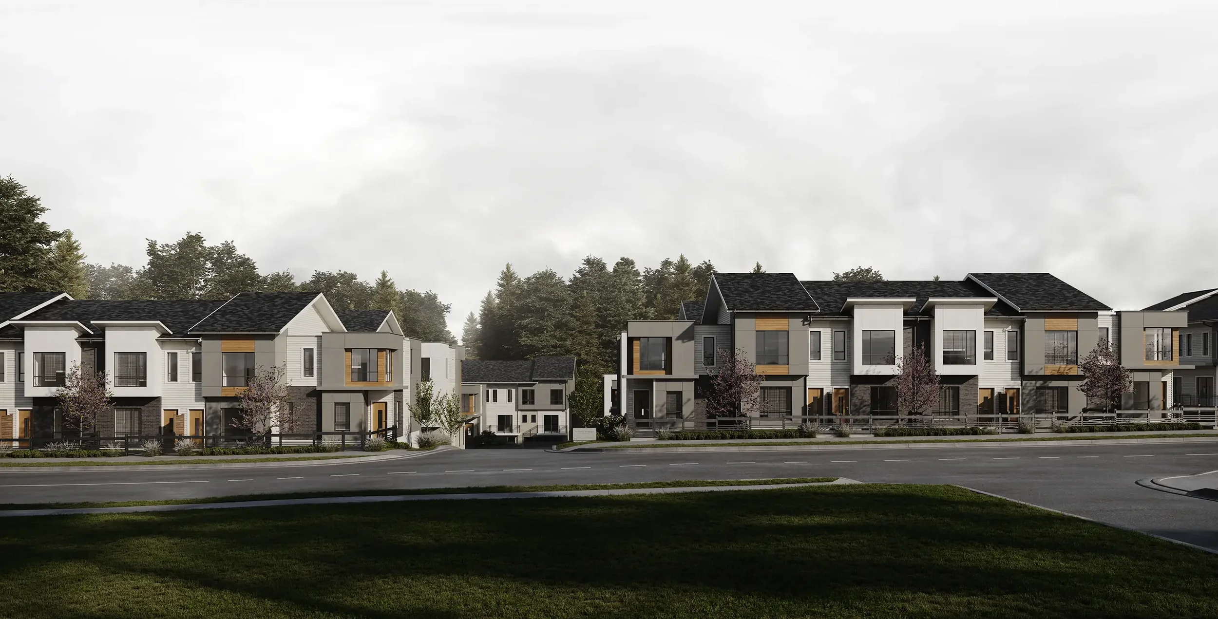
Vesterra Properties asked for a clear, modern brand and a fast microsite to support a single community launch. Our job was to shape the story, build a distinct identity, and design a simple path from interest to registration.
The Problem
Create a development brand that feels contemporary and trustworthy.
Keep the website tight and purposeful: fewer pages, clearer actions, faster load.
Make it easy for marketing and sales to point prospects to plans, features, and registration.
Our Approach
Start with positioning, then express it in design and UX.
Brand strategy. Define the value proposition, buyer priorities, and simple proof points.
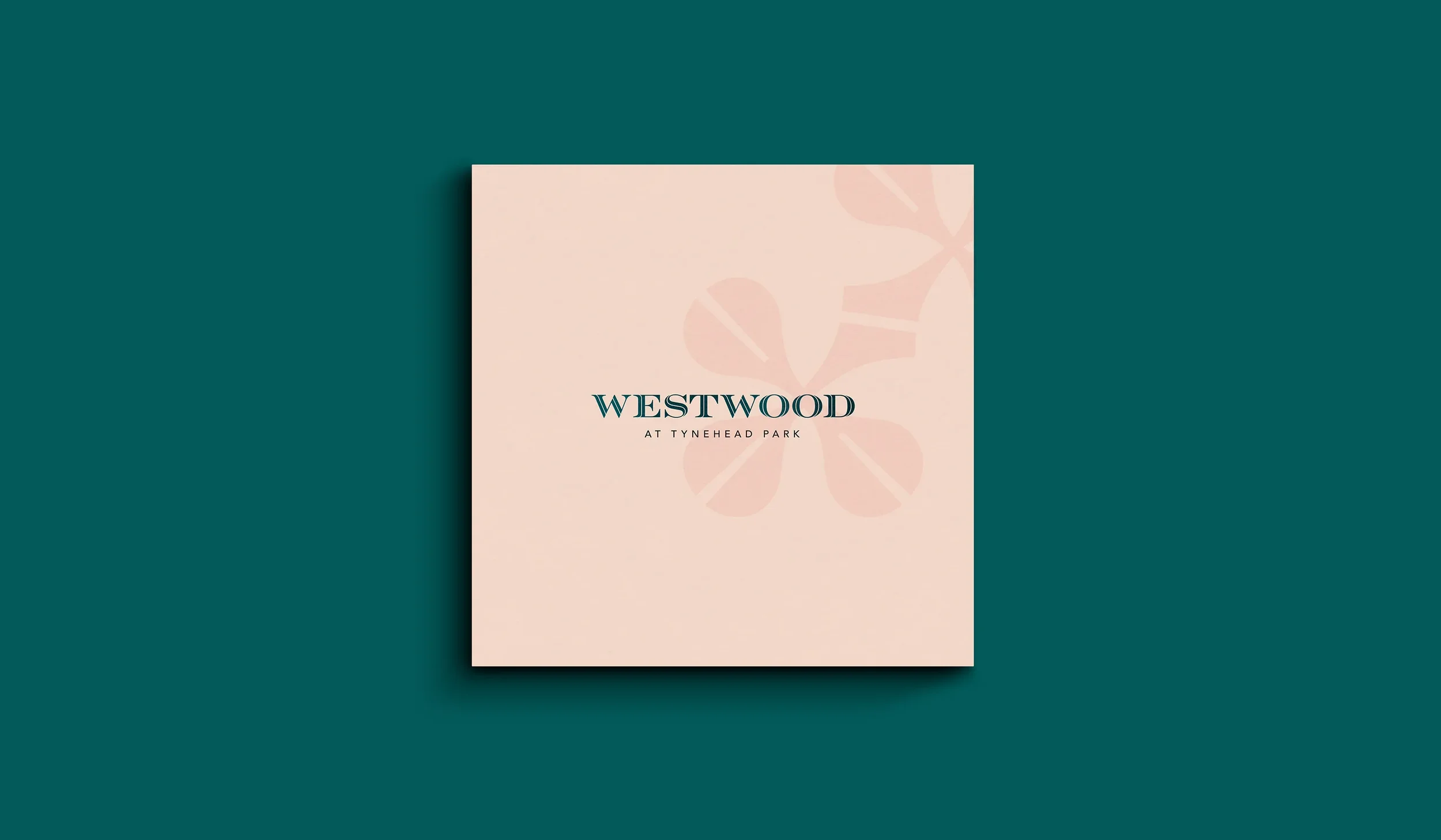
Visual identity. Logo, color, and typography with guidelines so signage, ads, and web stay consistent.
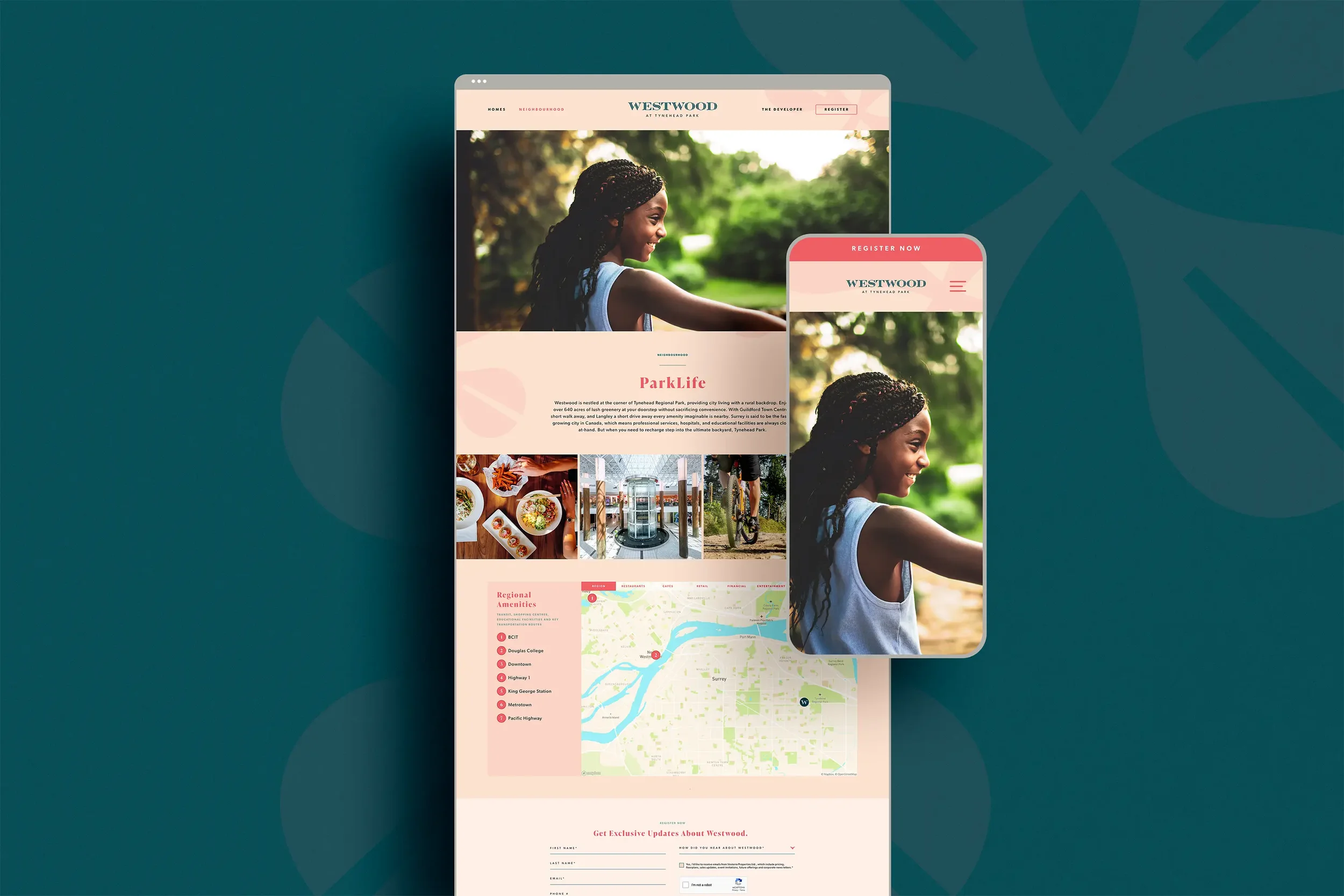
Conversion-minded UX. A compact site map with a straight path to plans, features, gallery, neighbourhood, and register.
WordPress build. Lightweight theme, mobile-first pages, SEO basics, analytics, and a clean lead form tied to the sales workflow.
What We Made
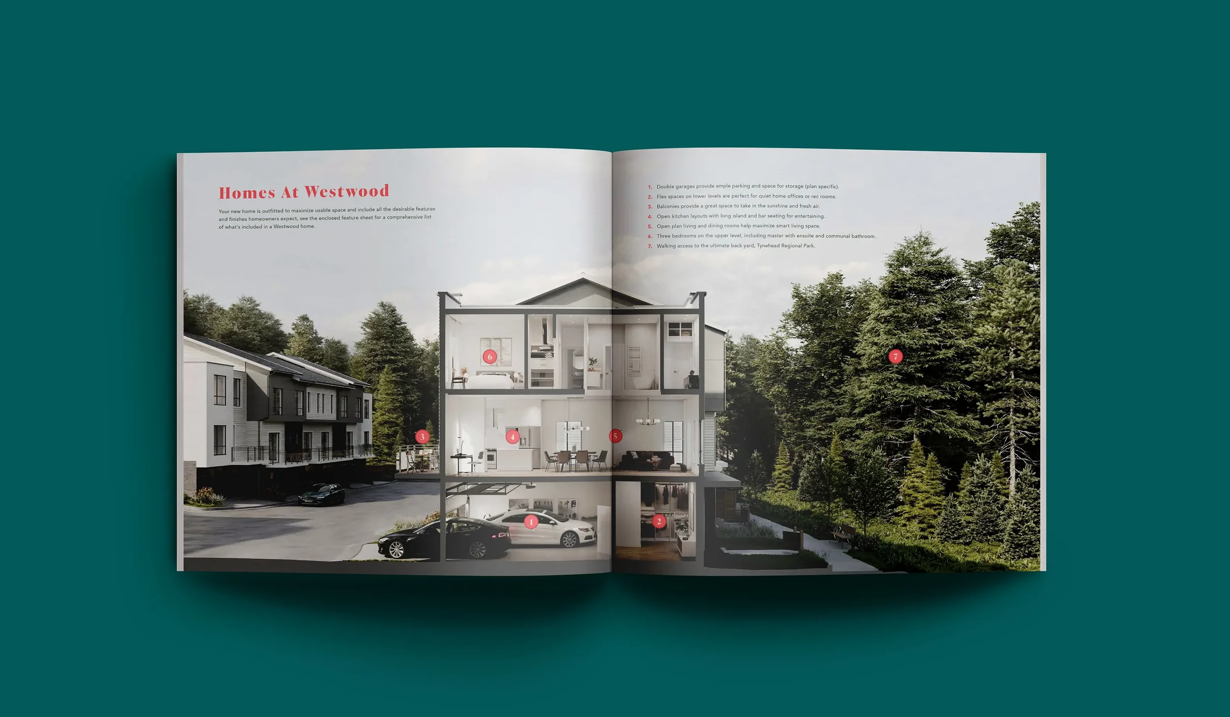
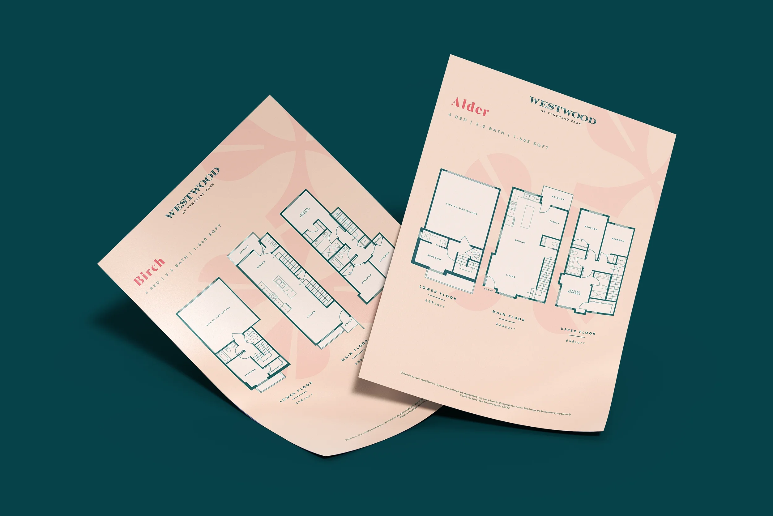
Identity kit with logo lockups, palette, type scale, and usage rules.
Content and messaging for headlines, benefits, and feature callouts.
Microsite UX/UI: Home, Homes/Plans, Features, Gallery, Neighbourhood, Register.
WordPress site: fast pages, easy updates, form tracking, and launch-ready hosting setup.
Outcomes
A recognizable development brand that carries from ads to site to sales centre.
A simple microsite that helps buyers find what matters and register quickly.
Faster campaign setup for the sales team with clear analytics on interest and intent.
Project Facts
Client: Vesterra Properties
Role: Naming, Brand Strategy, Visual Identity, Art Direction, Web Design
Platforms: Real estate branding + community microsite
Related Work We Have Done
Bloom at Yorkson →
Family-forward identity and a registration-first launch.

Oak Terrace →
Calm identity and a registration-first launch.
Marq Rowhomes →
Name, identity, and a registration-first WordPress microsite.