Clarity Eyecare
Diamond-inspired identity and a clean, upscale site
WHAT WE DID:
Brand Strategy • Visual Identity • Art Direction • Print • Squarespace Website
SECTOR:
Corporate (Healthcare/Optometry)

Clarity Eyecare is the second practice founded by Dr. Harbir Sian and Dr. Harleen Takhar. They asked us to create a brand that reads premium and crystal clear at every touchpoint, building on the success of their first practice, High Street Eyecare.
The Problem
Express “clarity” in a way that feels distinctive and upscale, not generic.
Build a visual system that is legible in small spaces (labels, cards) and strong at large scale (signage, hero imagery).
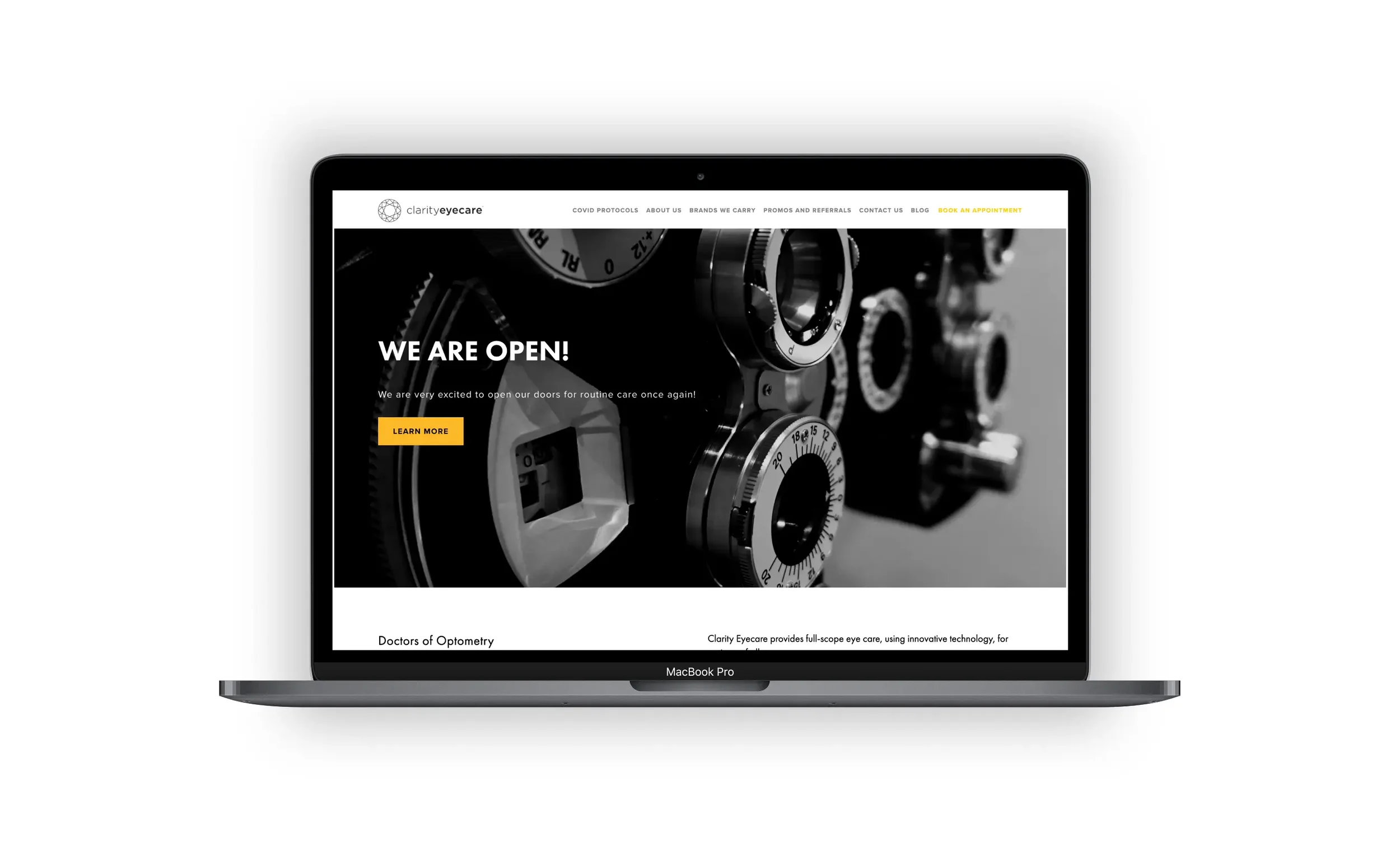
Ship a simple, fast site that matches the brand’s precision and is easy for patients to use.
Our Approach
Lead with a single, memorable idea, then systematize it.
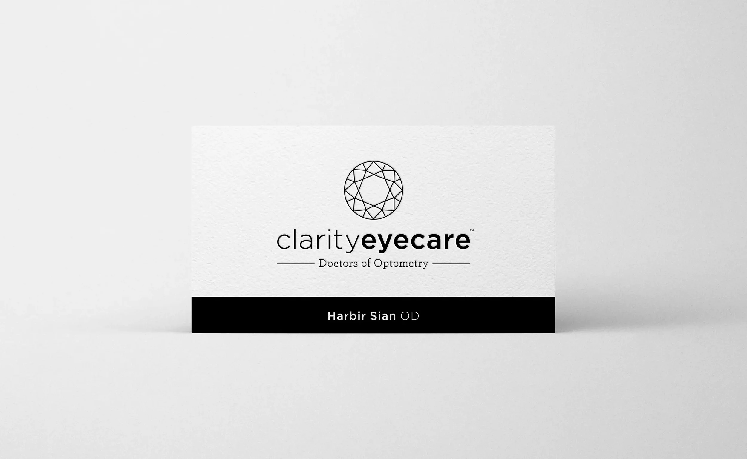
Core metaphor. A top-down view of a perfectly cut diamond becomes the brand’s organizing shape for icons, frames, and layouts.
High-contrast palette & type. Predominantly black and white with an ultra-legible sans for copy so the brand literally reads as “clarity.”
Logotype craft. A refined wordmark set from a Hoefler & Co. type family gives the identity a quiet, premium tone.
Web, kept simple. Clean navigation, generous space, and direct CTAs for booking, services, and location.
What We Made
Identity system built from the diamond motif: logo/lockups, pattern tiles, icon grid, color, and type rules.
Website design & development with readable typography, large contrast, and clear “Book an appointment” pathways.
Print & in-clinic pieces (business/appointment cards, simple signage) produced with Finoprint.
Usage guidelines so the team can keep layouts crisp and consistent.
Outcomes
A brand and site that explain the model in seconds and channel visitors to action.
Lower friction for first appointments via a clear mobile booking entry.
Content tools the team can use to educate employees and HR (FAQs + mobility blog).
Professional yet fun brand and website that resonated with enterprise employers, resulting in long-term engagements with large corporations, including Expedia, Electronic Arts and Trulioo.
Project Facts
Client: Clarity Eyecare (Surrey, BC) — founded by Dr. Harbir Sian and Dr. Harleen Takhar.
Role: Visual identity, art direction, website design & development, print production coordination
Platforms: Marketing site with booking pathway, program pages, FAQs, and blog
Related Work We Have Done
T.M. Crest Homes →
Brand platform and website built for repeatable launches.

Silver Valley Metals →
Brand strategy, identity, and an investor-ready website

Office Health + Wellness Group →
Brand and website for in-office care people actually use.