Office Health + Wellness Group
Brand and website for in-office care people actually use
WHAT WE DID:
Brand Strategy • Messaging • Visual Identity • UX/UI Design • Squarespace Website
SECTOR:
Corporate (Healthcare/Corporate Wellness)

OH+WG brings registered massage therapy and chiropractic care directly to workplaces in the Greater Vancouver region. The promise is simple: an in-office wellness plan employees will use and love.
The Problem
Explain the value of in-office chiropractic and RMT to employers and employees in one clear story.
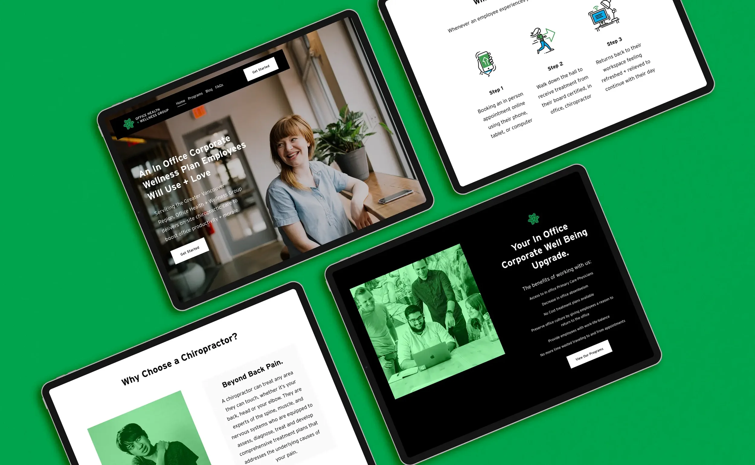
Reduce friction to first appointment with a simple, mobile-friendly booking entry.
Show what to expect on day one and answer common questions up front.
Our Approach
Lead with clarity, then make the next step obvious.
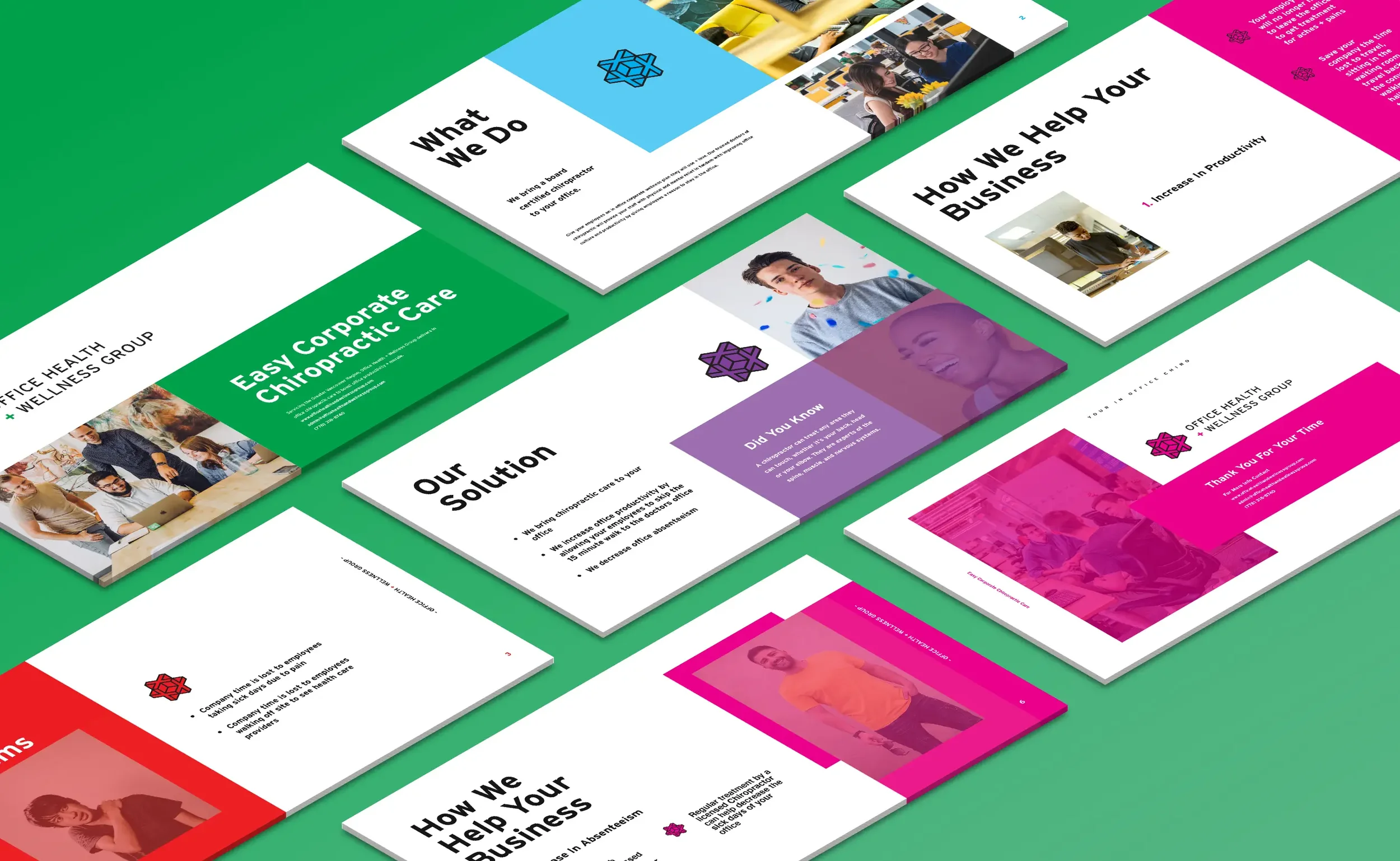
Positioning and voice. Plain language anchored to outcomes: productivity, morale, and on-site convenience. (“The Wellness Team That Comes To You.”)
Identity and UI cues. A friendly, high-contrast look that carries through headlines, icons, and section blocks.
Intent-led IA. Clear routes for Programs, Blog, FAQs, and a primary Get Started CTA in the global nav.
“What to expect” flow. Three steps—book online, walk down the hall, return refreshed—so employees know exactly how it works.
First-timer content. Dedicated entries for “First time seeing a Chiropractor?” and “First time seeing an RMT?” to lower anxiety and increase conversions.
Photo art direction with a shoot plan, framing guides, and usage specs for web and print.
Pattern library (SVG + PNG) with size/opacity presets and do/don’t examples.

Brand and Art Direction (Lifestyle-Led)
We show eureka moments—the instant someone feels pain-free and happy at work.
People first. Real office moments: taking a deep breath after treatment, an easy reach for a top shelf, a relaxed laugh at a desk, a light stretch before a meeting.
Inclusive casting. Mix of roles, ages, and body types so it feels like any modern workplace.
Framing for UX. Clean backgrounds and built-in negative space so headlines and CTAs slot in without fighting the image.
Own the stock. When we use stock, we tint it with the brand color so everything reads as one system, not a collage of sources.

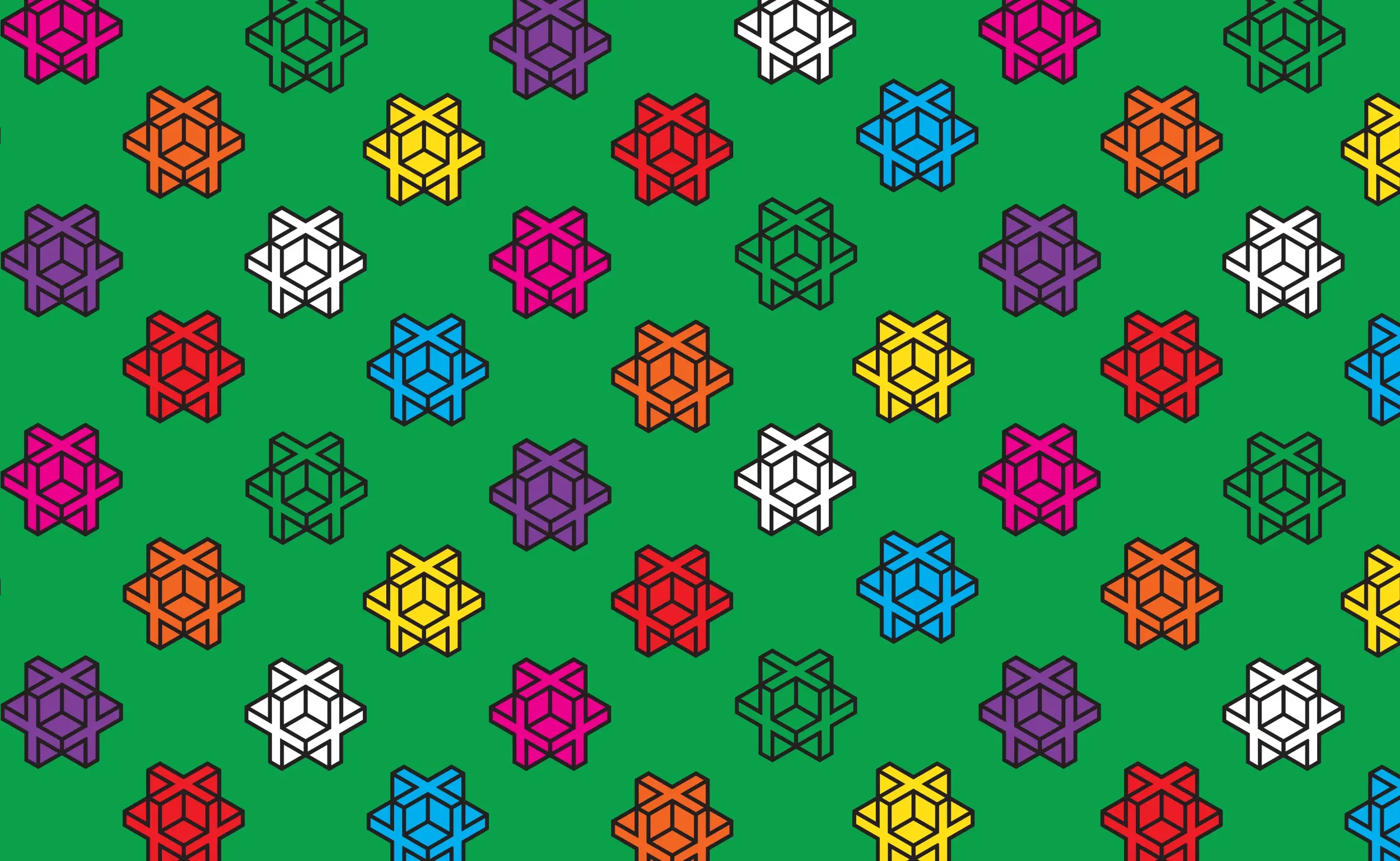
Pattern System
We designed a simple geometric pattern that suggests movement and alignment—echoing chiropractic and ergonomic principles—without feeling clinical. Built from the logo’s core geometry and spacing ratios, then reduced to a tileable set of lines/dots.
What We Made
Brand system with typography, color, iconography, and usage rules.
Messaging kit for headlines, benefits, and FAQ copy.
Website IA and UX/UI with a prominent Get Started pathway, “What Employees Can Expect,” and service pages.
Programs section for on-site chiropractic, ergonomics, and health talks (Lunch-and-Learns).
Blog patterns for mobility tips and quick education pieces.
Photo art direction: Lifestyle images that capture the eureka moment—pain-free and happy at work—brand-tinted for a unified look.
Pattern library: A simple, logo-based geometric pattern in three scales for web, print, and social with clear usage rules.
Outcomes
A brand and site that explain the model in seconds and channel visitors to action.
Lower friction for first appointments via a clear mobile booking entry.
Content tools the team can use to educate employees and HR (FAQs + mobility blog).
Professional yet fun brand and website that resonated with enterprise employers, resulting in long-term engagements with large corporations, including Expedia, Electronic Arts and Trulioo.
Project Facts
Client: Office Health + Wellness Group
Role: Branding, messaging, UX/UI, website
Platforms: Marketing site with booking pathway, program pages, FAQs, and blog
Related Work We Have Done
T.M. Crest Homes →
Brand platform and website built for repeatable launches.
Silver Valley Metals →
Brand strategy, identity, and an investor-ready website.
Clarity Eyecare →
Diamond-inspired identity and a clean, upscale site.