Imperial
A confident identity and a website that converts
WHAT WE DID:
Brand Strategy • Naming • Visual Identity • Messaging • UX/UI Design • Squarespace Website • Rendering Art Direction • Sales Collateral • Signage
SECTOR:
Real Estate
A calm, modern community brand paired with a lightweight site that makes it easy for buyers to view plans, understand the location, and register interest.

The Problem
Create a distinct townhome identity that feels trustworthy and current.
Keep the website tight and purposeful: few pages, clear actions, fast on mobile.
Support real-estate needs like plan downloads, feature highlights, map, and a short registration form the team can manage in-house.
Our Approach
Brand first, then a clean path to action.
Positioning and voice. Plain, benefit-led copy about space, light, and everyday convenience.
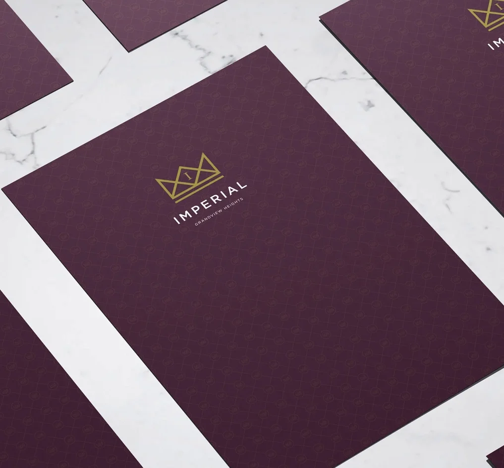
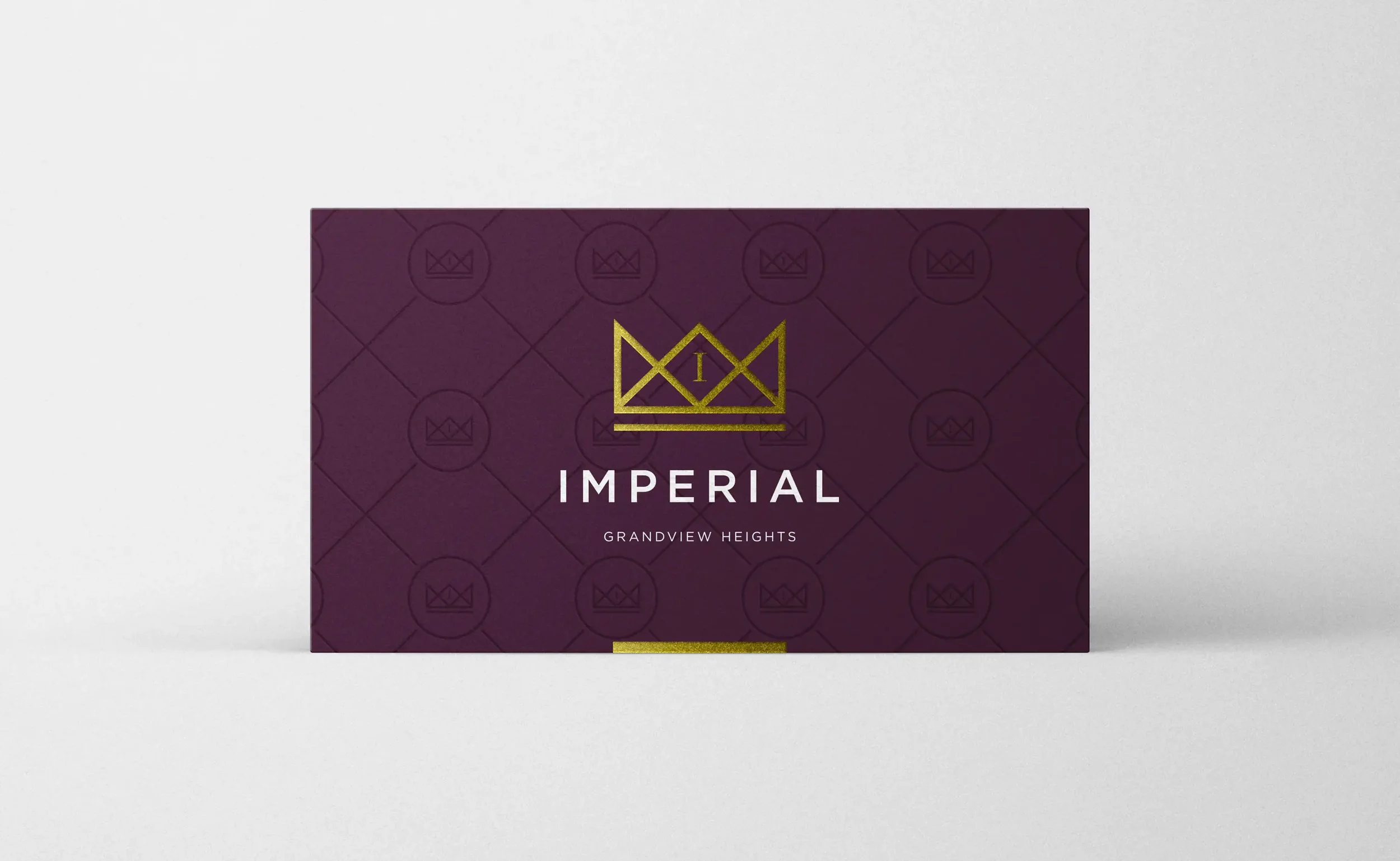
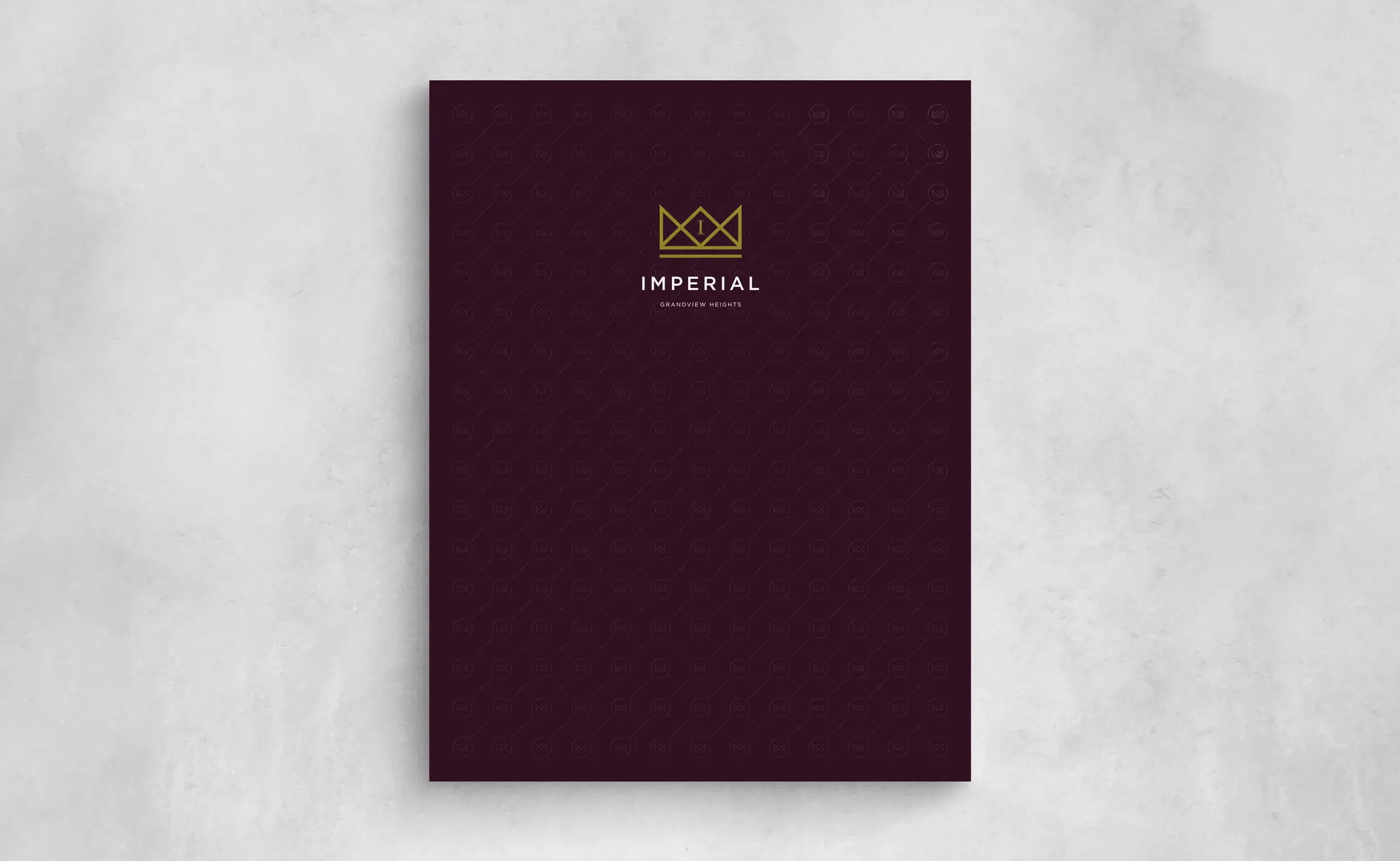
Identity system. Wordmark, palette, and readable type that carry from signs and ads to web.
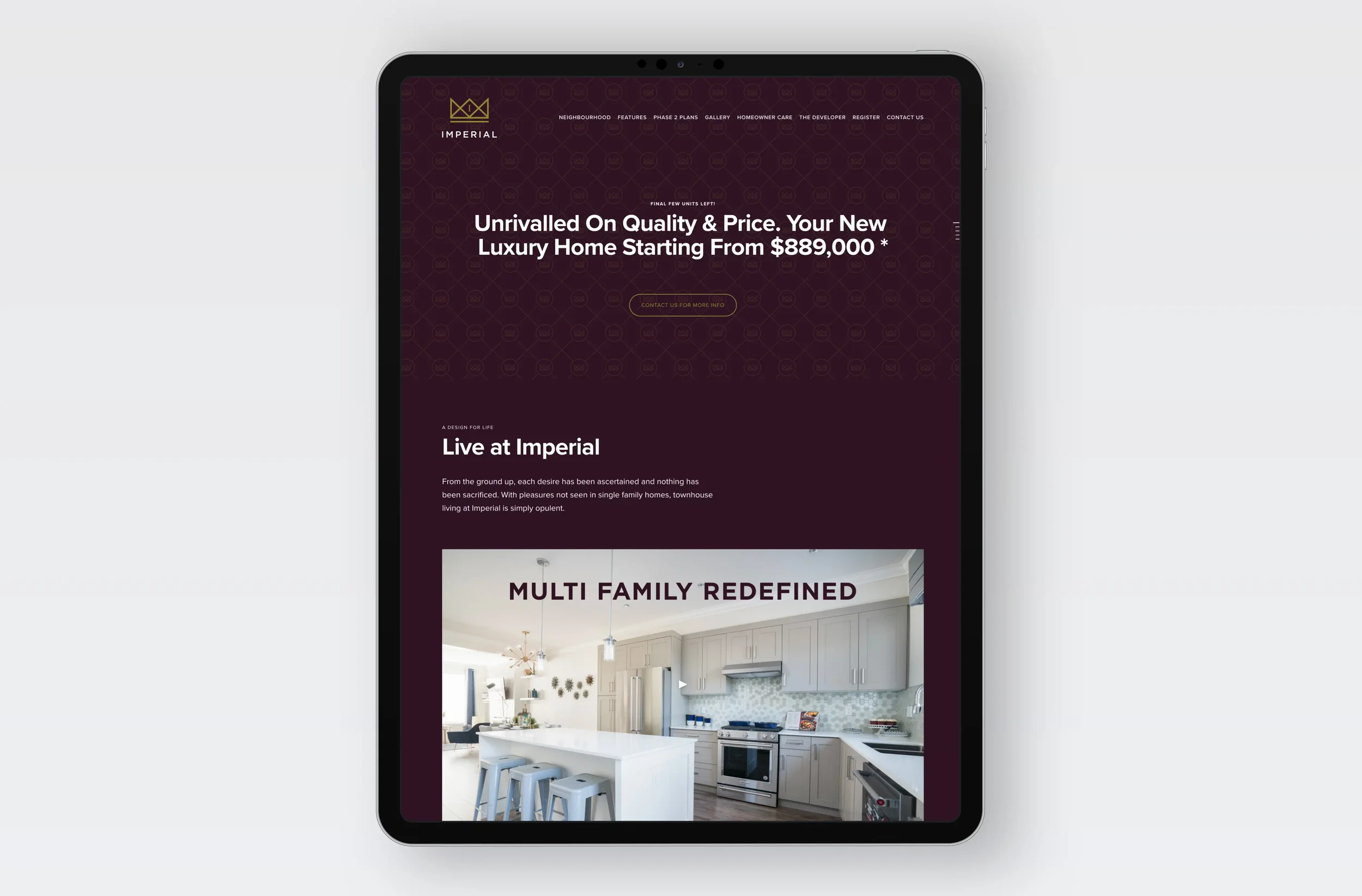
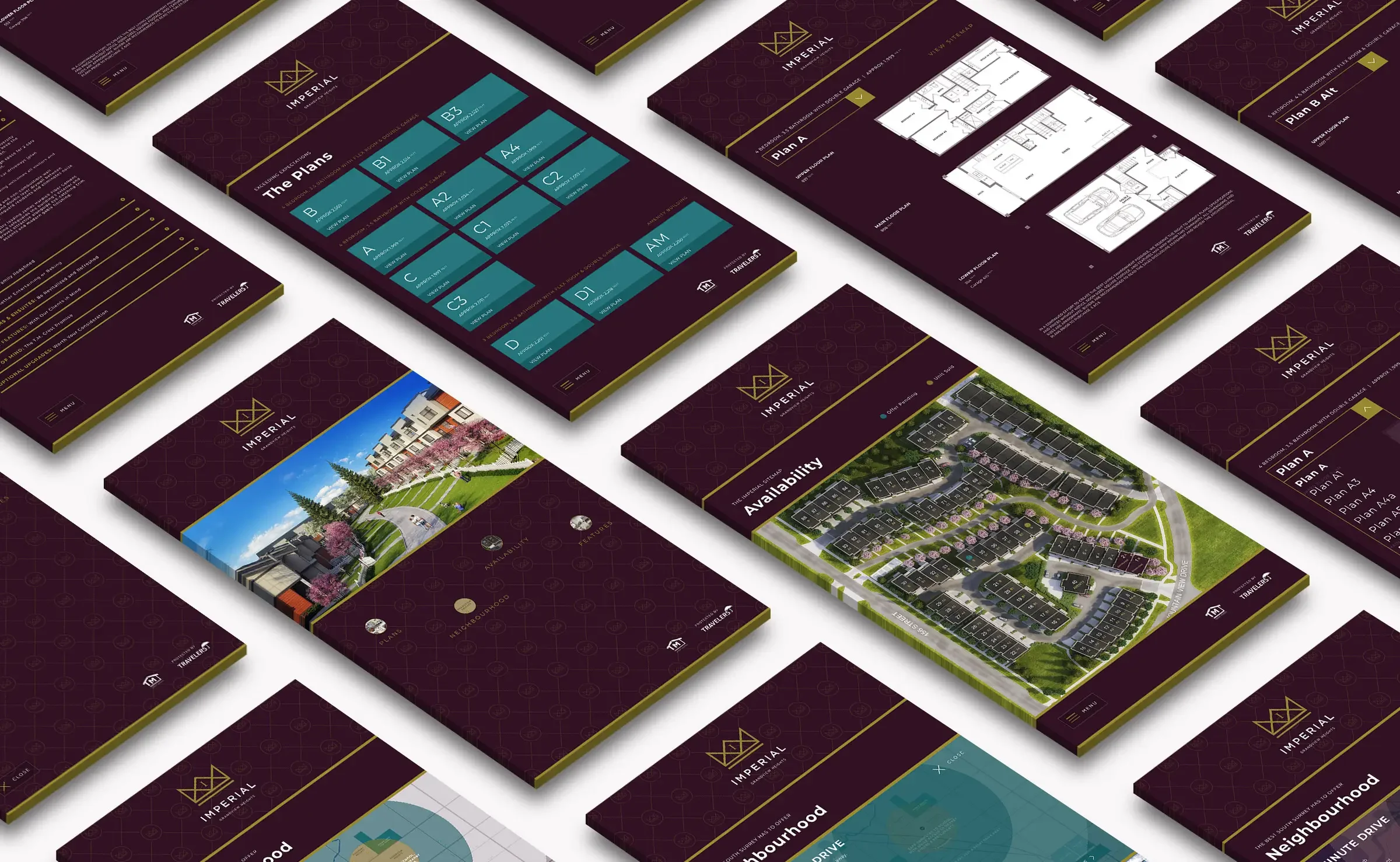
Registration-first UX. Compact sitemap with quick routes to Plans, Features, Gallery, Neighbourhood, and Register; CTA visible on every page.
Squarespace build. Native blocks, fast image handling, form integrations to the sales workflow, SEO basics, and analytics—no heavy plugins.
What We Made
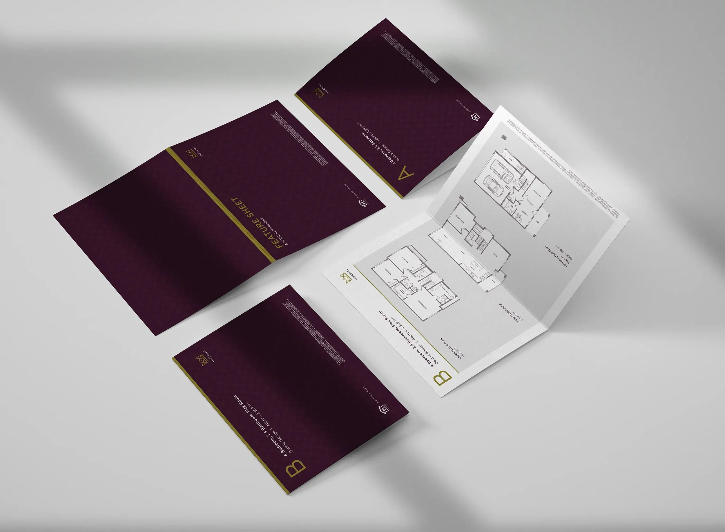
Identity kit with logo lockups, palette, type scale, and usage rules.
Messaging kit for headlines, benefits, plan summaries, and FAQs.
Squarespace site: hero with value prop, sticky jump links, plan/spec modules, gallery, map, and a short Register / Get floorplans form.
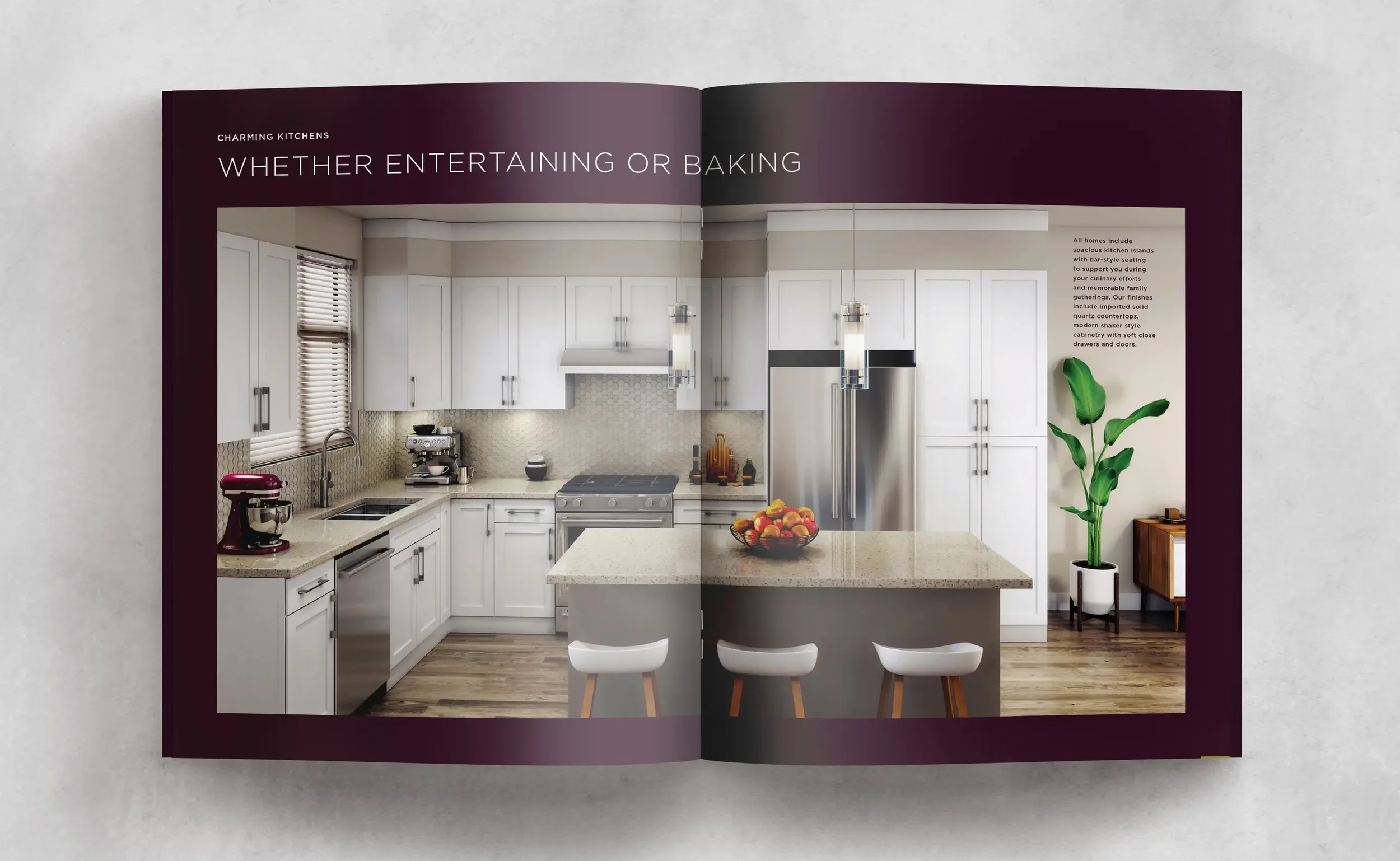
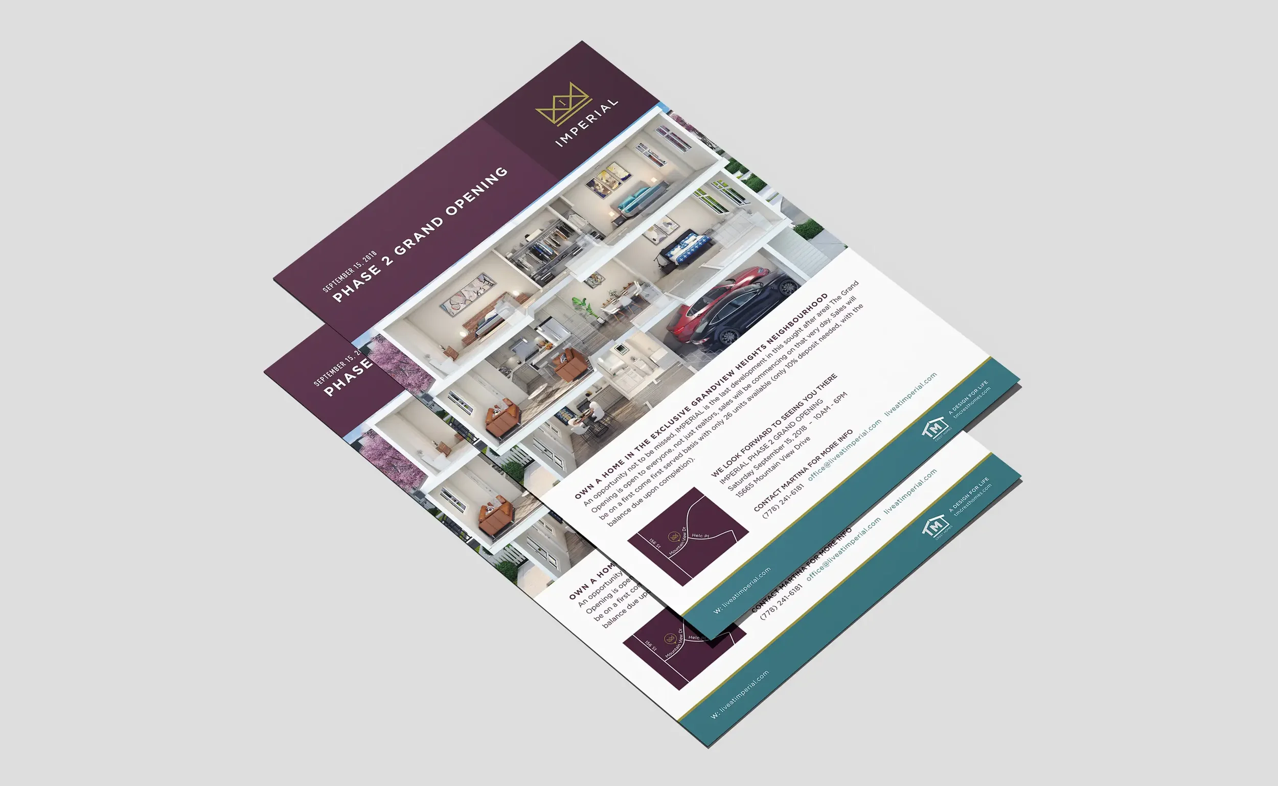
Sales collateral templates for plan sheets, feature callouts, and posters.
Launch checklist covering redirects, tracking events, and email confirmations.
Outcomes
A recognizable community brand that builds trust from first impression to sales centre.
A faster buyer journey from ad to plans to registration.
Easy updates for the sales team and clean analytics on interest and intent.
Project Facts
Client: T.M. Crest Homes
Role: Brand strategy, visual identity, UX/UI, Squarespace development, sales collateral
Platforms: Real estate branding + community microsite
Related Work We Have Done
Bloom at Yorkson →
Family-forward identity and a registration-first launch.

Westwood at Tynehead Park →
Park-side brand and microsite that make registering easy.
Marq Rowhomes →
Name, identity, and a registration-first WordPress microsite.