Oakmont Senior Living
UX/UI that makes tours and careers easier
WHAT WE DID:
UX/UI Design • Information Architecture • Design System • Component Library • Content Patterns • Front-end Support
SECTOR:
Healthcare & Hospitality / Senior Living

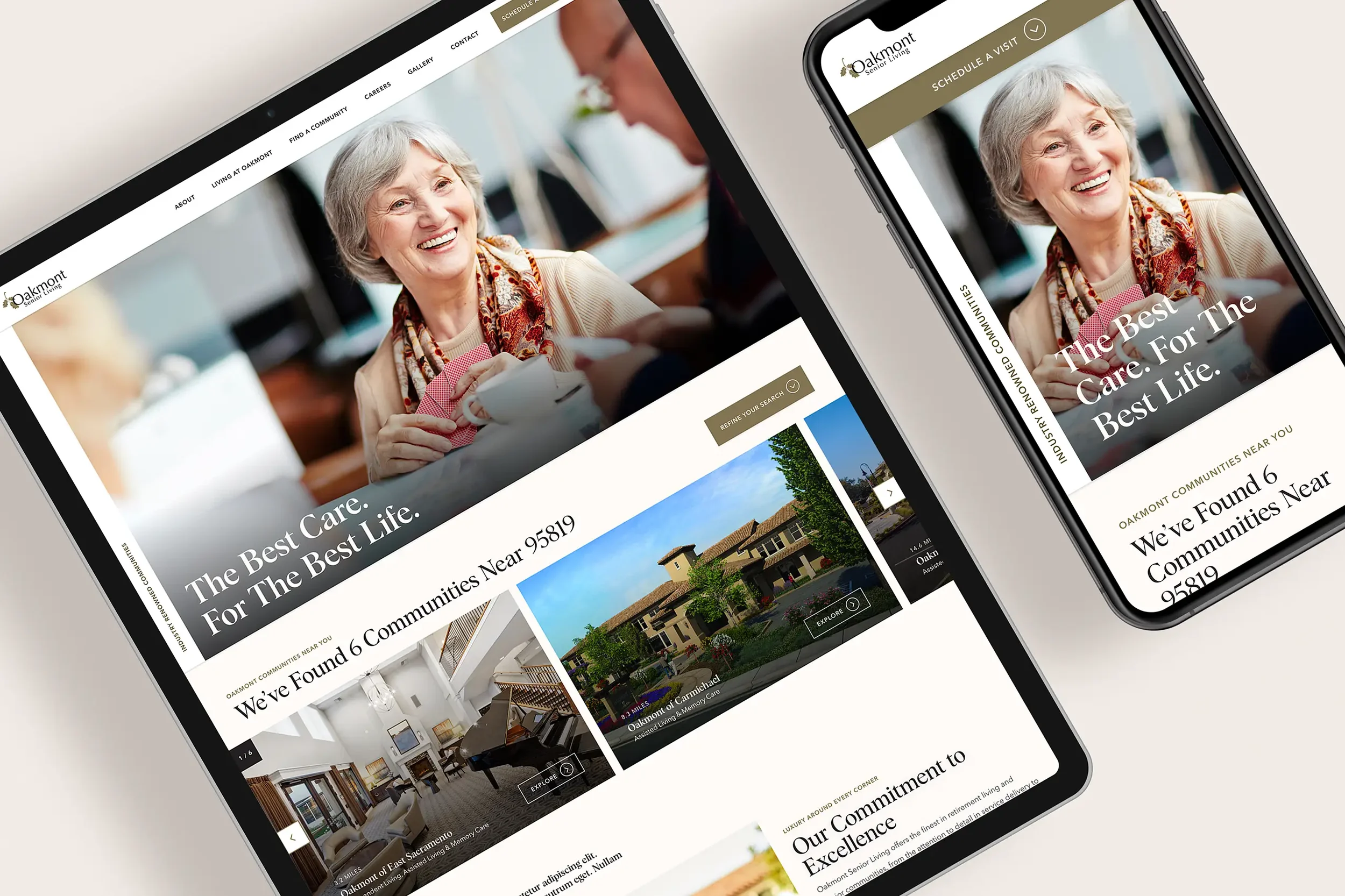
Oakmont needed a site that helps families quickly understand options, find a nearby community, and book a tour—while also supporting recruiting and day-to-day updates. We designed a clear, mobile-first experience and a component system the team can extend across many locations.
The Problem
Families and caregivers needed a simpler way to compare services and book a tour without getting lost.
The site had to support many communities with consistent design but room for local content.
Recruiting was a priority; the careers path needed to be more visible and easier to act on.
Marketing required a repeatable component library to ship pages faster and keep the look consistent.
Our Approach
Organize around real visitor intents, then build a system that scales.
Intent-led IA. Clear routes for “Find a community,” “Compare care & services,” “Book a tour,” and “Careers.”
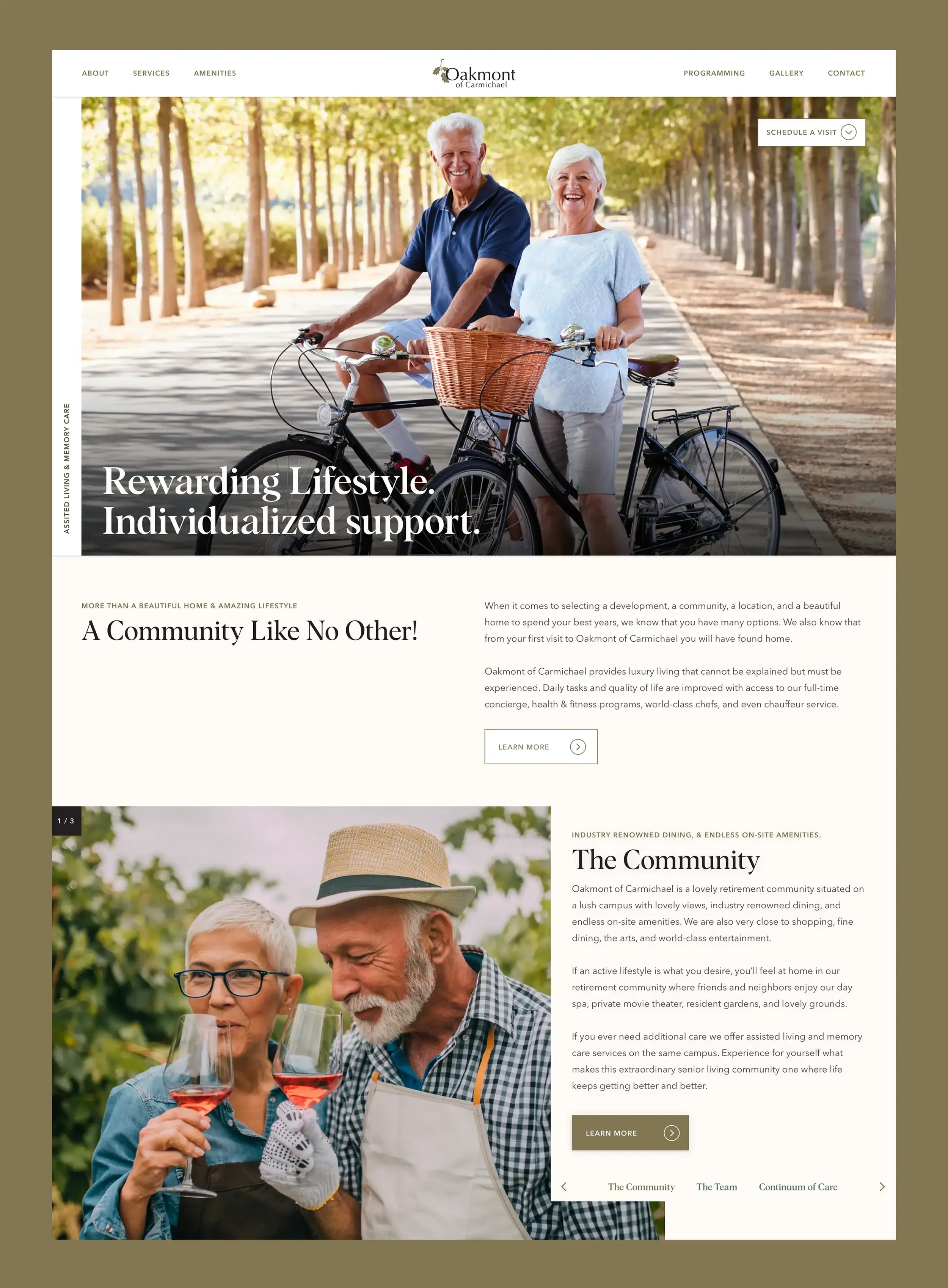
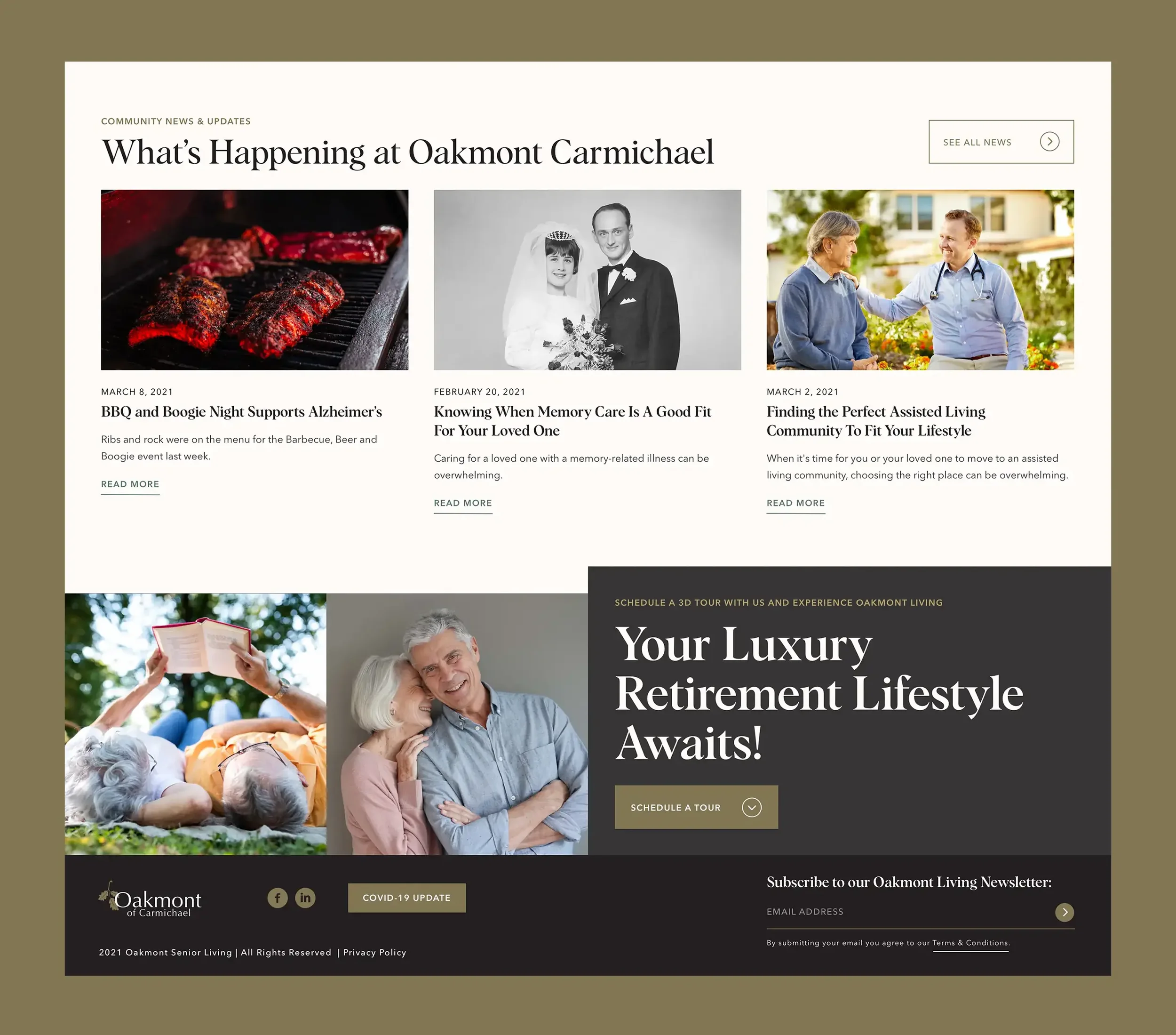
Location model. Reusable page templates for communities with consistent sections: overview, services, dining, activities, photos, map, FAQs, and tour form.
Booking always handy. A persistent entry to schedule a tour or contact, visible on mobile and desktop.
Component library. Cards, comparison tables, photo galleries, FAQs, promo banners, and CTAs with documented states.
Accessibility & speed. Legible type, color contrast checks, keyboard focus, image discipline, and concise copy patterns.
(Delivered in partnership with Wallop’s hospitality team.)
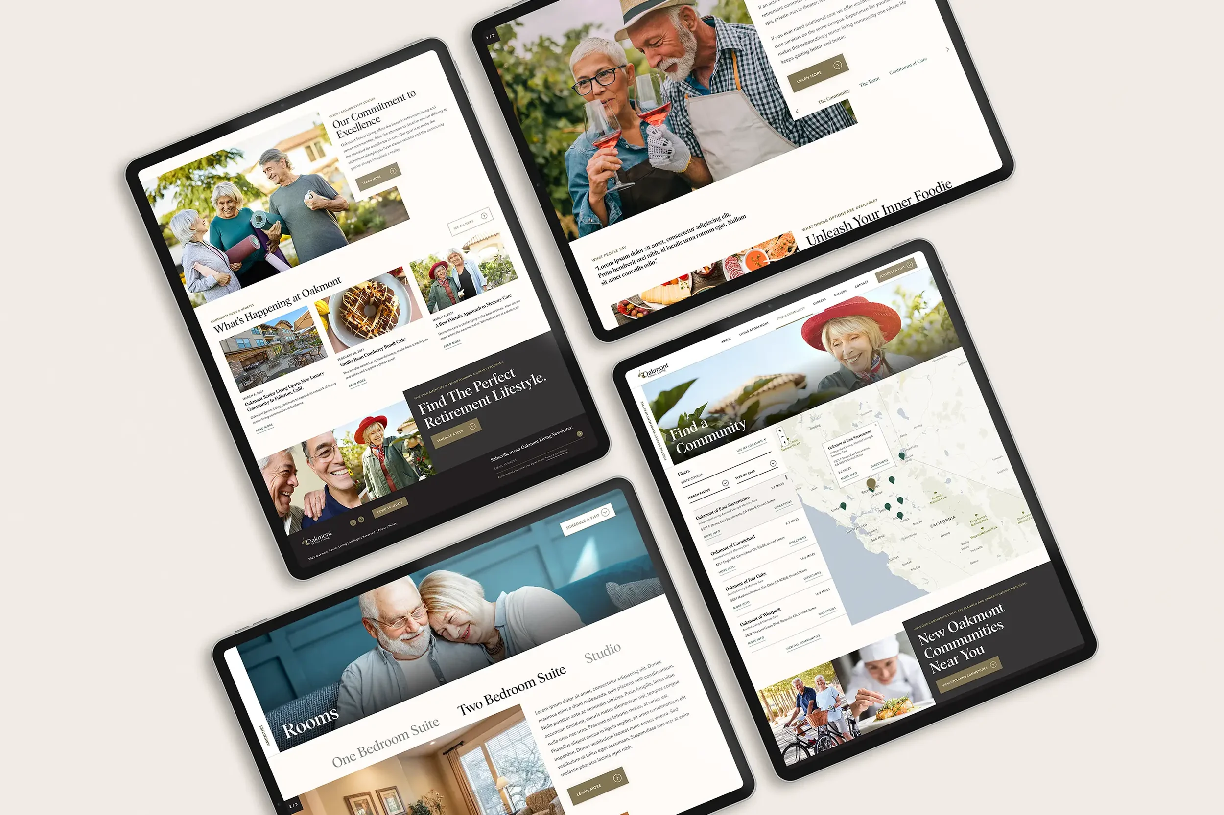
What We Made
Corporate and community templates with a shared system of blocks and headings.
Tour request flow streamlined to fewer fields and clearer confirmations.
Care & services framework that explains levels of care without jargon.
Careers entry points from global nav and community pages, plus a simple job-list pattern.
Design system tokens for color, type, spacing, and interactive states to keep new pages consistent.
Outcomes
Faster paths to tours and inquiries on mobile and desktop.
Consistent community pages that reduce authoring time and brand drift.
Clearer careers visibility so candidates can find and apply more easily.
A scalable UI that supports new communities and campaigns without redesign.
Project Facts
Client: Oakmont Senior Living
Role: UX/UI design, design system, component library
Partners: Wallop (web development, digital marketing)
Platforms: Corporate site with multi-community templates
Related Work We Have Done
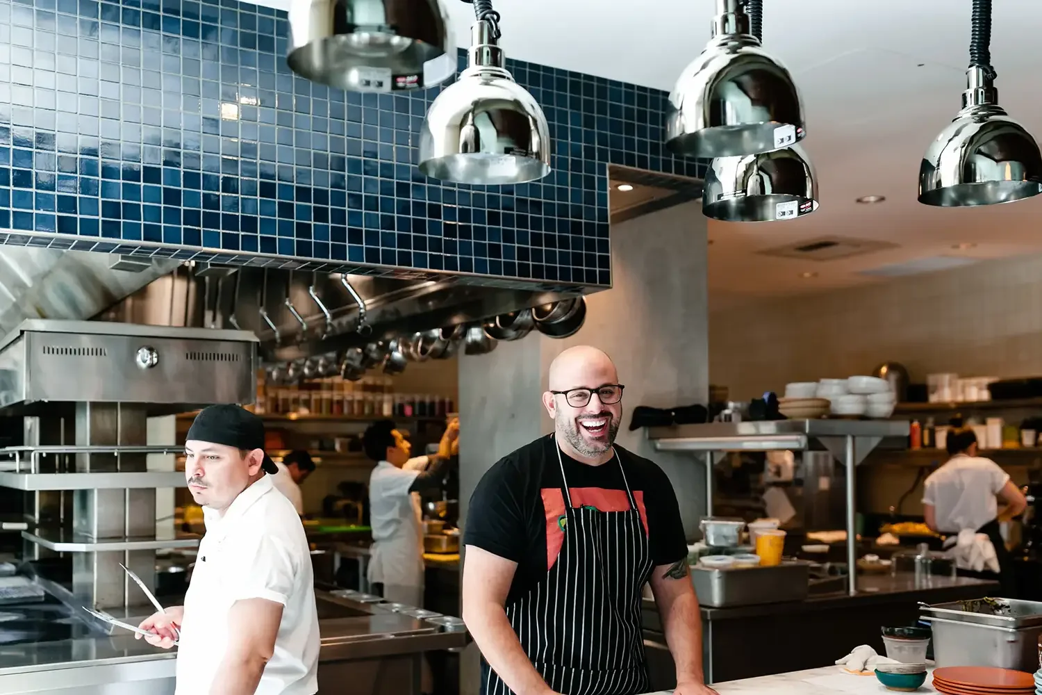
White Lodging →
Recruitment-first corporate site and scalable property platform.
Ace Hotel →
Brand-first web experience that books.
24seven Hotels →
Visual identity for a people-first hotel operator.